Article + Client Project
December 2016
__
Michigan Wheel Marine
Navigating client relationships can be complex, much like an experience I had with Michigan Wheel Marine (now named Michigan Wheel), a former client based in Grand Rapids, Michigan. Established in 1906, they have a rich history and maintain a strong reputation for handcrafting propellers celebrated for their unparalleled performance.
Project Background:
When Michigan Wheel Marine sought my services to develop a new brand identity for their company, I was initially unaware of the internal conflict and power dynamics at play within the organization. So like any beginning of a project, I dove in and began to work closely with the internal team and their global partners. It soon became evident that there was internal and partner conflict regarding how they defined their brand and how customers perceived them. Unfortunately, their ongoing disagreements only complicated my efforts to provide them with sound advice and develop a meaningful brand identity.
Instead of wanting to gain an understanding of their market and customers, they created internal alignments that swayed what they felt was their brand. Never considering my advice for thoughtful research and interviewing to understand their business, market, and customer perceptions.
Reflecting back on this situation, I wish I had been more direct with them, though I'm uncertain if that would have helped. It's unfortunate that they relied on internal alignments to assert what they believed was right, overlooking the importance of thorough qualitative and quantitative research. Missing this important step, they overlooked valuable insights that would have helped me shape their brand more effectively. Research should always play a crucial role in uncovering customer needs, preferences, and perceptions, ultimately guiding an effective brand strategy.
The result of neglecting this essential step, Michigan Wheel Marine missed out on opportunities to differentiate themselves and resonate with their target markets and consumers. Unfortunately, this led to the termination of our working relationship, as they sought a design studio that would simply comply with their instructions without prioritizing strategic research and insights.
Logo Direction:
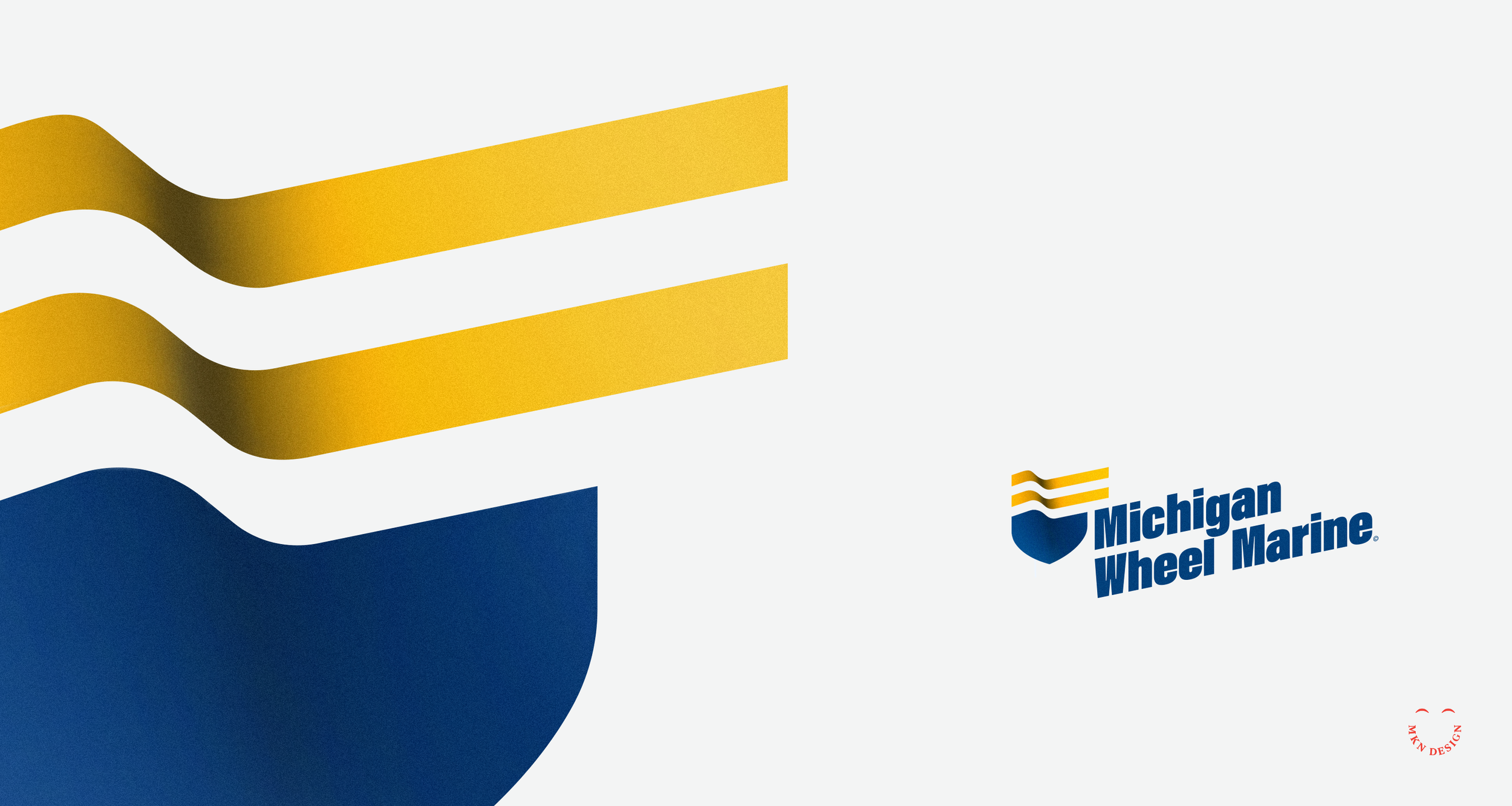
The logo direction was shaped by restricted research, as the client was unwilling to invest in what they perceived as unnecessary expenses. I hate to say, “I told you so.” Some companies do not like spending money on important research. Since this was the reality of this project, I spent time on preparing a basic questionnaire to understand the company, its market segments and competitor analysis. This limited research revealed a desire to differentiate from competitors and avoid the common propeller motif. I felt my approach was unique, drawing from their company's rich history, engineering expertise, and providing precision handcrafted propellors.
During my exploration phase, I focused on incorporating marine motifs. I used a boat bow with the addition of two flowing lines (acting as a flag), these two combined elements created a badge. I chose a bold typeface, Acumin Variable designed by Robert Slimbach from Adobe Originals to commitment the logomark. With the additional of color, reflecting a nautical theme I added depth to the mark to give it presence. Also, by angling the logo I created a sense of movement, making it feel more modern and energetic. The final execution integrates the logomark (badge) and logotype (company name) to reflect the company's experience, excellence and superior products.
Even though the stakeholders didn't see this as the right direction, it was just one of my approaches that I believed aligned with their needs based on the research conducted.
-
+Brand Identity
-
+ Creative Direction
+ Project Management
+ Qualitative Research
+ Concept Development
+ Sketching & Ideation
+ Illustration


