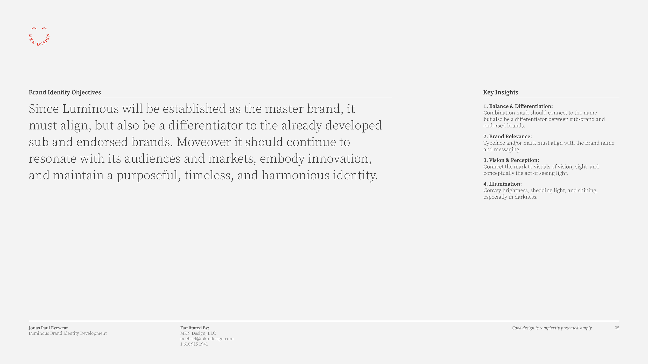
These pages serve as a repository of MKN Design Studio’s articles, client projects, independent work, and products.
Careful, it’s a rabbit hole.
Use the search to find projects by type, or the dropdown to explore by group.
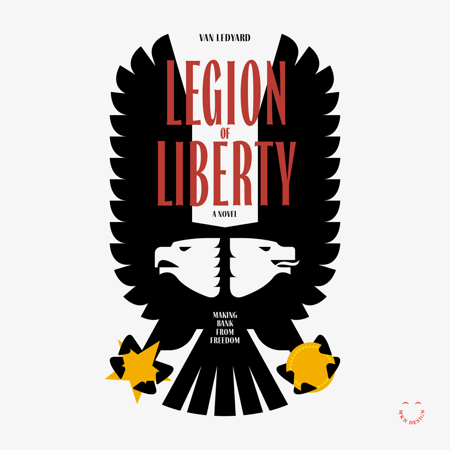
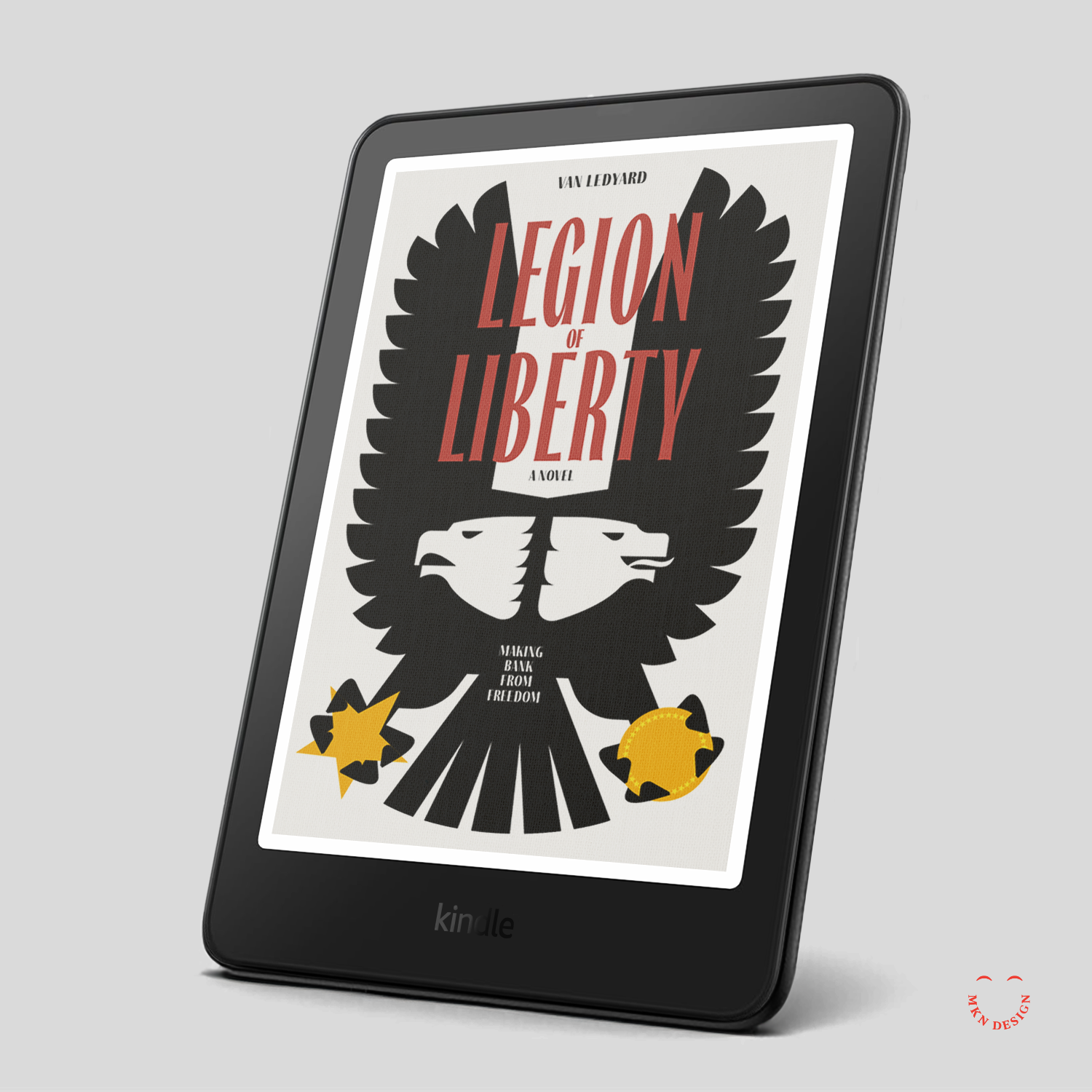
Legion Of Liberty – Book Cover Design
Client Project
—
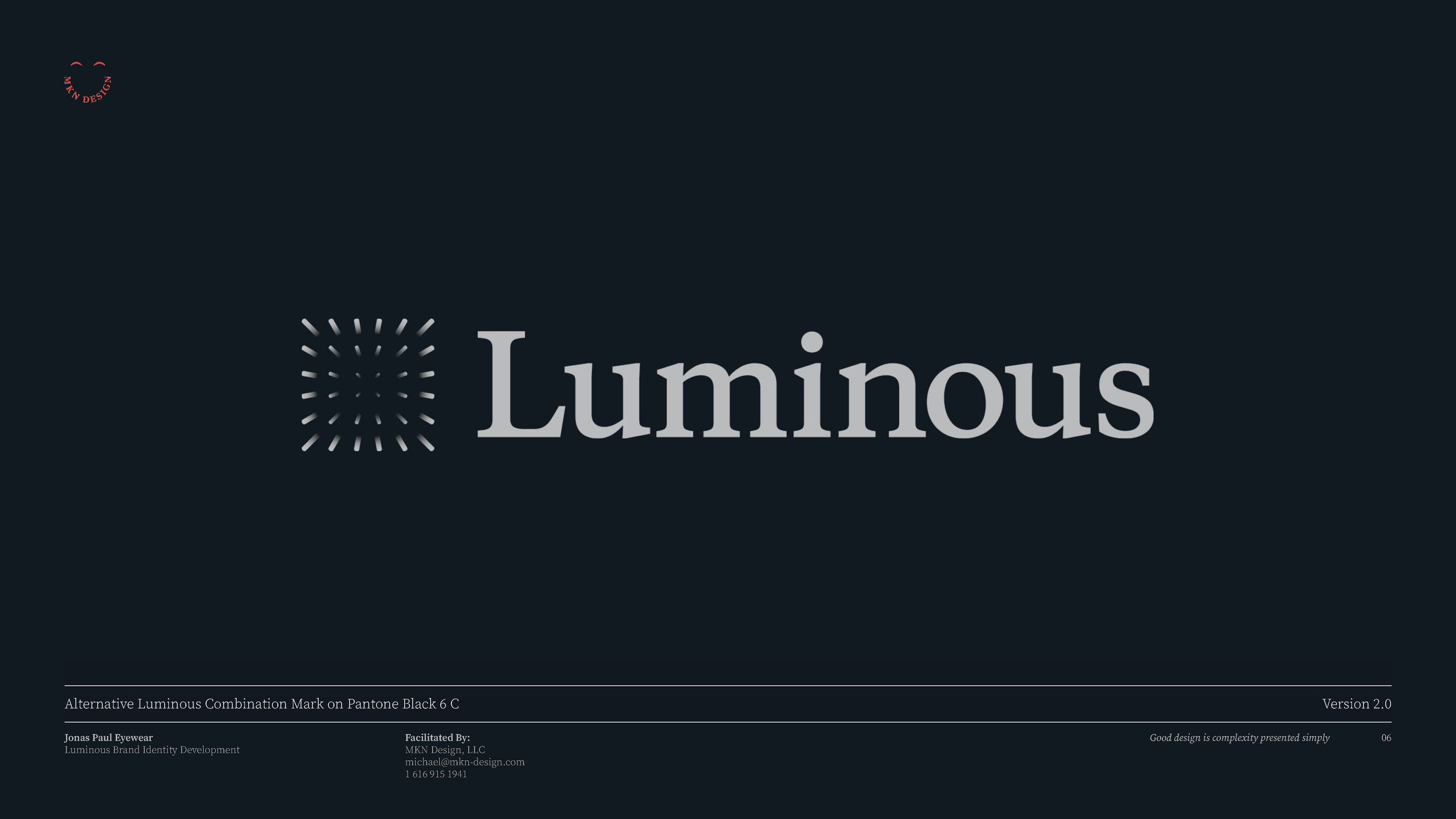
Legion Of Liberty – Book Cover Design
Legion of Liberty is satirical political noir about moral drift, complicity, and the seductions of proximity to power. As the story unfolds, liberty is revealed not as a pure ideal, but as something leveraged—protected on paper and constrained in practice.
As the story unfolds, liberty is revealed not as a pure ideal, but as something leveraged, protected on paper and constrained in practice, and the cover translates this tension through a minimalist, symbolic approach. Centered on the American eagle, a culturally immediate icon rendered with deliberate symmetry and control, the image initially reads as noble and authoritative. On closer inspection, its rigid geometry and high-contrast palette suggest institutional force, dominance, surveillance, and power insulated from consequence.
This fractured duality is made visible: the left side embodies the ideal of freedom, its talon grasping the American star as a symbol of unity and virtue, while the mirrored right side exposes moral drift and the seduction of power, exposes moral drift and the seduction of power, with a gold coin standing in for ideology. Even the tagline, “Making Bank from Freedom,” reinforces the novel’s satirical edge—underscoring a system that appears virtuous on the surface while concealing something transactional beneath.
The book’s title is set in Thrillers, designed by Natanael Gama from NDISCOVER, with Fino Sans by Ermin Medjedovic from TypeTogether used as the secondary typeface.
Purchase This Novel:
Legion of Liberty: Making Bank for Freedom, by Van Ledyard, can be purchased on Amazon for Kindle.
-
Van Ledyard
Author -
+ Concept Development
+ Conceptual Translation
+ Design Direction
+ Narrative Distillation
+ Qualitative Research
+ Visual Identity -
MKN Design Team:
+ Michael Nÿkamp, Design DirectorStakeholder:
+ Van Ledyard, Author