GO Transit
__
Designer: Frank Fox, Gagnon Valkus
Studio: Gagnon/Valkus Inc. in assoc. with Canadian National Railway
Origin: 1967, Canada
Status: Active (updated)
__
gotransit.com
I love this mark! Most likely because I commuted on the train from Oakville to Toronto everyday when beginning my career. I miss the commute. I was able to reflect on the day forward, chat with a friendly passenger nearby and drift off to sleep to the rhythmic clickety-clack.
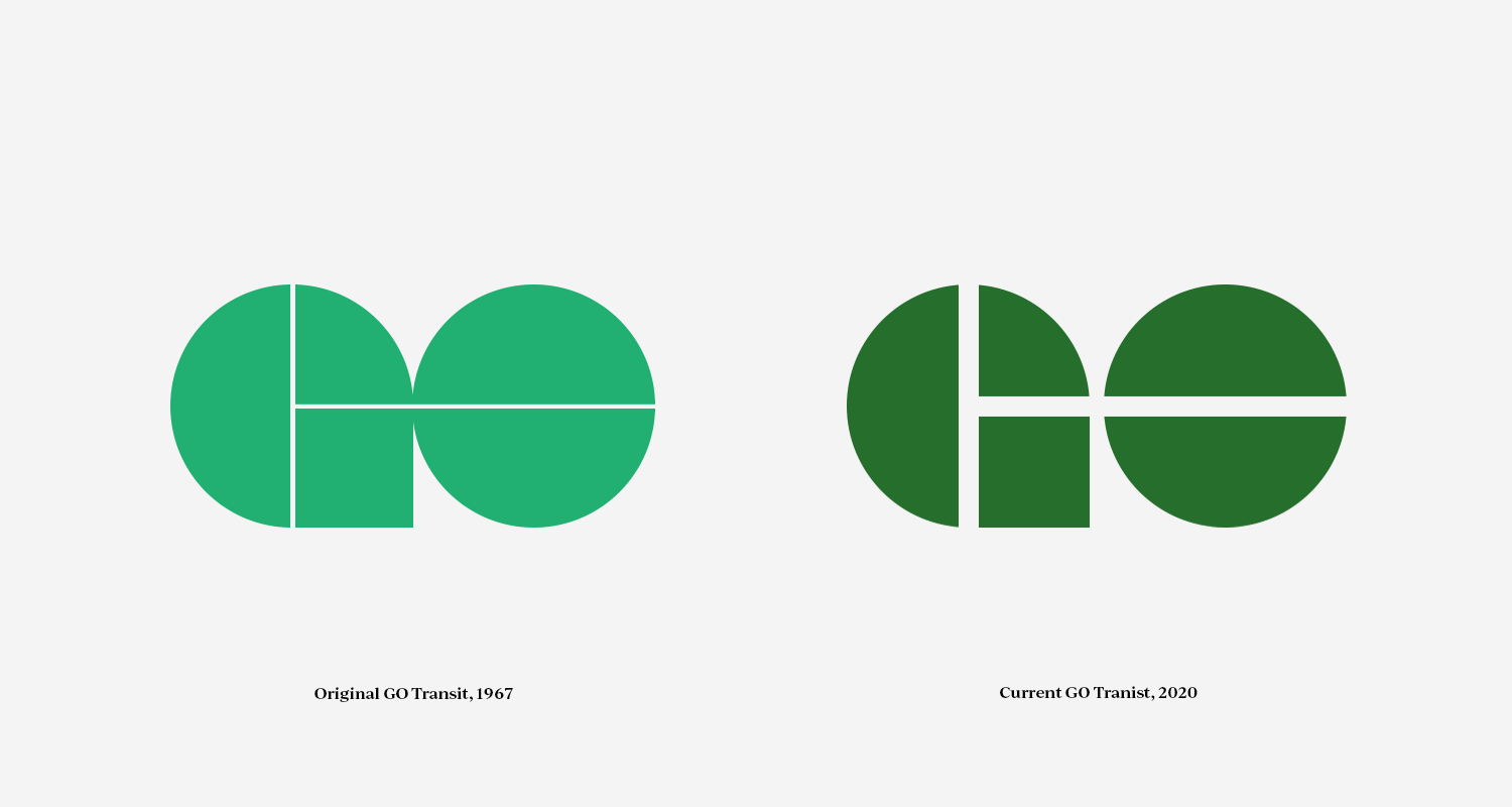
The GO Transit mark is memorable, simple and has some hidden visuals.
Mark Elements:
1. The letters 'G' and 'O' form a 'T’ lying on its side representing the first letters of GO Transit.
2. The letters 'G' and 'O' illustrate the undercarriage wheelset.
3. The letters 'G' and 'O' is an acronym for the Government of Ontario.
Notably, the GO Transit mark has been around for 53 years. The logo has changed slightly from 1960 to today. But has still maintained it original form and integrity. Typically thoughtful, well designed marks are enduring.
Photo Description & Credit:
1. GO Transit cab car #322 - Youngjin Ko
2. Original 1960 and current 2020 Go Transit logo
3. Commuters at Mount Pleasant GO Transit Station - Ontario Growth Secretariat, Ministry of Municipal Affairs
4. Find Your Go Time Illustration - MKN Design ©


