Article + Creative Musing
November 2020
__
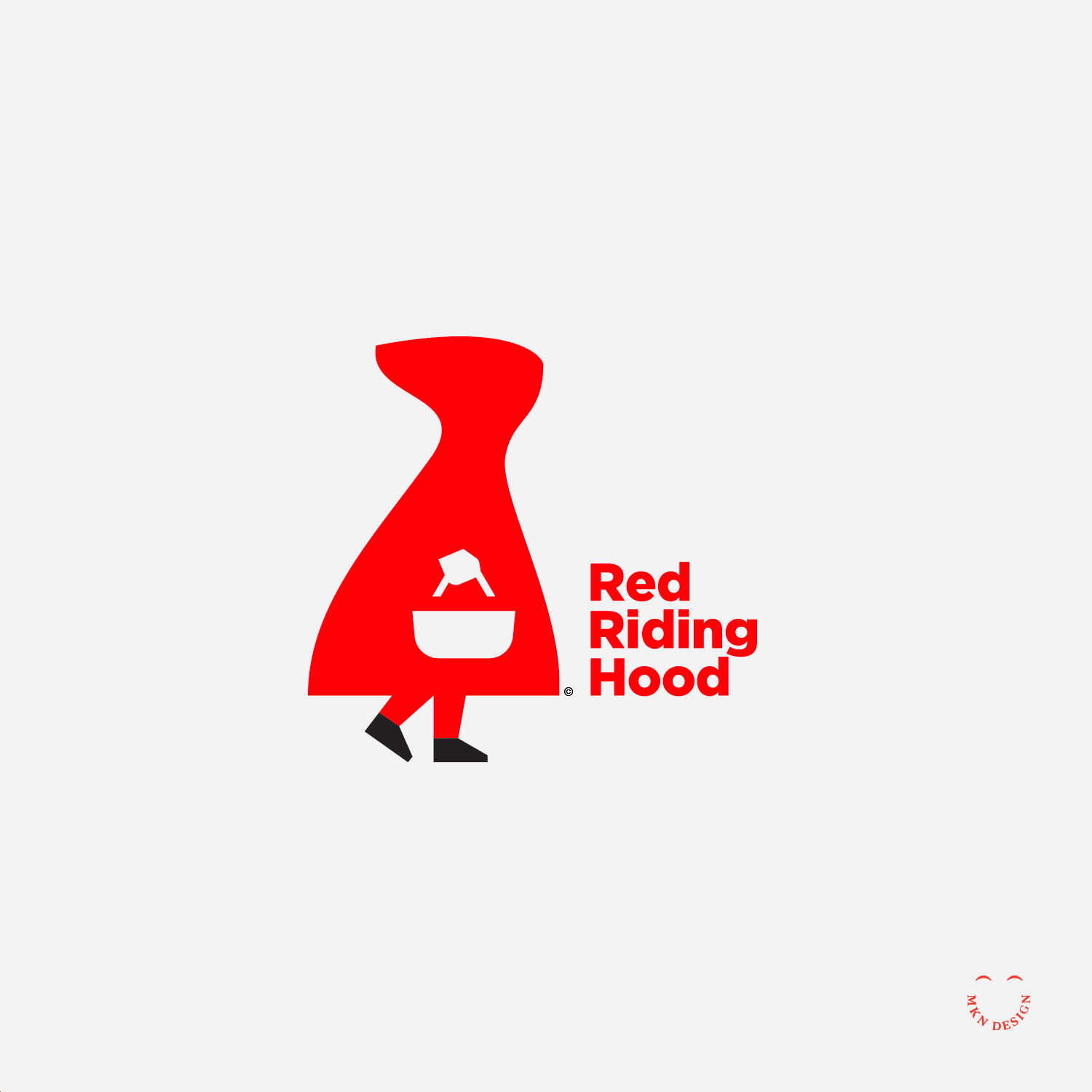
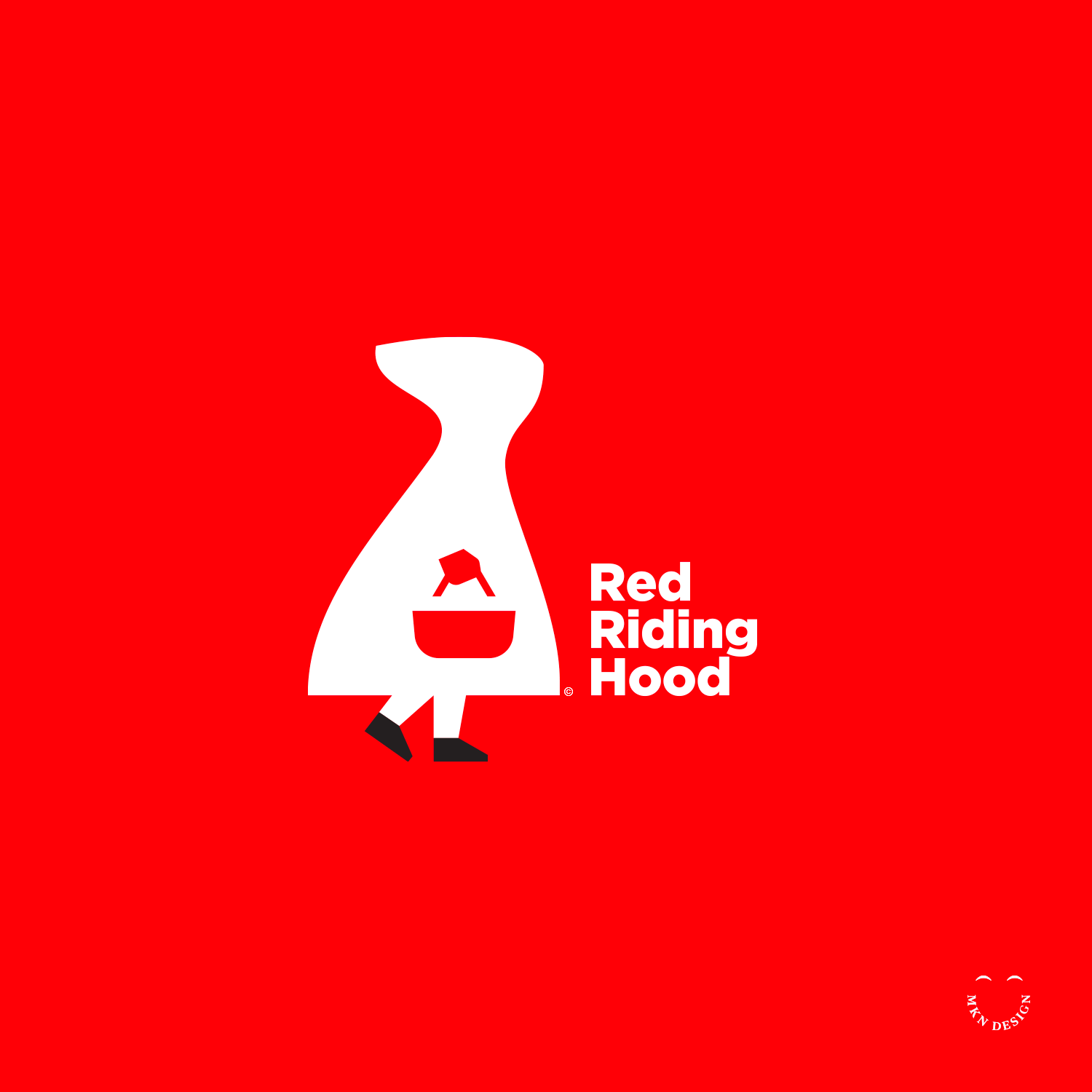
Red Riding Hood
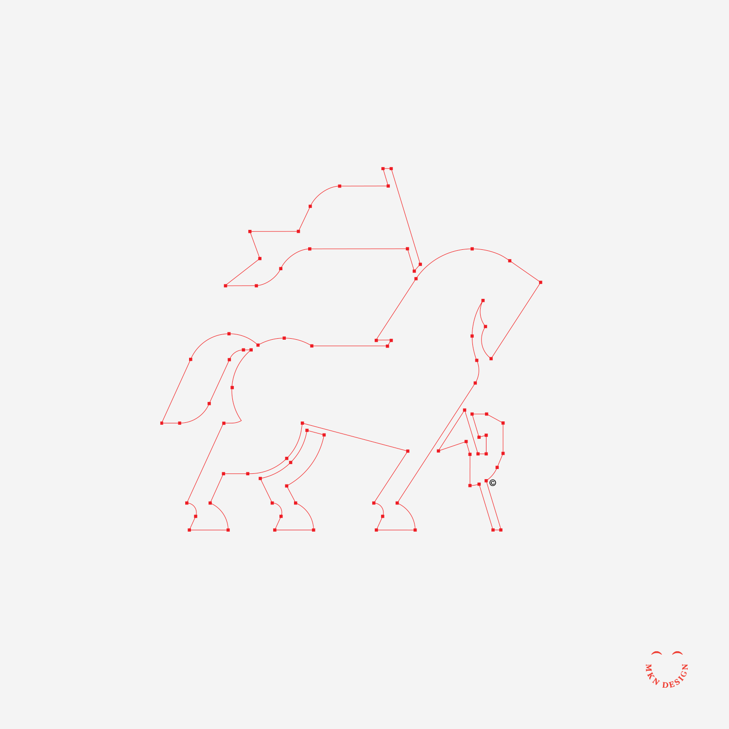
I have been asked many times about my illustrative logo/icon process, so I thought I would share. (it’s very similar to any design process). Though my illustrative style is simple, it does not mean that it's effortless. Process takes time and is a combination of thoughtfulness, collaboration, knowledge, and craft. In the initial phase, sketches and ideation are crafted based on comprehensive research, with only one or a few selected from a wide array of rough concept drawings. Moving into the second phase, the process progresses to defining sketches, utilizing basic shapes to enhance the conceptualization. Finally, in the third phase, numerous iterations, adjustments, and refinements are undertaken until both the client and/or I are satisfied with the result, leading to the culmination of the final execution. The typeface I used for the copy is Gotham design by Jonathan Hoefler and Tobias Frere-Jones at Hoefler&Co.
-
Green arrows signify progress in the illustration process, while red arrows indicate a pause or halt in the process.


