Client Project
February 2023
__
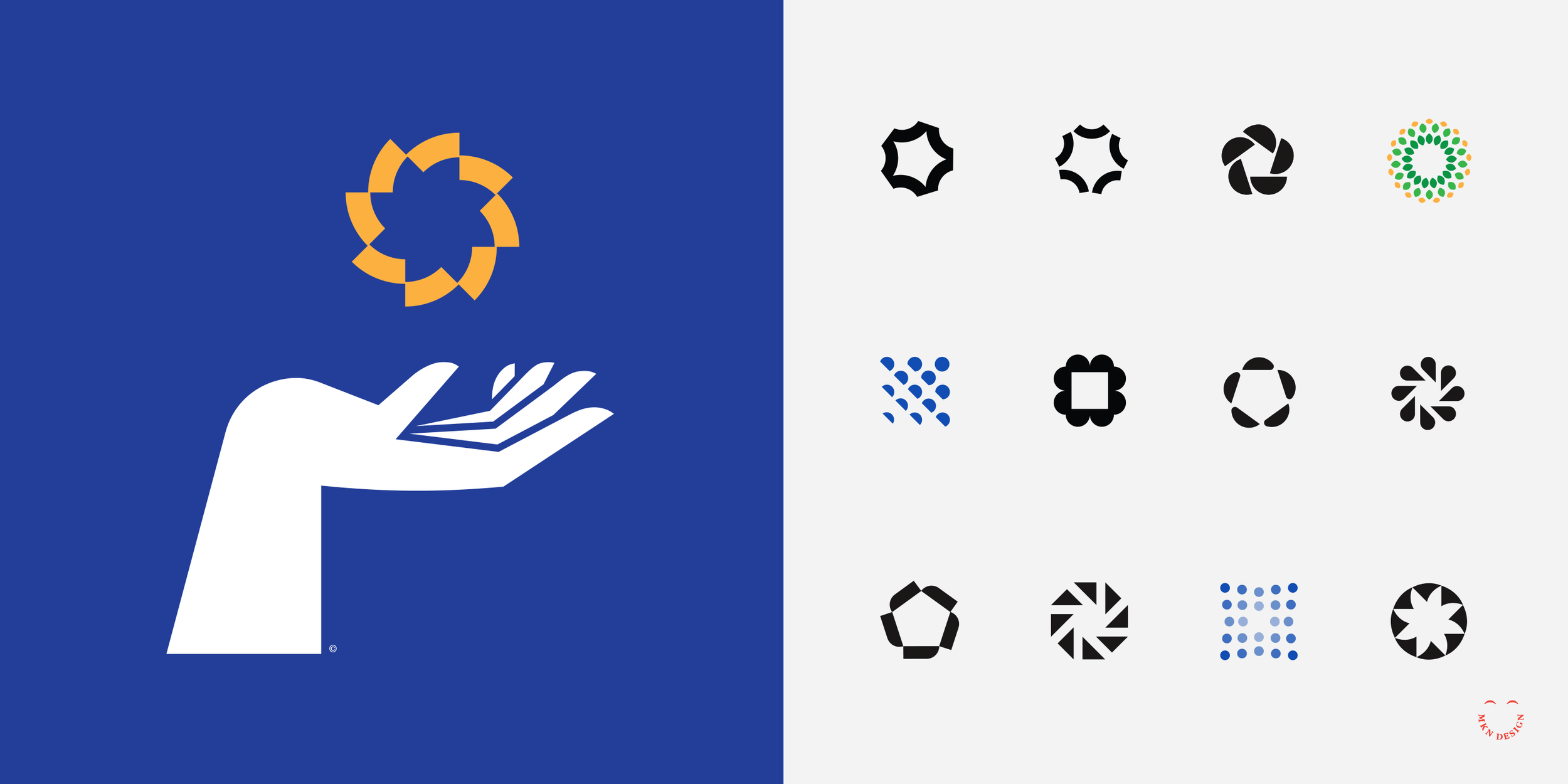
Carbon Cycle
Creating and illustrating a carbon cycle infographic for a major producer of sustainable lumber, pulp, and paper. Our task was to clearly communicate the client's approach to combating climate change while showcasing their strong commitment to environmental sustainability.
The goal was to streamline a complex sustainability concept, making it visually captivating and ensuring the audience was able to comprehend the initiative. The final infographic was simple and friendly, conveying the client’s message of responsible environmental stewardship and dedication to a greener, more sustainable future.
-
+ Infographic
-
+ Research
+ Concept Development
+ Sketching & Ideation
+ Illustration
+ Design & Layout -
This project was a collaborative effort, with Peopledesign providing Art Direction.