

Creative Musing
Creative Musing
Client Project + Product
Fultonwood Type Foundry
Independent Typography Studio
+ Graphic Design
+ Illustration
MKN Design Team:
+ Michael Nÿkamp, Design Director
Peopledesign Stakeholder:
+ Zac Freeland, Founder & Type Designer
This poster is available for purchase in my shop.


Client Project
Panda & Rainbows
Independent Creative Collaborative
+ Brand Advisor
+ Concept Development
+ Creative Assets
+ Design Direction
+ Qualitative Research
+ Visual Identity
The five members of this independent group where made up of designers, illustrators, web developers and game developers. The members of this independent group where:
+ Kurt Devlaeminck, Designer & Illustrator
+ Michael Nÿkamp, Designer & Illustrator
+ Celeste Pretzel Ritsema, Web Designer
+ Todd Ritsema, Creative Digital Experience Designer


Client Project
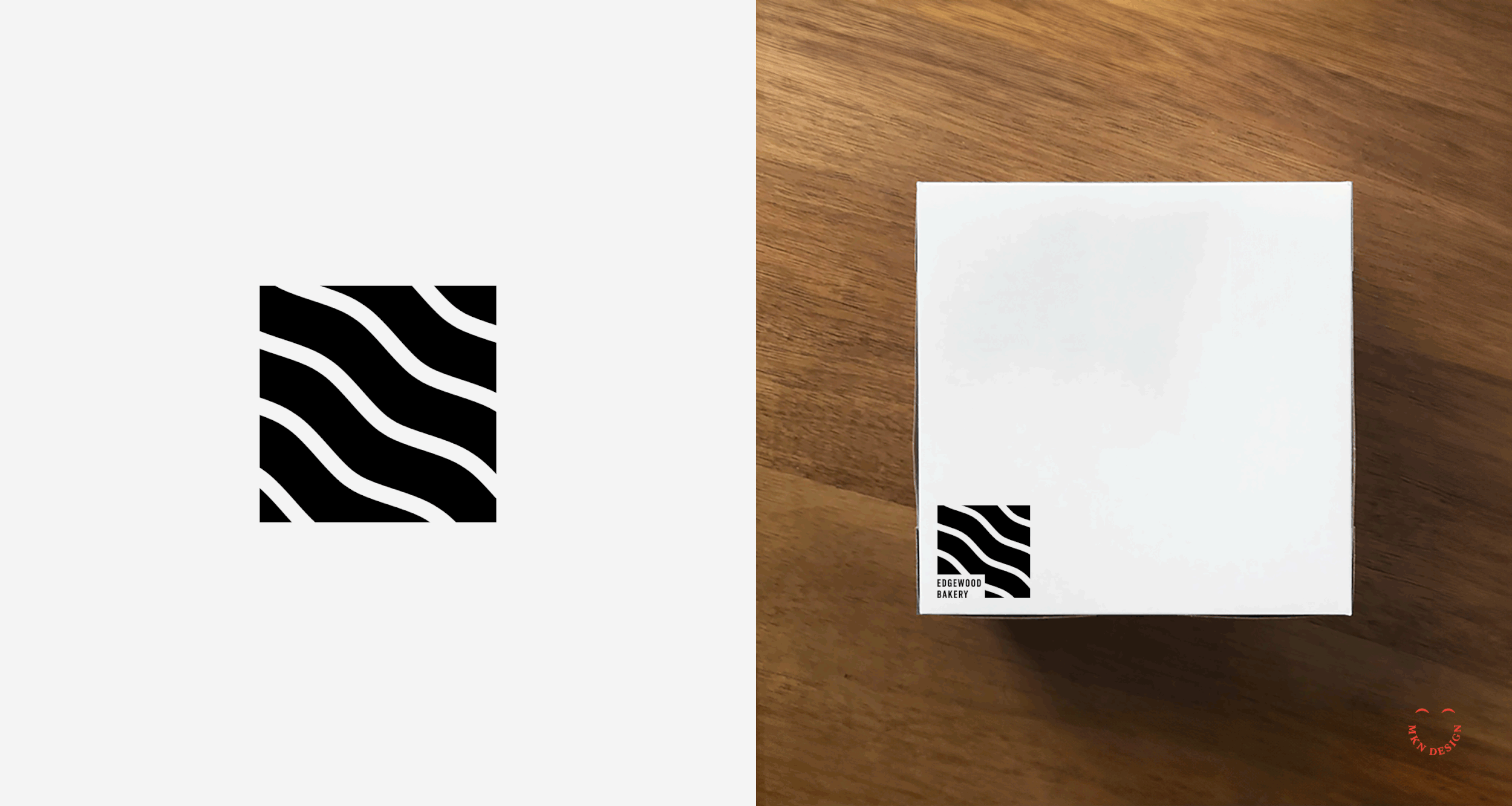
Edgewood Bakery
European Specialty Bakery
+ Brand Advisor
+ Concept Development
+ Creative Assets
+ Design Direction
+ Qualitative Research
+ Visual Identity
MKN Design Team:
+ Michael Nÿkamp, Design Director
+ Otto Selles, Photography
Edgewood Bakery Stakeholders:
+ Rita Selles, CEO & Baker


Creative Musing

Client Project
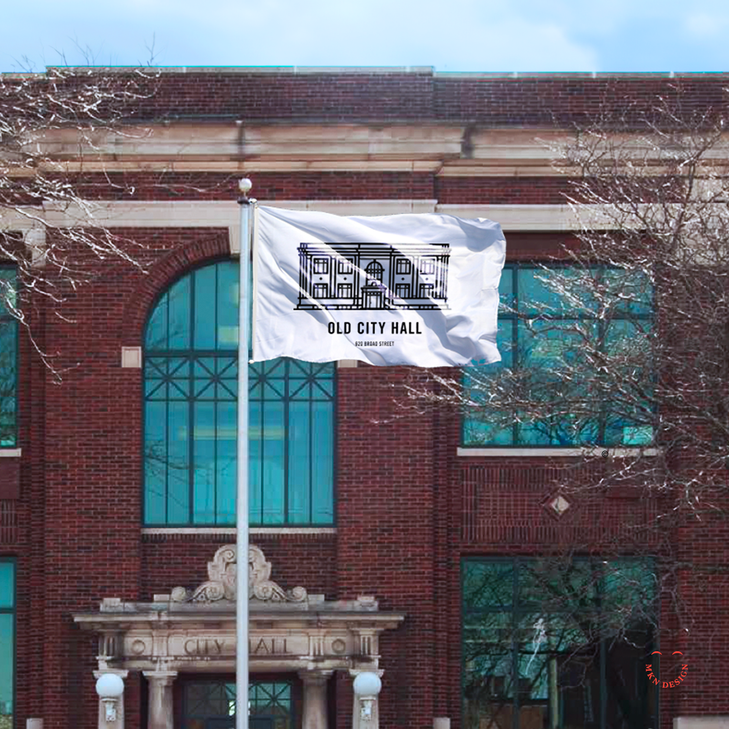
Old City Hall via Thesis
City of St. Joseph, Michigan
+ Illustration
+ Sketching & Ideation
MKN Design Team:
+ Michael Nÿkamp, Illustrator
Thesis Stakeholders:
+ Brian Edlefson, Founding Principal & Creative Director
+ Mark Cook, Founding Principal

Creative Musing

Article


Creative Musing

Article
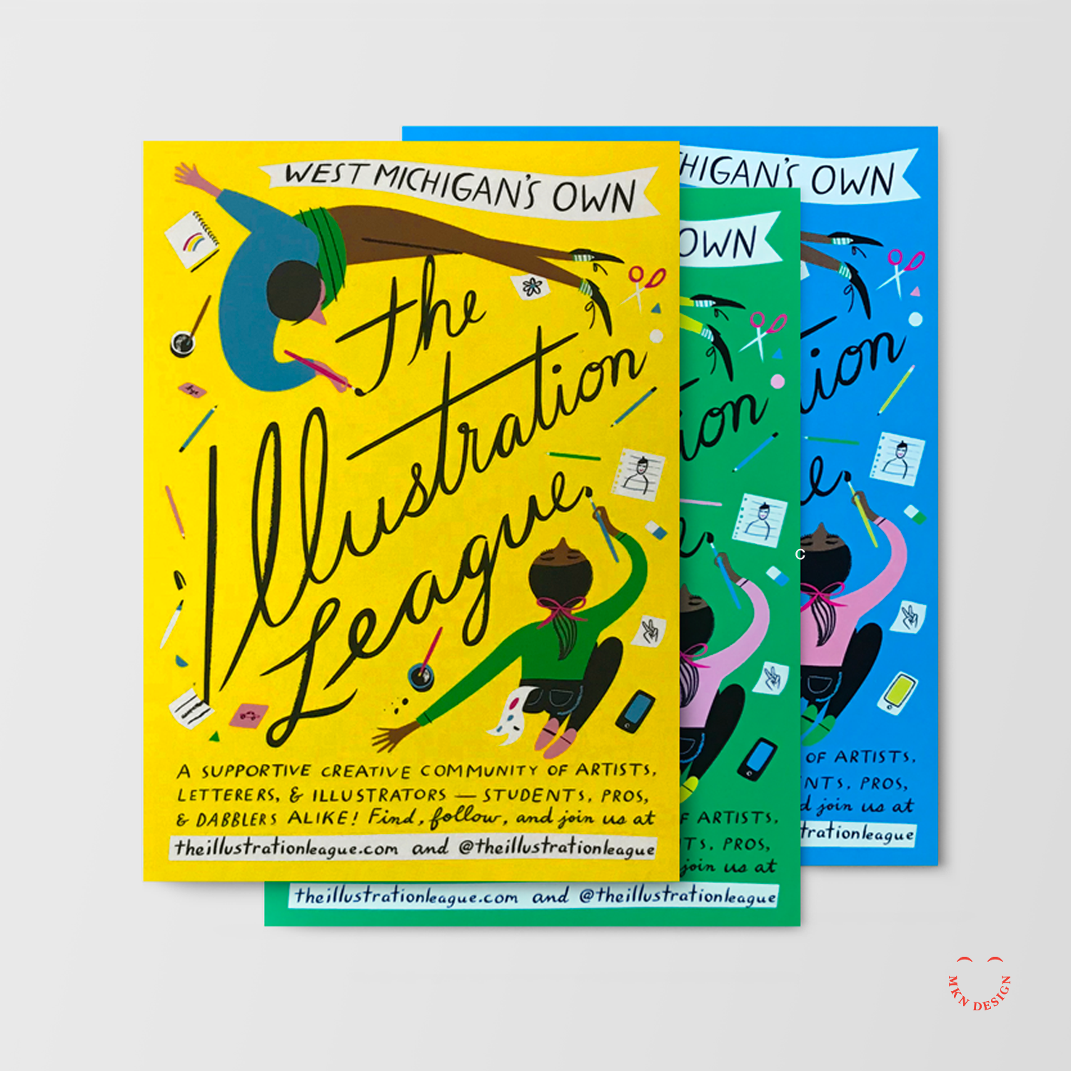
→ Building An Illustration Community – Rapid Growth Article
→ The Illustration League Identity
→ Woosah & The Illustration League Workshop

Creative Musing


Creative Musing
Creative Musing

Creative Musing
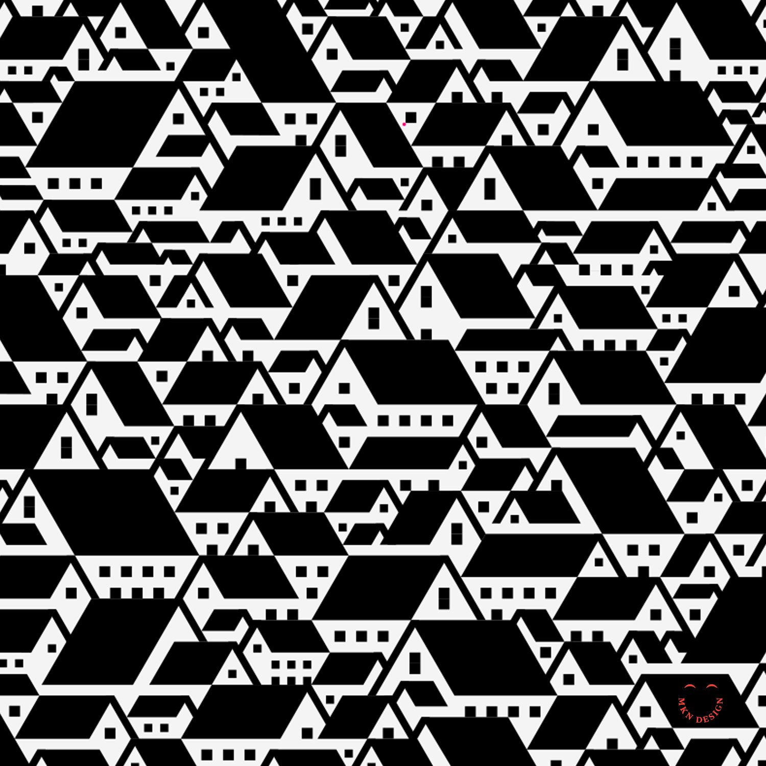
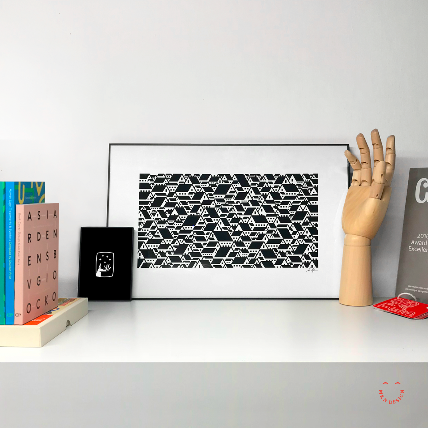
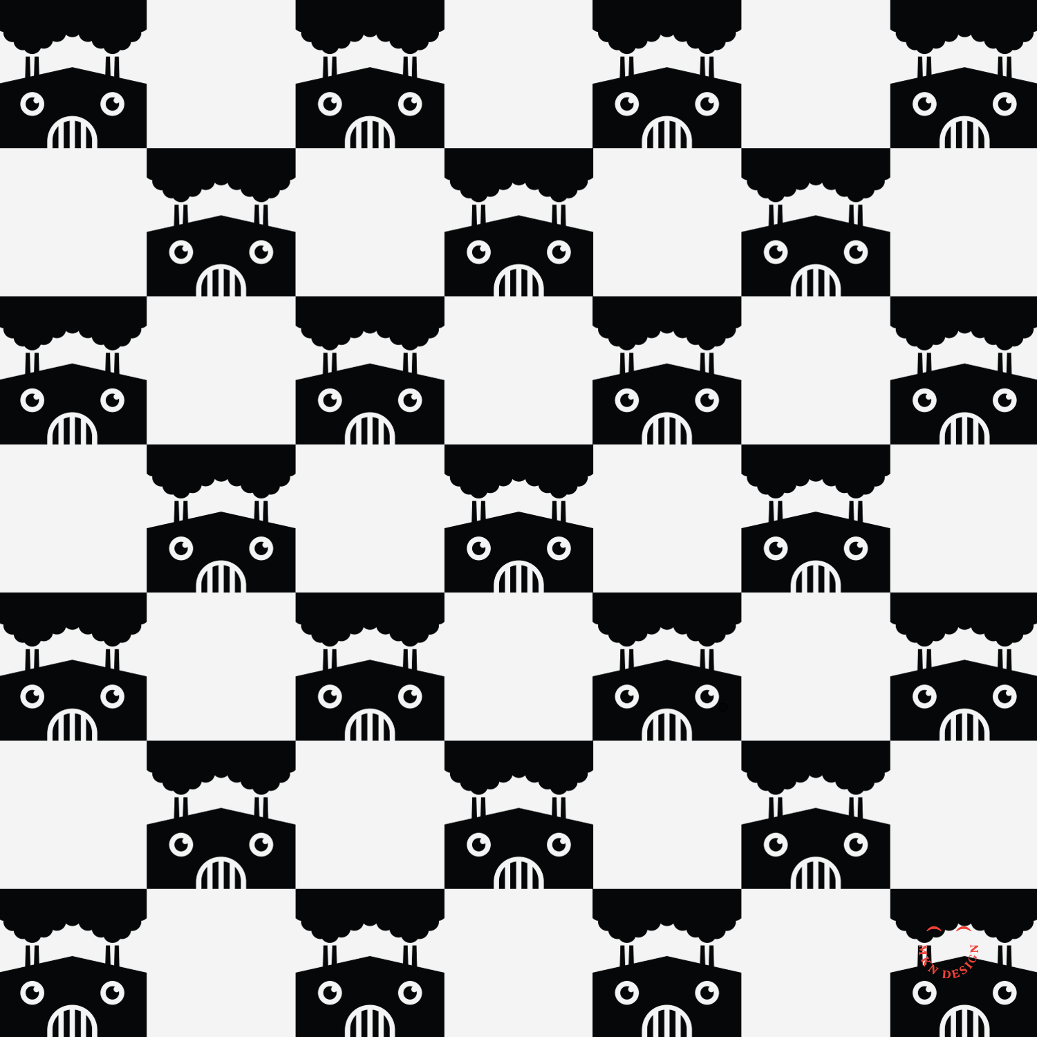
Product
Suburban Rooftops print is available for purchase in my shop.

Creative Musing

Creative Musing
Creative Musing


Creative Musing

Creative Musing
MKN Design, LLC
michael@mkn-design.com
1 616 915 1941
Good design is complexity presented simply
MKN Design LLC © 2025
Originally from Ontario, Canada, and currently based in West Michigan, Michael Nÿkamp is dedicated to helping businesses develop and refine creative strategies into clear, impactful solutions that captivate and engage.