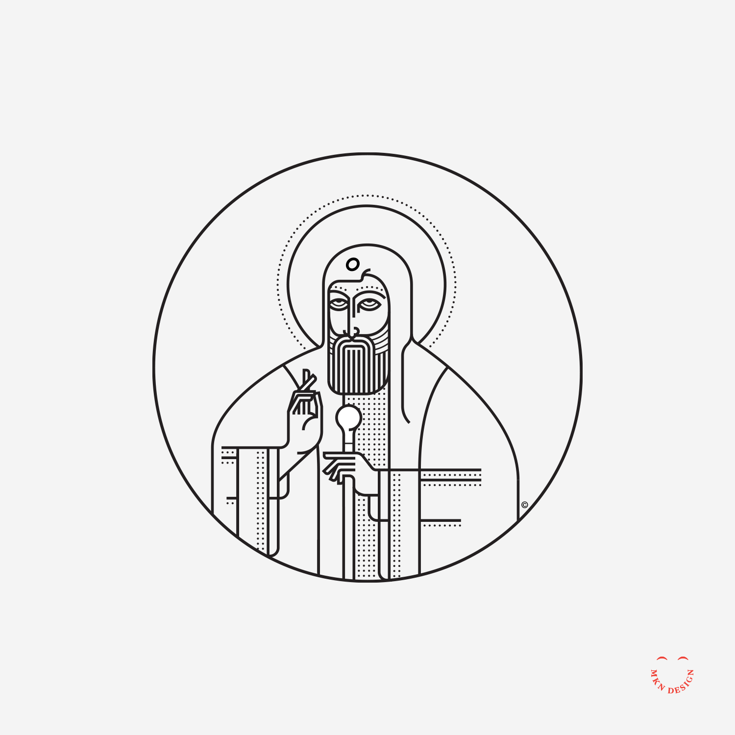
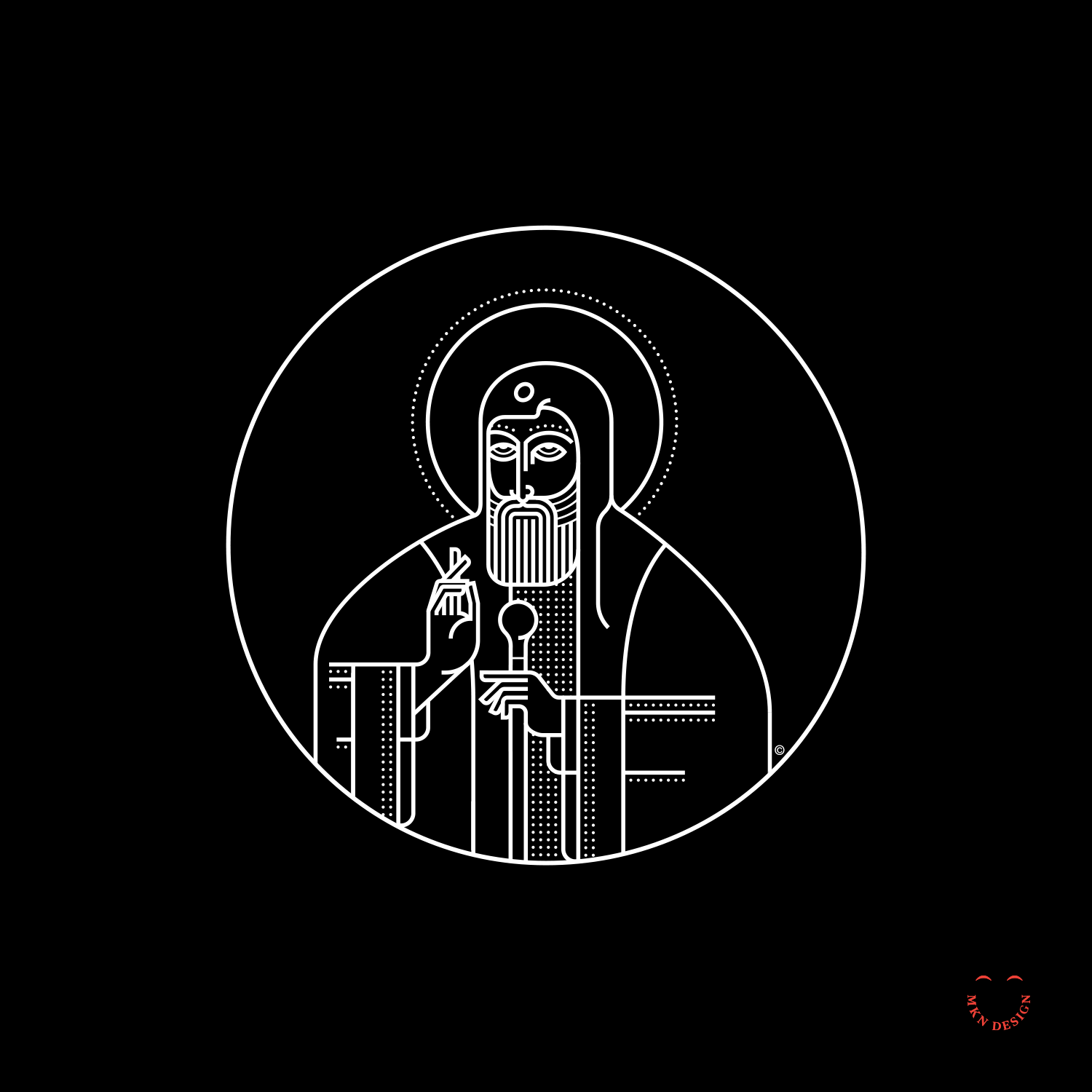
Creative Musing
March 2017
Creative Musing
March 2017
Article
February 2017
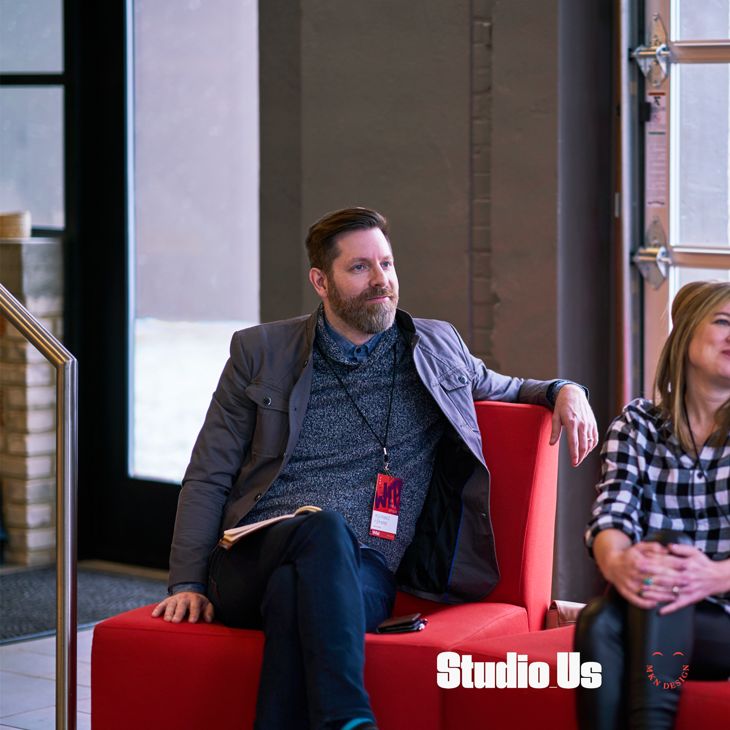
Program design and photography by two kind and talented humans, Bree and Ross Tanner from Studio_Us.
Creative Musing
February 2017

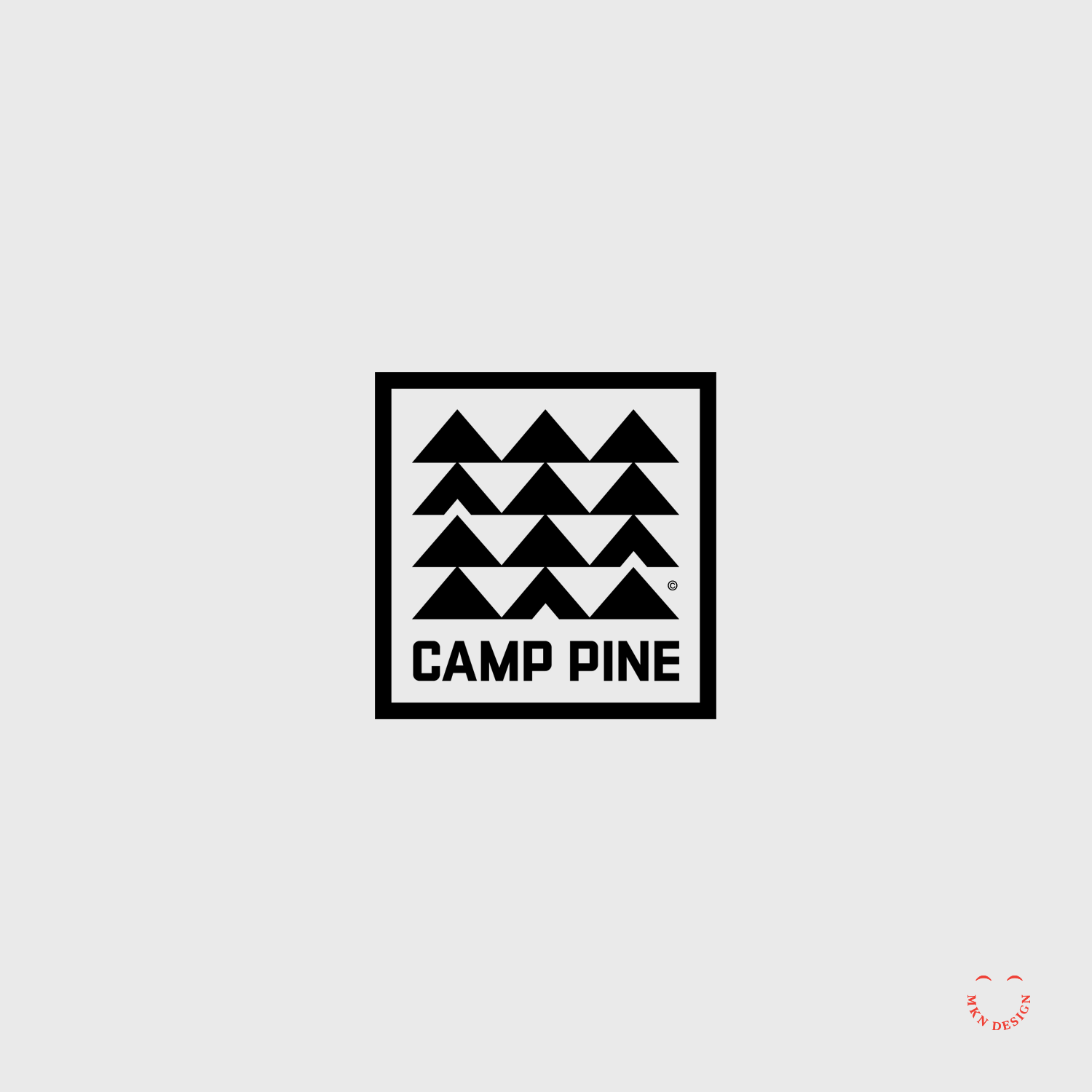
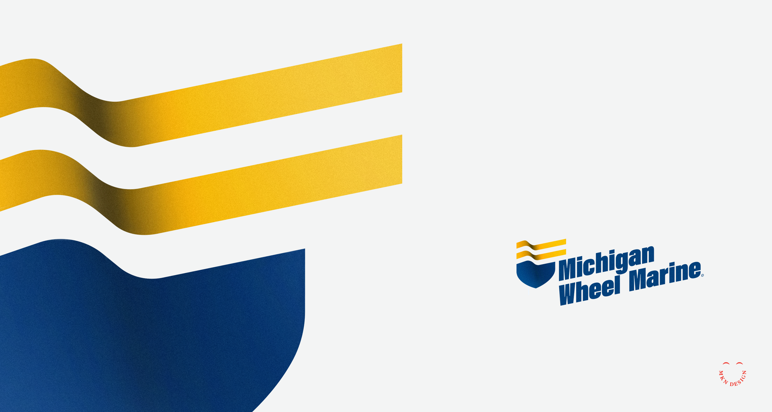
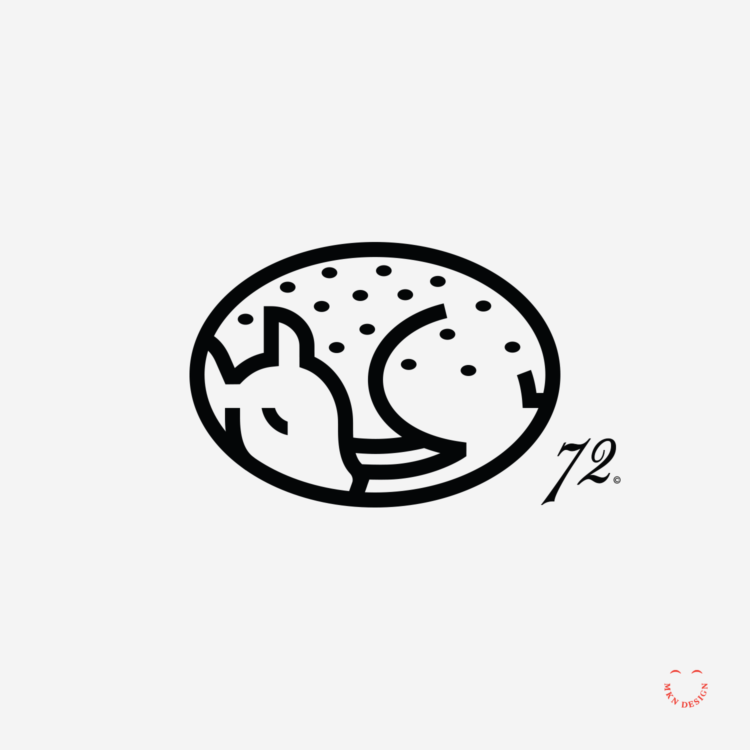
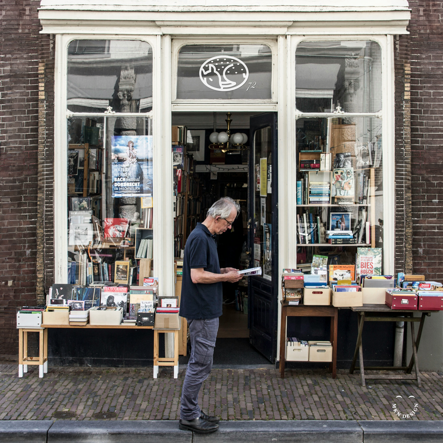
Client Project
February 2017
Brand Identity
+ Creative Direction
+ Qualitative Research
+ Concept Development
+ Sketching & Ideation
+ Illustration
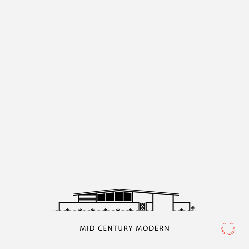
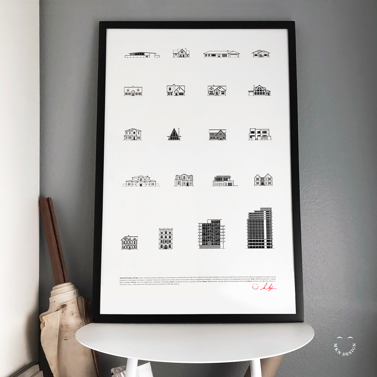
Client Project
January 2017
Employing my minimalist illustrative approach, I visually captured 20 distinct architectural styles. These illustrations were subsequently compiled into a poster, presenting a comprehensive showcase of the diverse spectrum of architectural designs found in Newport Beach, California.
Illustration & Graphic Design
+ Creative Direction
+ Research
+ Sketching & Ideation
+ Graphic Design
+ Iconography
This poster is available for purchase in my shop.


Article + Product
January 2017
Skate, Surf, & Art is available for purchase on Monsa Publications website.


Creative Musing
January 2017

Creative Musing
January 2017

Creative Musing + Article
December 2016

Creative Musing
December 2016

Article + Client Project
December 2016
+Brand Identity
+ Creative Direction
+ Project Management
+ Qualitative Research
+ Concept Development
+ Sketching & Ideation
+ Illustration
Client Project
December 2016
+ Brand Identity
+ Creative Direction
+ Project Management
+ Qualitative Research
+ Concept Development
+ Sketching & Ideation
+ Illustration

Client Project
November 2016
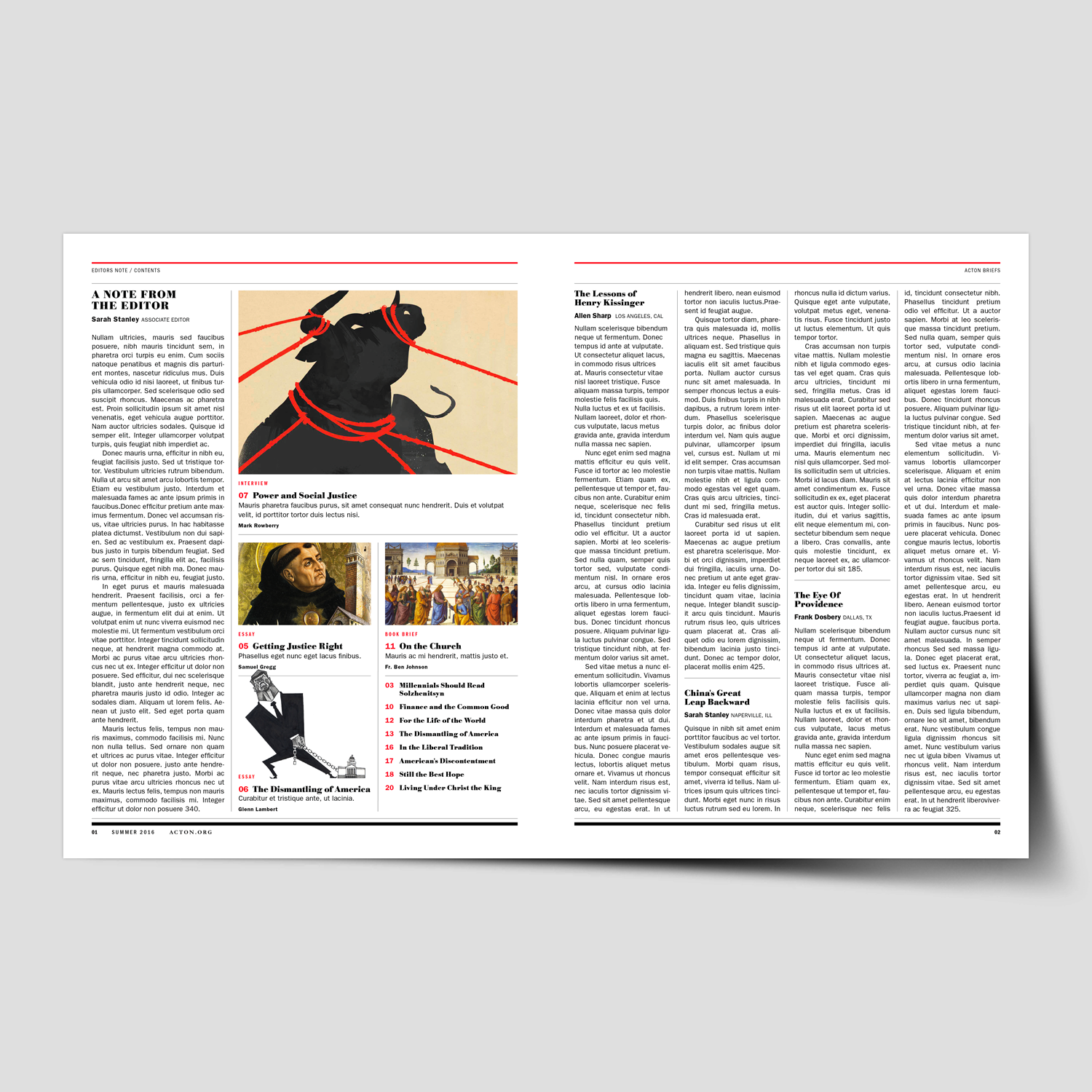
Brochure Design & Layout
+ Creative Direction
+ Project Management
+ Qualitative Research
+ Concept Development
+ Sketching & Ideation
+ Graphic Design & Layout
+ Photography Art Direction
+ Infographics
+ Illustration

Article + Product
December 2016
View my work on my Dwell profile page.

Client Project
November 2016
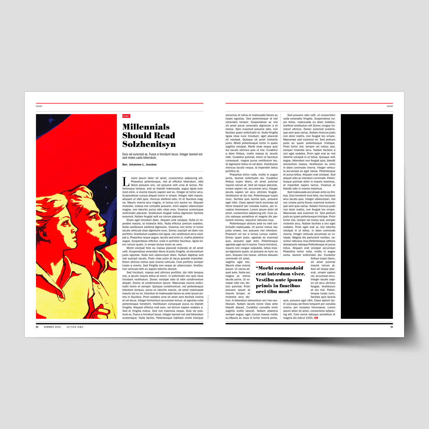
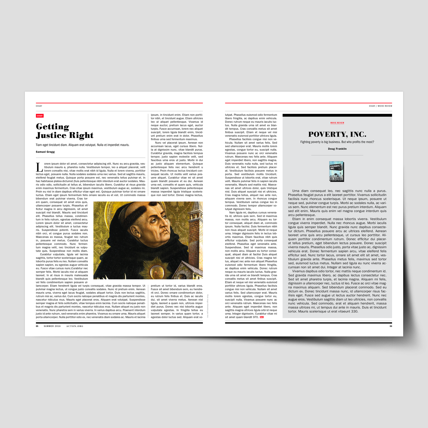
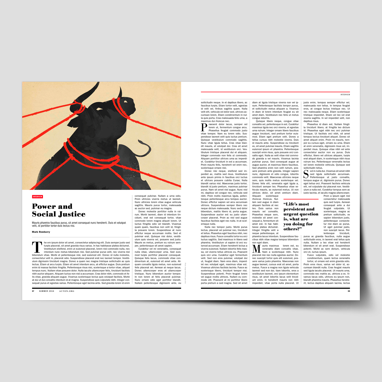
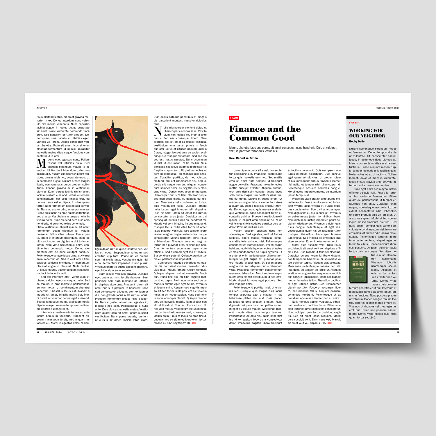
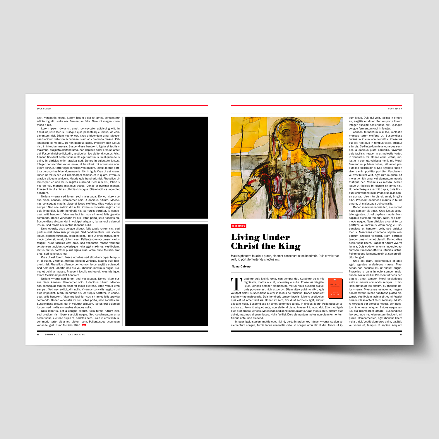
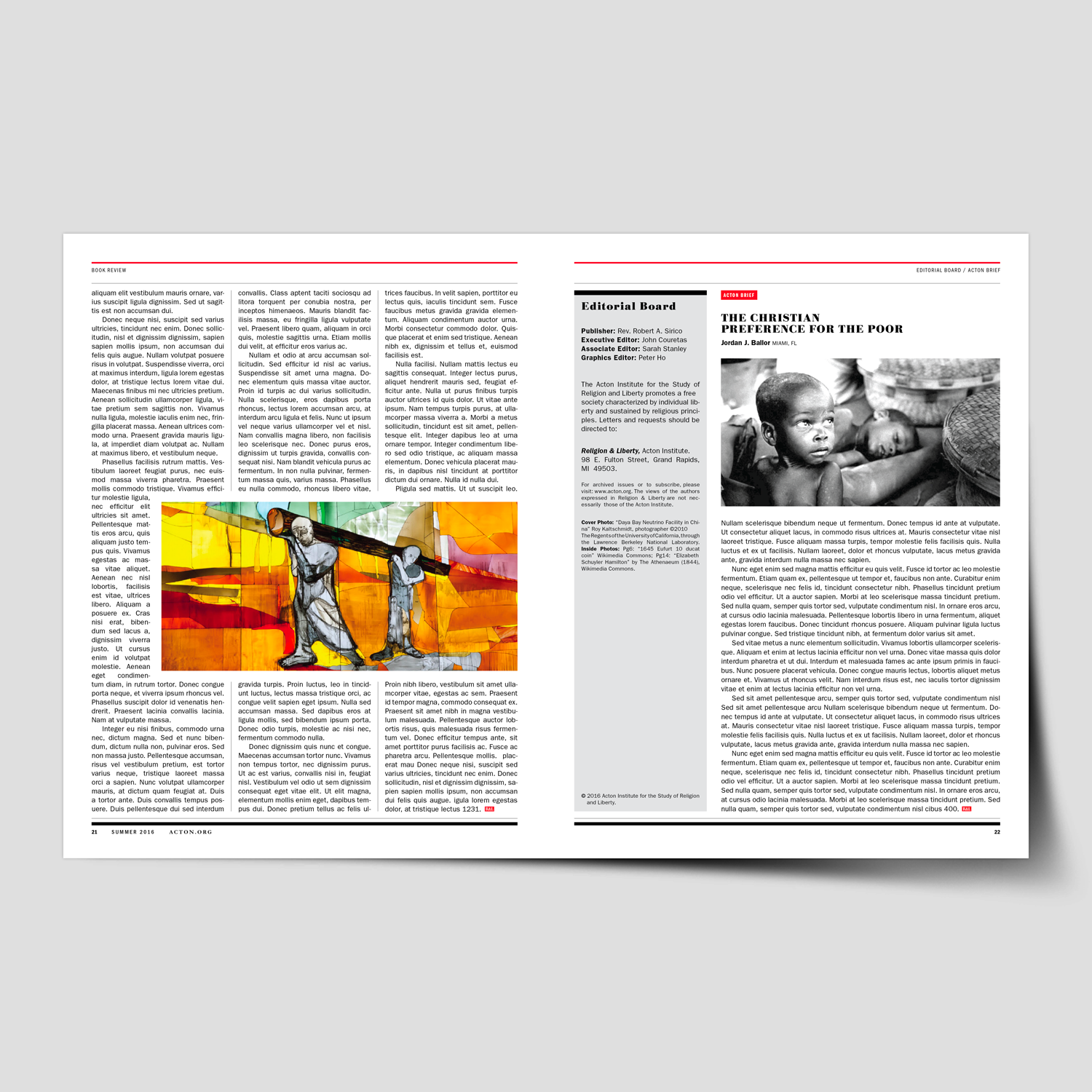
Branding, Magazine Design & Layout
+ Creative Direction
+ Project Management
+ Qualitative Research
+ Concept Development
+ Sketching & Ideation
+ Graphic Design & Layout
+ Photography Art Direction
+ Infographics
+ Illustration
View the design and layout toolkit. This was developed to simplify layout decisions and maintain a consistent and coherent visual narrative for all future publications.
Creative Musing
November 2016

Creative Musing
October 2016

Creative Musing
September 2016
Client Project
September 2016
+ Brand Identity
+ Creative Direction
+ Qualitative Research
+ Concept Development
+ Sketching & Ideation
+ Illustration

Creative Musing
September 2016
michael@mkn-design.com
1 616 915 1941
Good design is complexity presented simply
MKN Design LLC © 2024
Formerly from Ontario, Canada, now based in West Michigan, I help organizations form and shape creative strategies into simple, impactful creative solutions that delight and engage audiences.