Creative Musing
December 2024
Googly Eyed Philosophers
Creative Musing + Product
December 2024
__
Googly Eyed Philosophers
Some design fun with old lithographs, goggly eyes, and 3 philosophers.
Quotes from Aristotle, Plato, and Socrates.
“Educating the mind without educating the heart is no education at all.” – Aristotle
“When men speak ill of thee, live so as nobody may believe them.” – Plato
“All I Know Is That I Know Nothing.” – Socrates
-
Aristotle, Plato, and Socrates graphic tees are available for purchase on Cotton Bureau. Check out more graphic tees on my Cotton Bureau profile page.
__
Note: All Cotton Bureau apparel comes in a variety of clothing types, styles, fits, sizes, materials, and colors.
Holmes Sardines
Creative Musing
November 2024
__
Holmes Sardines
This internal project reflects my appreciation for vintage packaging and its rich history. I’m inspired by the hand craftsmanship of early packaging design, which beautifully captures the essence of its era. Through recreation, my aim is to preserve and honor its historical significance.
Sardine fisheries and their canning factories were prominent along the U.S. East and West Coasts from the 1870s until their decline in the mid-20th century, serving as vital industries for coastal communities. These operations not only supported local economies but also played a significant role in shaping the cultural and industrial landscape of the time. The Stinson Sardine Cannery in Prospect Harbor, Maine, was the last operating sardine cannery in the United States, closing its doors in April 2010, marking the end of an era for a once-thriving industry.
-
+ Historical Photo: Holmes Sardine Factories, 1885
+ Lithography: Holmes Sardine Tin Packaging, 1912
+ Historical Photo: Sealing Sardine Cans, 1930
+ Historical Artifact: Artifact of the week, 2024
KitchenAid Branded Environment
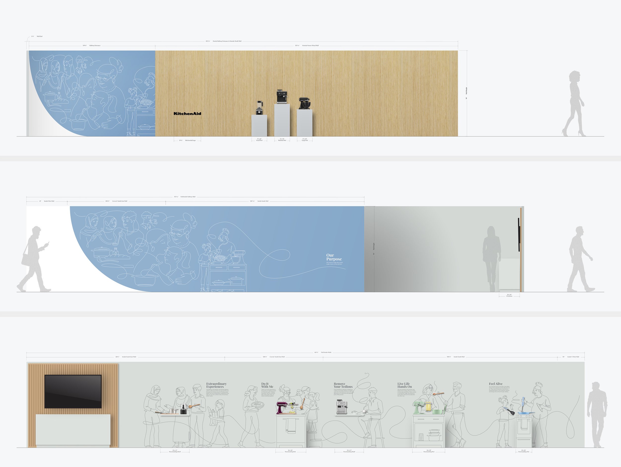
▲ Branded environment concept based on KitchenAid’s updated brand.
▼ Final design integrated into branded environment
Client Project
October 2024
__
KitchenAid Branded Environment
For the second consecutive year, I partnered with Whirlpool Corporation to assist in the development of their annual Board of Directors meeting showcasing their latest and most innovative products to investors. The 2023 event spotlighted KitchenAid, and I was tasked with translating their updated brand into environmental graphics that conveyed this new direction. The visualization were carefully crafted to reflect the brand's new direction, integrating the essence of family and innovation into every element of the showroom experience.
In close collaboration with KitchenAid’s product and CMF team, I developed five distinct narratives to bring the “Do It With Me” ethos to life. Each story focused on households preparing meals in their kitchens, showcasing KitchenAid countertop appliances, cookware, and utensils in action. These individual stories were then seamlessly integrated into a larger, cohesive narrative, illustrating how KitchenAid plays a central role in bringing people together in the kitchen, helping families prepare food and create meaningful experiences.
The final installation was a seamless blend of clean, minimalist line illustrations paired with physical KitchenAid products, effectively demonstrating how the brand serves as an ‘aid’ in everyday cooking routines. The result was a *visually captivating* environment that embodied KitchenAid’s brand principles and brought their message to life.
-
+ Branded Environment Design
-
+ Creative Direction
+ Research
+ Concept Development
+ Narrative Storytelling
+ Sketching and Ideation
+ Graphic Design
+ Illustration
+ Print Management -
This project was a collaborative effort, with the KitchenAid product and CMF teams.
Concept illustrations provided by Jody Williams.
Tulip Festival
Creative Musing
October 2024
__
Tulip Festival
I submitted these minimalist tulip illustrations to the Tulip Time poster competition, but they didn’t place. So, I repurposed them into mockups for the Tulip Festival at Keukenhof Gardens in Lisse, Netherlands.
Artwork Statement: Inspired by the tulip’s form, this series of minimalistic illustrations captures its beauty through three life stages: Emerge, Unveil, and Reveal. Each phase captures the tulip’s transformation using the simplicity of negative space to frame its contours. The reduction of detail allows the viewer to focus on the essence of the tulip’s appearance, revealing how it unfolds over time. Through this work, I seek to emphasize the tulip’s beauty and timeless form. The three posters can be evaluated as a series or individually considered.
City Pours
Client Project
April 2024
__
City Pours
City Pours is a local bartending service that provides professional dry bartending services that offer a range of beverage solutions. Their business specializes in providing a convenient, all-in-one bar service solution for events, ensuring a seamless and exceptional experience. Their professionally trained staff, paired with exceptional bar options and packages, guarantees a top-notch experience for any celebration.
-
+ Brand Identity
-
+ Creative Direction
+ Concept Development
+ Sketching & Ideation
+ Illustration
+ Graphic Design
Navigator
Client Project
January 2023
__
Navigator Driving Academy
After 23 years of growth, Navigator's brand no longer aligned with its current focus on training young teenagers and adults in smart or autonomous vehicles, nor did it represent the direction Navigator aimed to pursue. Therefore, a new brand was imperative to reflect its evolution accurately.
Navigator had a few distinctive design challenges that required resolution:
Develop a logo that intuitively feels like a driving academy without feeling or stating it's a driving academy.
Logo to be perceived as trustworthy, safe, and exceptional to parents (core audience), but also conveys a cool factor for teen student drivers (secondary audience).
By law, driving academy vehicles are legally required to have ‘student driver’ signage on their vehicles. This is typically resolved with magnetic ‘student driver’ signs prone to slipping or peeling. A solution was needed to seamlessly integrate Navigator's logo with the required signage—ensuring a purposeful design rather than an afterthought, enhancing both safety and branding.
The final combined logo for Navigator successfully tackled every design challenge with a bold, attention-grabbing appearance. It seamlessly integrated the student driver sign by utilizing a vehicle wrap, ensuring a cohesive and visually striking solution.
-
+ Brand Identity
-
+ Creative Direction
+ Project Management
+ Qualitative Research
+ Concept Development
+ Sketching & Ideation
+ Design & Layout
+ Brand Mockups
+ Vehicle Wrap
AIGA Detroit Member Spotlight
Article
August 2017
__
AIGA Detroit, Member Spotlight
Big thank you to AIGA Detroit for featuring me and my work on their website and future e-newsletter. I hope to make it down soon.
Michigan Wheel Marine
Article + Client Project
December 2016
__
Michigan Wheel Marine
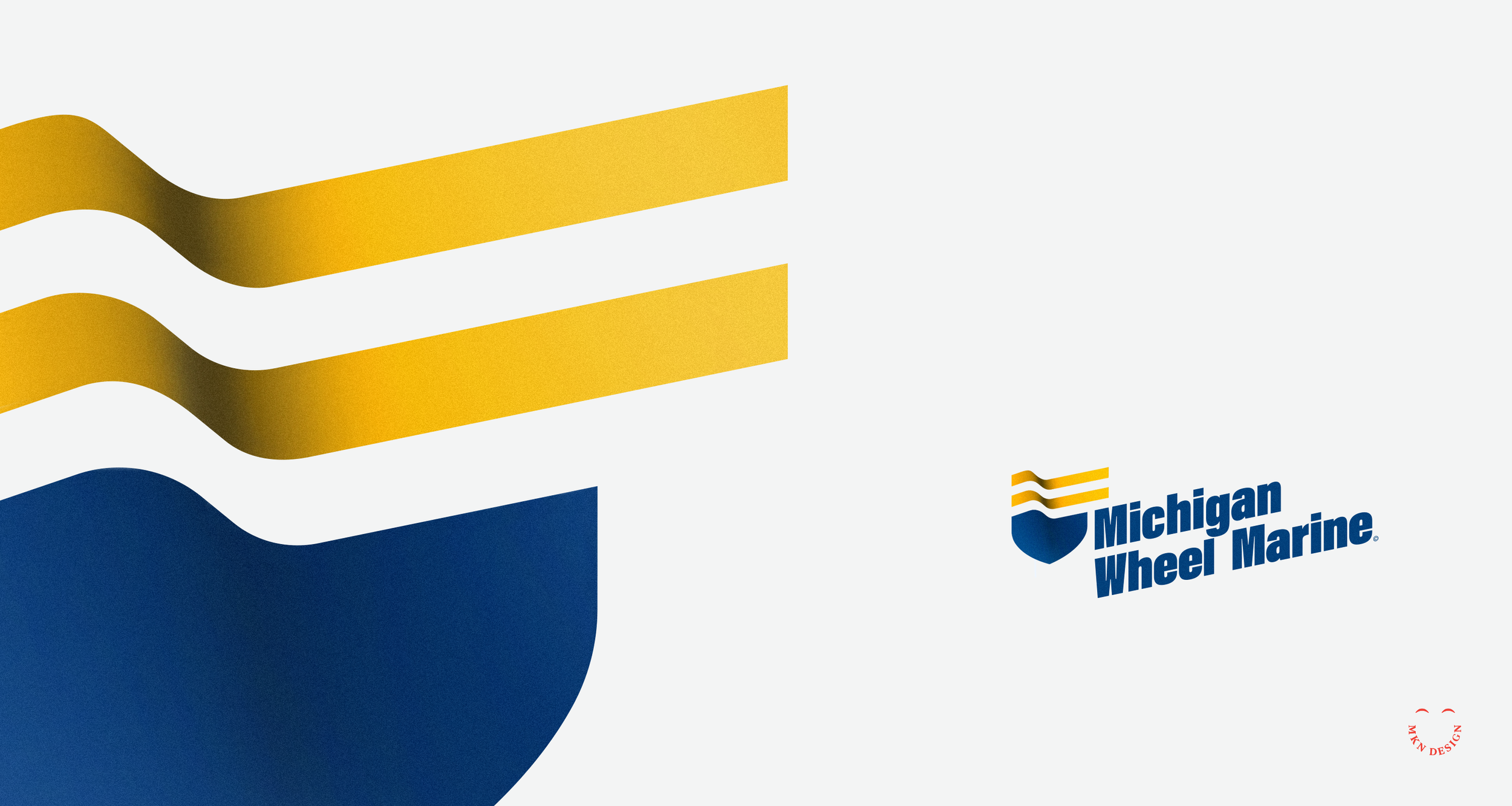
Navigating client relationships can be complex, much like an experience I had with Michigan Wheel Marine (now named Michigan Wheel), a former client based in Grand Rapids, Michigan. Established in 1906, they have a rich history and maintain a strong reputation for handcrafting propellers celebrated for their unparalleled performance.
Project Background:
When Michigan Wheel Marine sought my services to develop a new brand identity for their company, I was initially unaware of the internal conflict and power dynamics at play within the organization. So like any beginning of a project, I dove in and began to work closely with the internal team and their global partners. It soon became evident that there was internal and partner conflict regarding how they defined their brand and how customers perceived them. Unfortunately, their ongoing disagreements only complicated my efforts to provide them with sound advice and develop a meaningful brand identity.
Instead of wanting to gain an understanding of their market and customers, they created internal alignments that swayed what they felt was their brand. Never considering my advice for thoughtful research and interviewing to understand their business, market, and customer perceptions.
Reflecting back on this situation, I wish I had been more direct with them, though I'm uncertain if that would have helped. It's unfortunate that they relied on internal alignments to assert what they believed was right, overlooking the importance of thorough qualitative and quantitative research. Missing this important step, they overlooked valuable insights that would have helped me shape their brand more effectively. Research should always play a crucial role in uncovering customer needs, preferences, and perceptions, ultimately guiding an effective brand strategy.
The result of neglecting this essential step, Michigan Wheel Marine missed out on opportunities to differentiate themselves and resonate with their target markets and consumers. Unfortunately, this led to the termination of our working relationship, as they sought a design studio that would simply comply with their instructions without prioritizing strategic research and insights.
Logo Direction:
The logo direction was shaped by restricted research, as the client was unwilling to invest in what they perceived as unnecessary expenses. I hate to say, “I told you so.” Some companies do not like spending money on important research. Since this was the reality of this project, I spent time on preparing a basic questionnaire to understand the company, its market segments and competitor analysis. This limited research revealed a desire to differentiate from competitors and avoid the common propeller motif. I felt my approach was unique, drawing from their company's rich history, engineering expertise, and providing precision handcrafted propellors.
During my exploration phase, I focused on incorporating marine motifs. I used a boat bow with the addition of two flowing lines (acting as a flag), these two combined elements created a badge. I chose a bold typeface, Acumin Variable designed by Robert Slimbach from Adobe Originals to commitment the logomark. With the additional of color, reflecting a nautical theme I added depth to the mark to give it presence. Also, by angling the logo I created a sense of movement, making it feel more modern and energetic. The final execution integrates the logomark (badge) and logotype (company name) to reflect the company's experience, excellence and superior products.
Even though the stakeholders didn't see this as the right direction, it was just one of my approaches that I believed aligned with their needs based on the research conducted.
-
+Brand Identity
-
+ Creative Direction
+ Project Management
+ Qualitative Research
+ Concept Development
+ Sketching & Ideation
+ Illustration
Truman Cage
Client Project
August 2016
__
Truman Cage
John Swihart is a versatile artist known for his roles as a musician, composer for film and television, and electronic EDM producer, under the alias Truman Cage. His notable contributions include crafting the score for the iconic movie Napoleon Dynamite which won Golden Satellite Award for best Original Score. He also produced the music for How I Met Your Mother, alongside various other impressive works.
It was on a sunny afternoon that I received a call from John. He mentioned that he loved my branding and illustration work and he trusted I would come up with a unique logo for his electronic persona that he’d love. His only requirements where incorporating the letters "T" and "C" while being encased within a box. The logo persona he chose is displayed at the top, while the other various concepts below he loved but did not make the cut.
-
+ Brand Identity
-
+ Creative Direction
+ Qualitative Research
+ Project Management
+ Concept Development
+ Sketching & Ideation
+ Illustration -
My client for this project was John Swihart, an American composer renowned for his work in film and television music. He best known for his score to Napoleon Dynamite and his music for the TV shows How I Met Your Mother.
Rethinking Math Workbooks
Article + Creative Musing
January 2016
__
Rethinking Math Workbooks
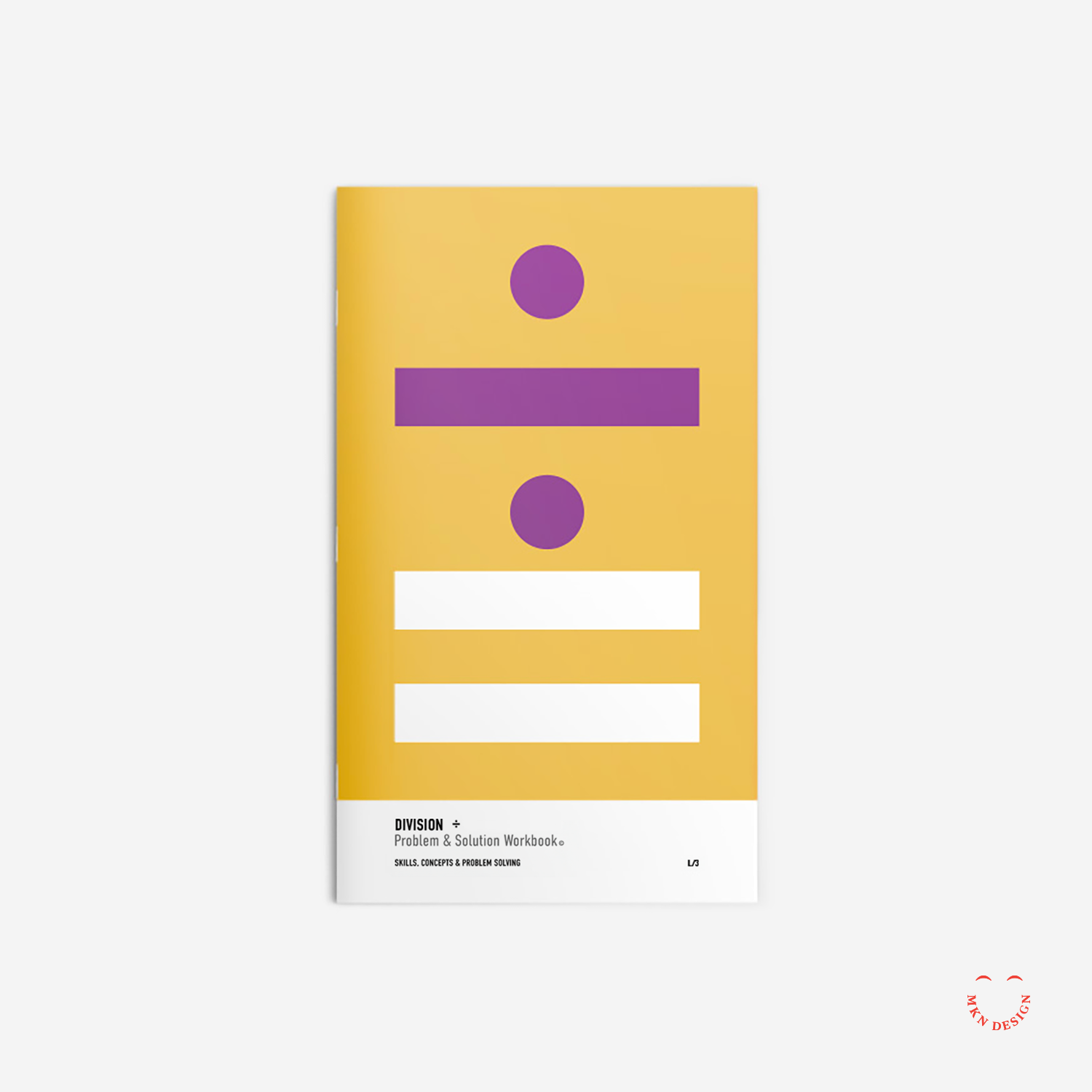
During my childhood, I despised math and often wondered if it was due to how it was taught and presented. Perhaps it was, perhaps not. Even now, I feel my kids math workbooks are unapproachable. So, I thought create a cover series for simple math workbooks – taking my youngest sons math workbook, I stripped it down to its bare essentials, and gave it a complete rebranding. The typeface I used for this design is DIN Condensed Variable, designed by Isabella Chaeva and Tagir Safayev from Paratype.
Midwest UX Conference Design
Client Project
October 2013
__
Midwest UX Conference Design
Managed a team to orchestrate the planning, development, and design of the Midwest UX Conference. This three-day event took place in Grand Rapids and drew more than 500 participants who engaged in workshops, talks, and keynotes. The overarching theme of “Place” served as the foundation for the event’s visual identity.
We meticulously crafted and refined key visuals, which were then translated into a range of assets, including badges, wayfinding elements, videos, websites, t-shirts, service design, social media content, and posters. The resulting assets harmoniously conveyed a unified design language, enriching the experience for both attendees and participants of the conference.
-
+ Branded Conference Environment Design
-
+ Creative Direction
+ Research
+ Creative Strategy
+ Concept Development
+ Design Ideation
+ Environmental Graphic Design
+ Project Management
Herman Miller Planning Guides
▲ Isometric Illustrations
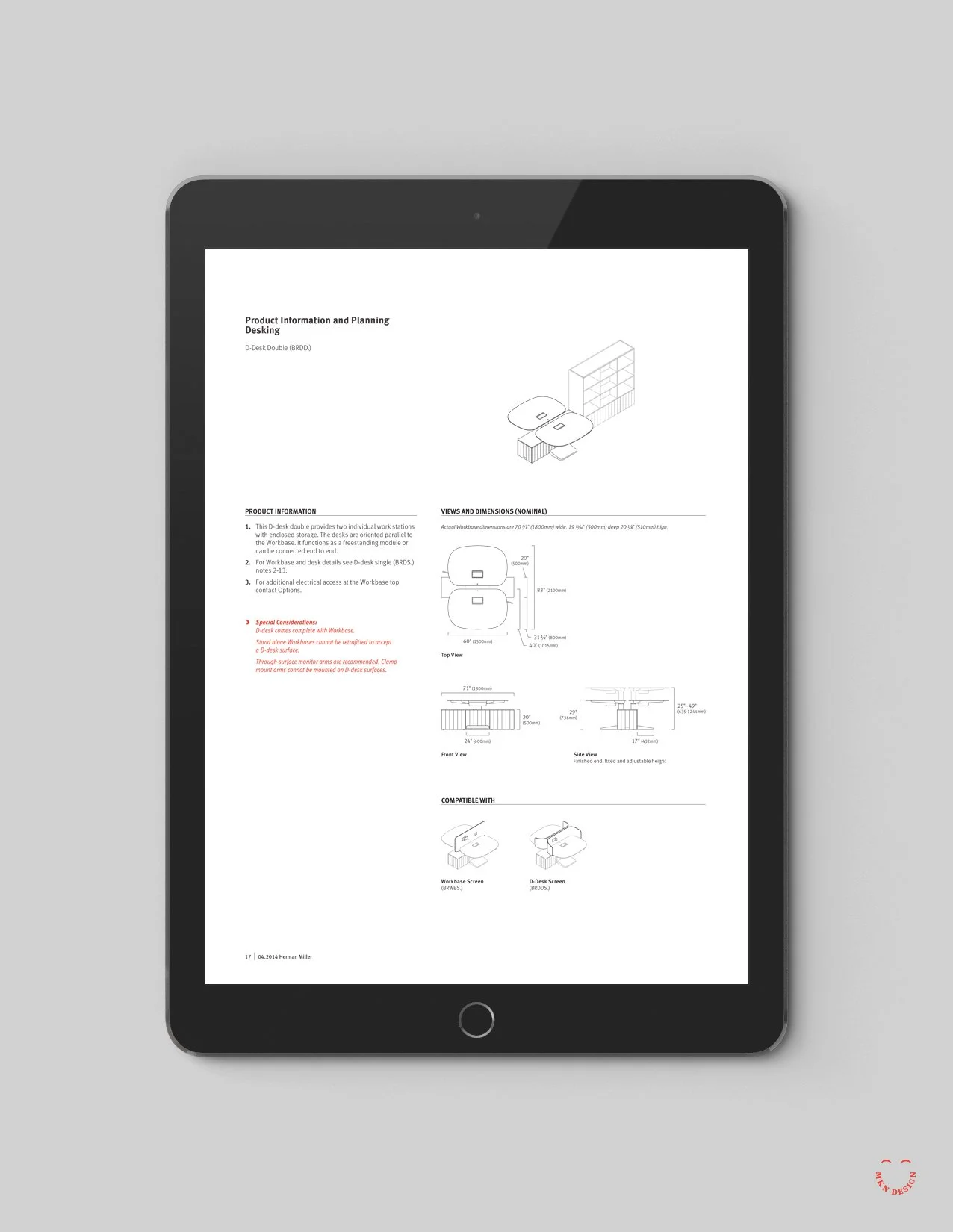
A selected few of the 275+ isometric illustrations created for the Locale Planning Guide. Click images enlarge.
◀ Locale Planning Guide
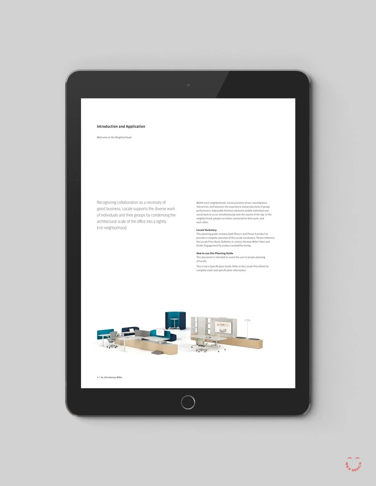
Several layouts from the Locale product planning guide.
Client Project
September 2013
__
Herman Miller Planning Guides
Over two years, I designed a flexible framework for the Herman Miller’s product planning guides. The new designed framework revitalized their existing planning guides, enhanced search functionality, and introduced an intuitive layout. Thorough research, user experience considerations, creative exploration, and the synthesis of input from interior designers, customer care, and Herman Miller guided the transformation. The resulting implementation was user-friendly, easily navigable, expandable, and accessible to users across electronic devices, plus a function to download and print PDFs.
-
+ System Design Layout
+ Isometric Illustrations -
+ Art Direction
+ Creative Strategy
+ Concept Development
+ Design and Ideation
+ Graphic Design
+ Product Research
+ Illustration
+ Project Management
Sustainable Research Group
Client Project
January 2012
__
Sustainable Research Group
Following a decade of expansion, SRG’s logo no longer aligned with the organization’s aspirations. Collaborating closely with the leadership I gathered key insights informing what the brand could be. Based on these insights, a fresh trajectory emerged—one aimed at broadening expertise, enlarging the customer base, and refining market focus. The bold new approach reflects an innovative impression of sustainability and boasts confidence, strength, and leadership. The rebrand extended to stationery brand standard guidelines.
-
+ Brand Identity
-
+ Creative Direction
+ Research
+ Concept Development
+ Design and Ideation
+ Illustration
+ Graphic Design
+ Print Management
Brand Identity & Design System Collateral
Client Project (via Designvox)
2006 to 2009
__
Brand Identity & Design System Collateral
Following a series of internal shifts, Turnstone found their brand outdated and disconnected from their customer base. A relevant change was needed to resonate with the emerging demands of smaller businesses and startups. Equally important was to show that their products could grow with them and still have the quality and longevity as other furniture brands in the industry. I was a member of the design team responsible for creating a revitalized brand and integrating the new brand across various communication channels, including advertising, product catalogs, brochures, and website improvements.
-
+ Brand Identity and Design Materials
-
+ Research
+ Concept Development
+ Sketching & Ideation
+ Brand Development
+ Packaging Design
+ Catalog Cover Design and Layout
+ Design and Ideation
+ Illustration -
This brand project and design system collateral was completed while employed at Designvox.
