
Article + Client Projects
July 2024
__
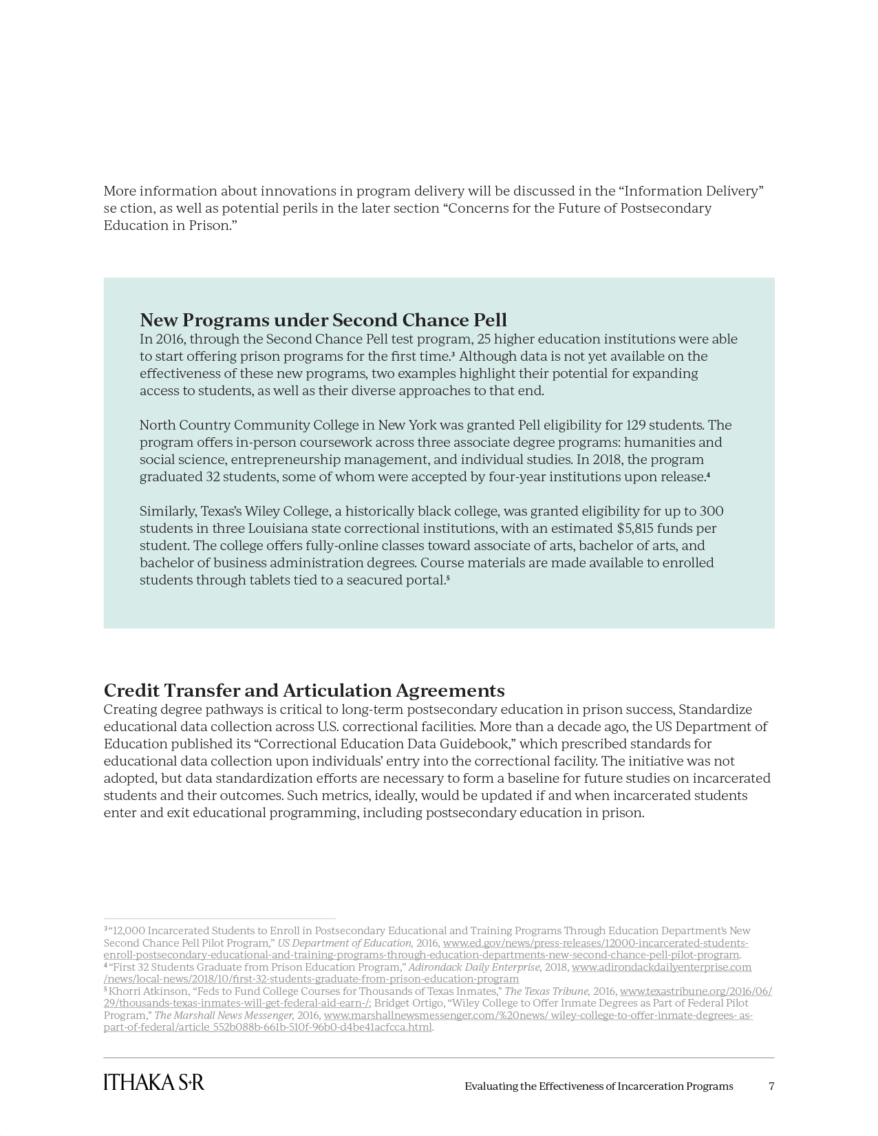
KitchenAid Packaging
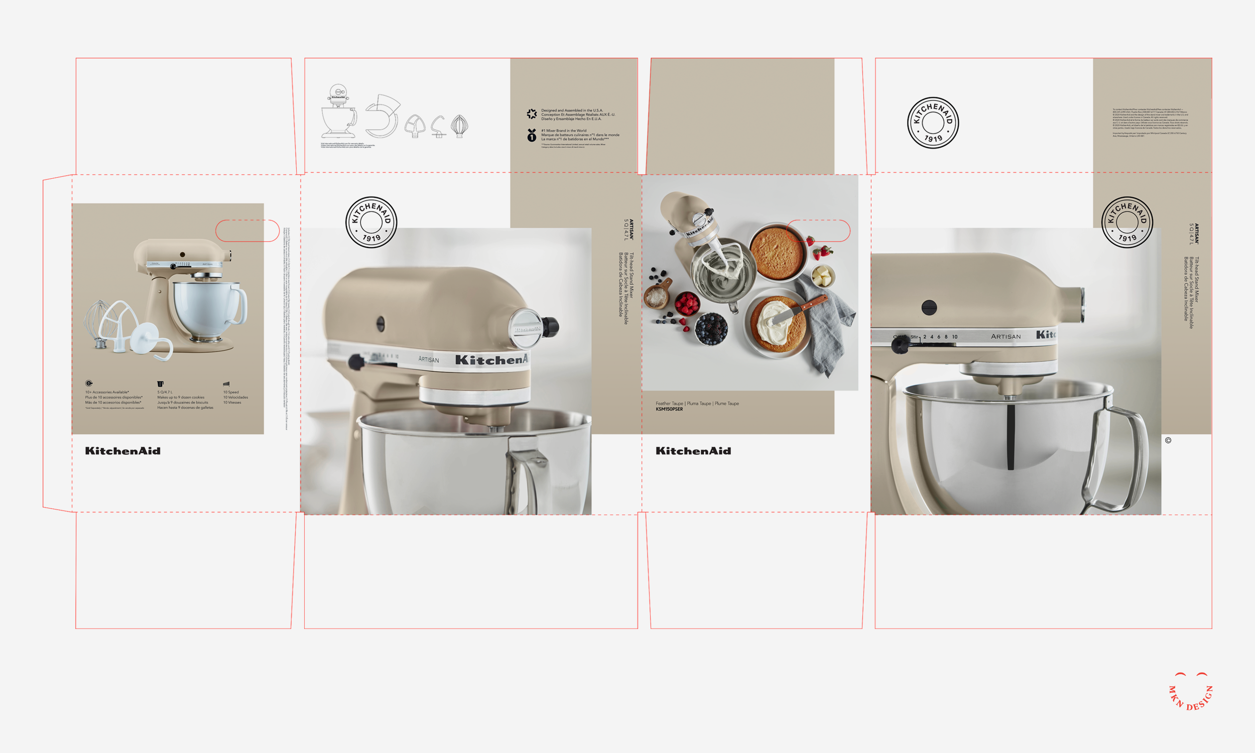
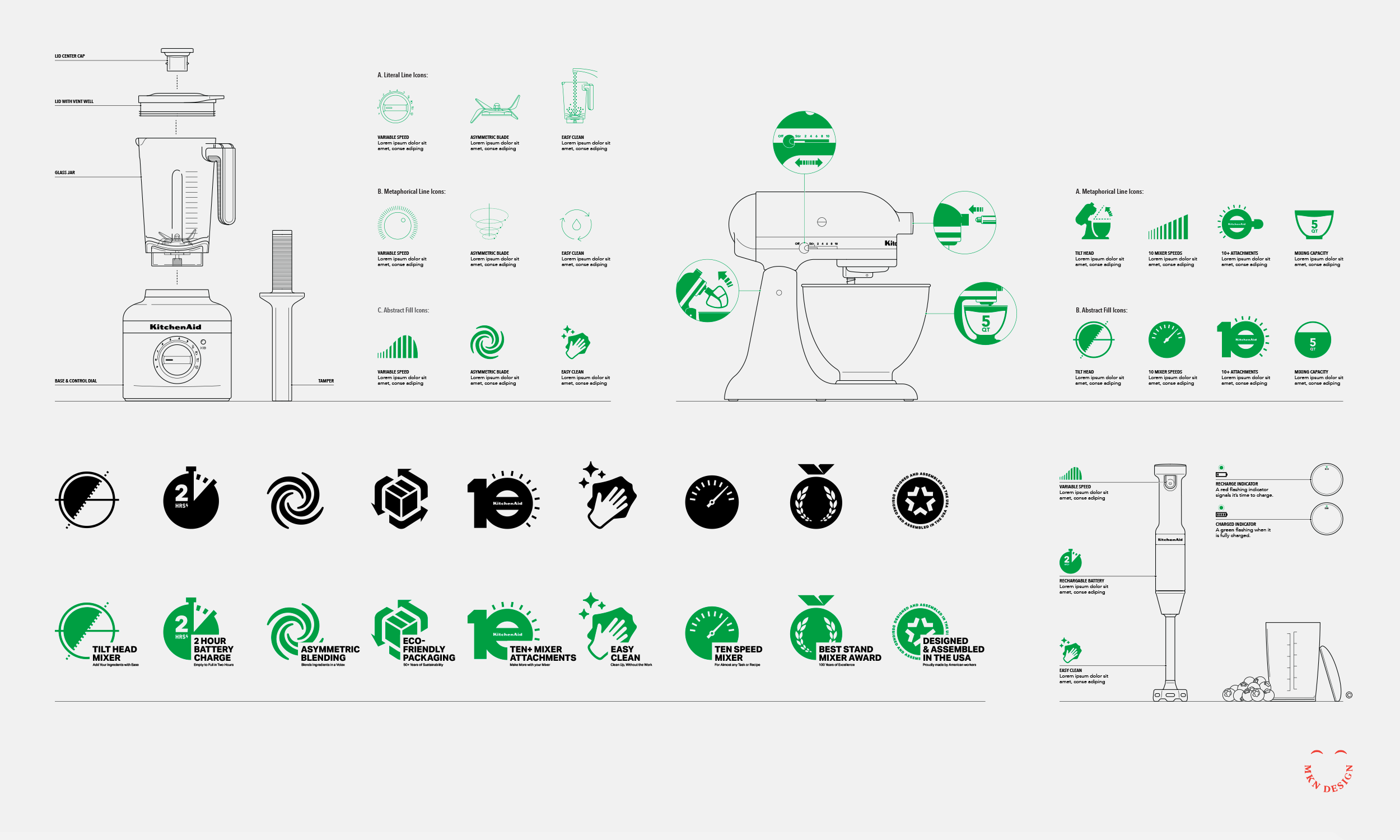
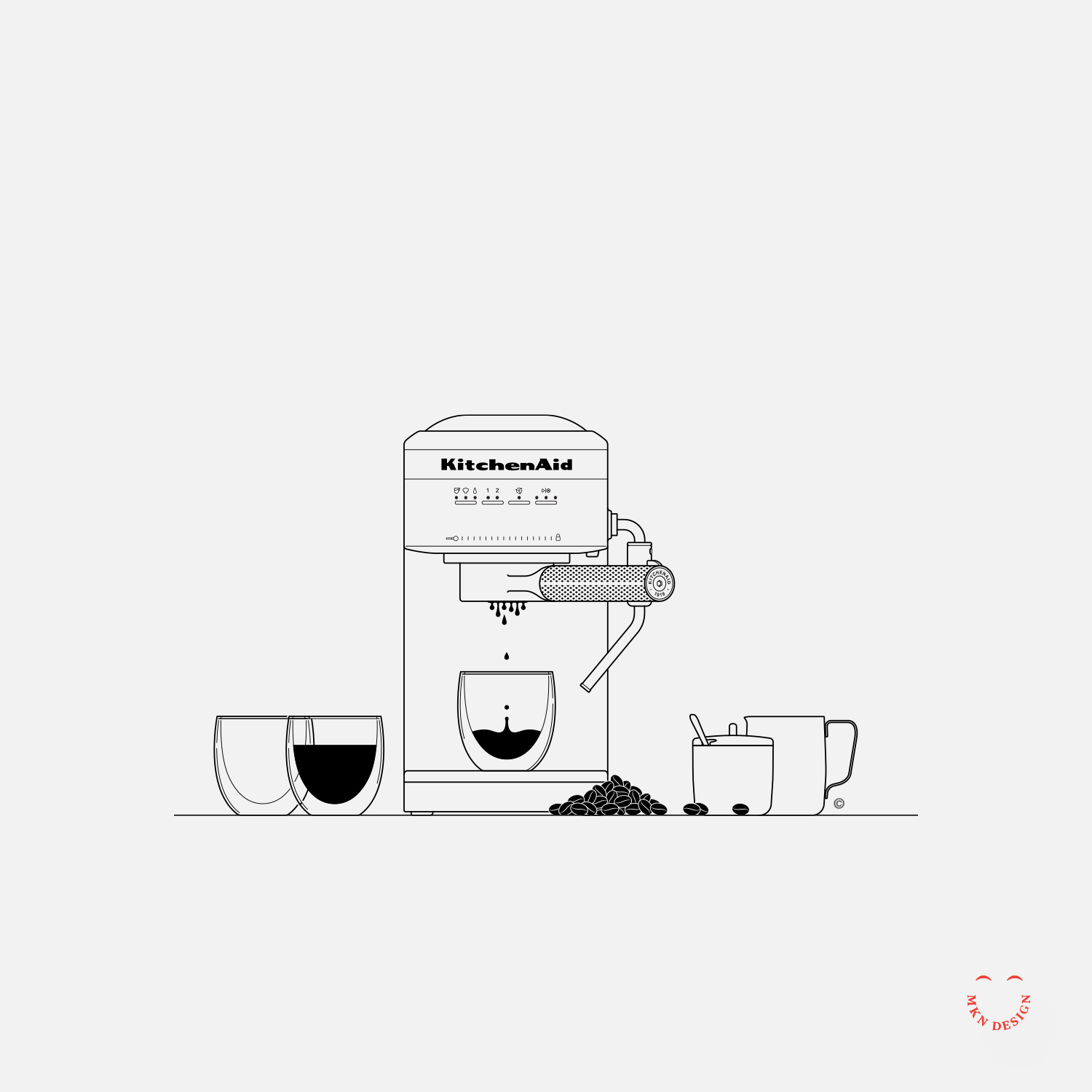


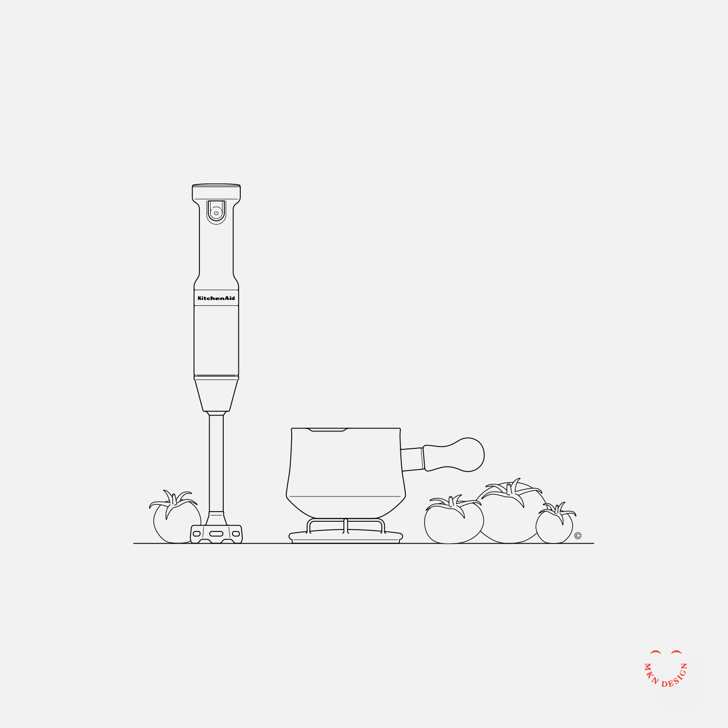


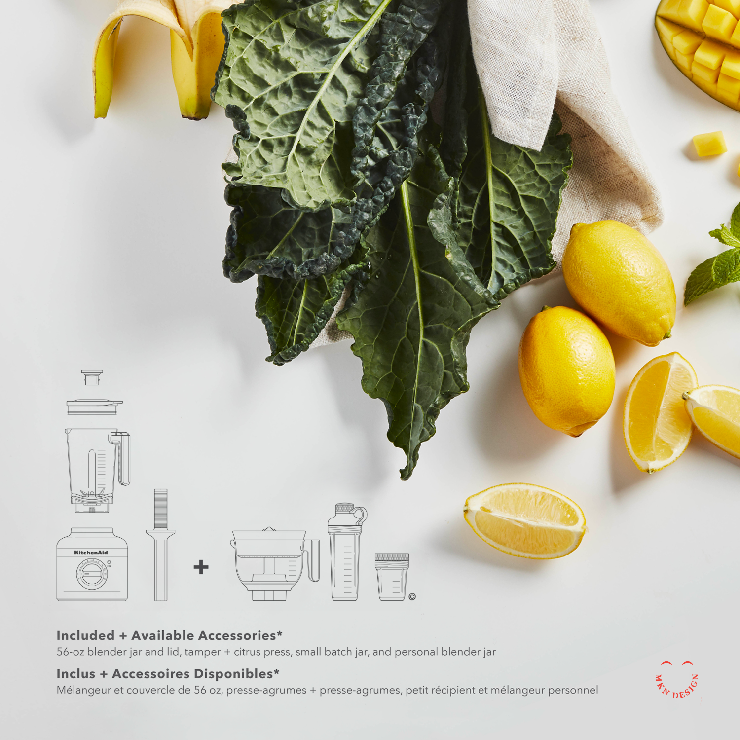
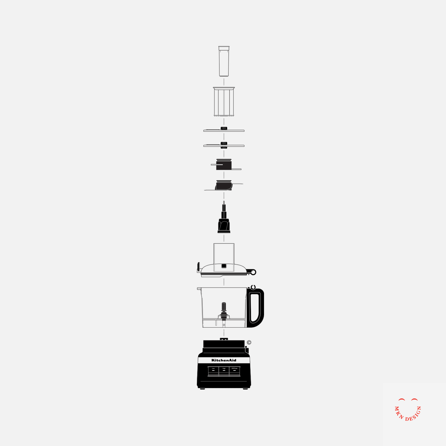
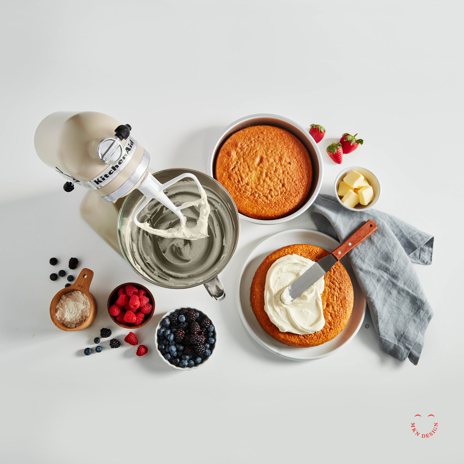
Client Project
August 2022
__
KitchenAid Packaging
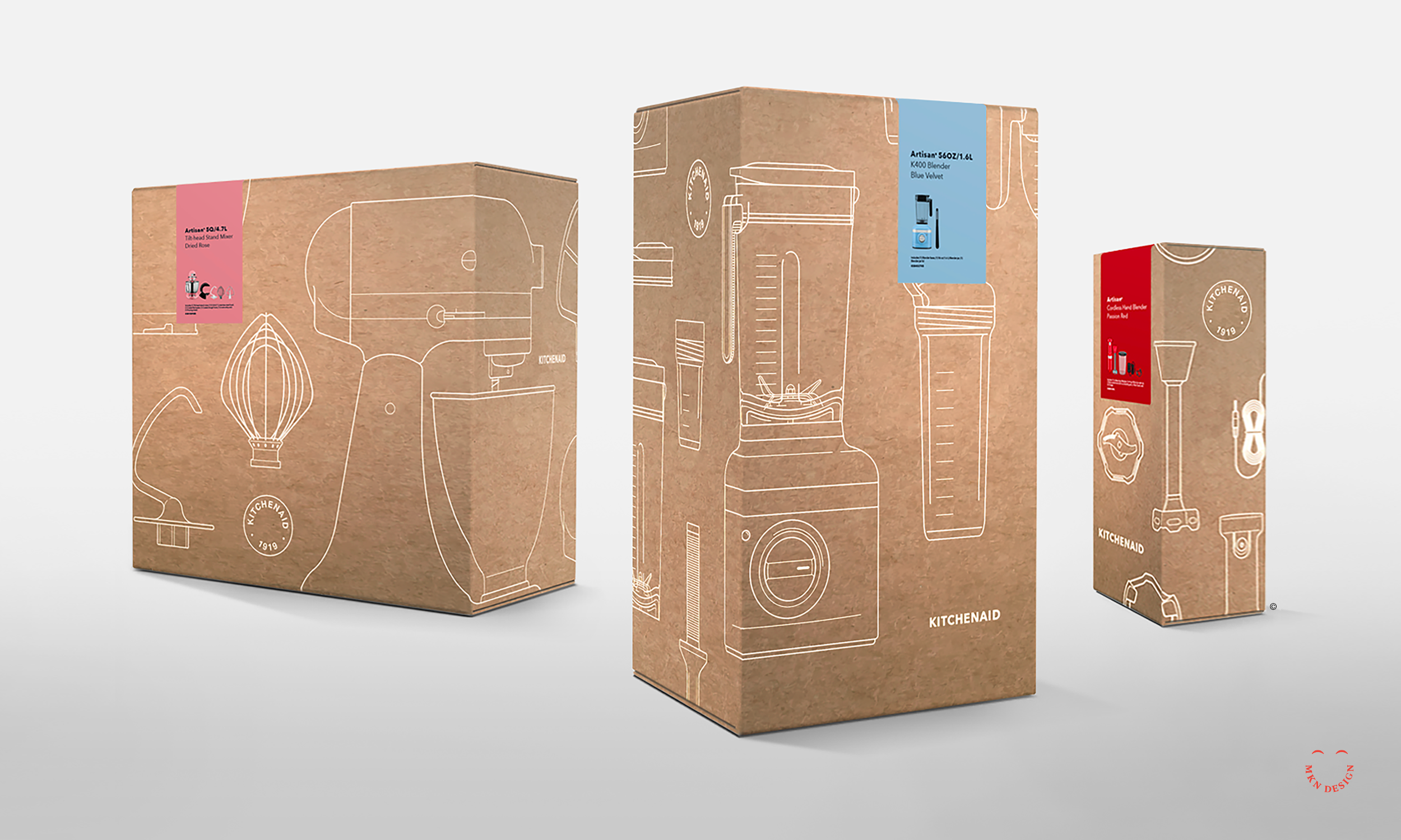
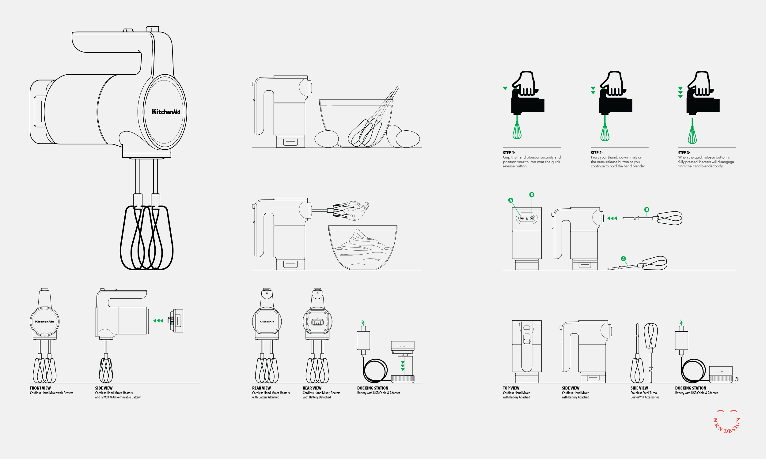
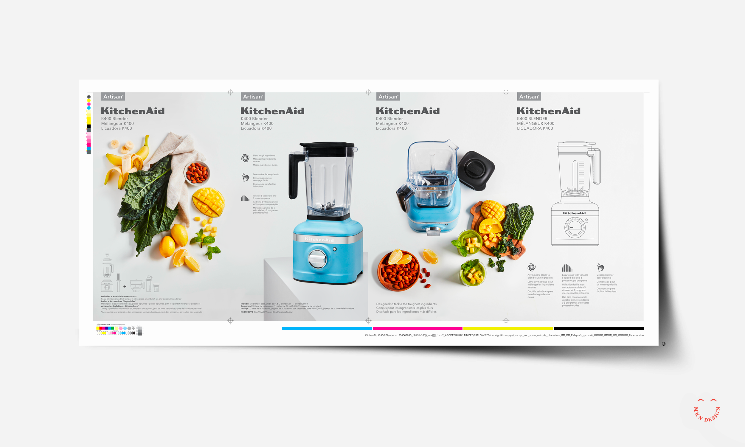
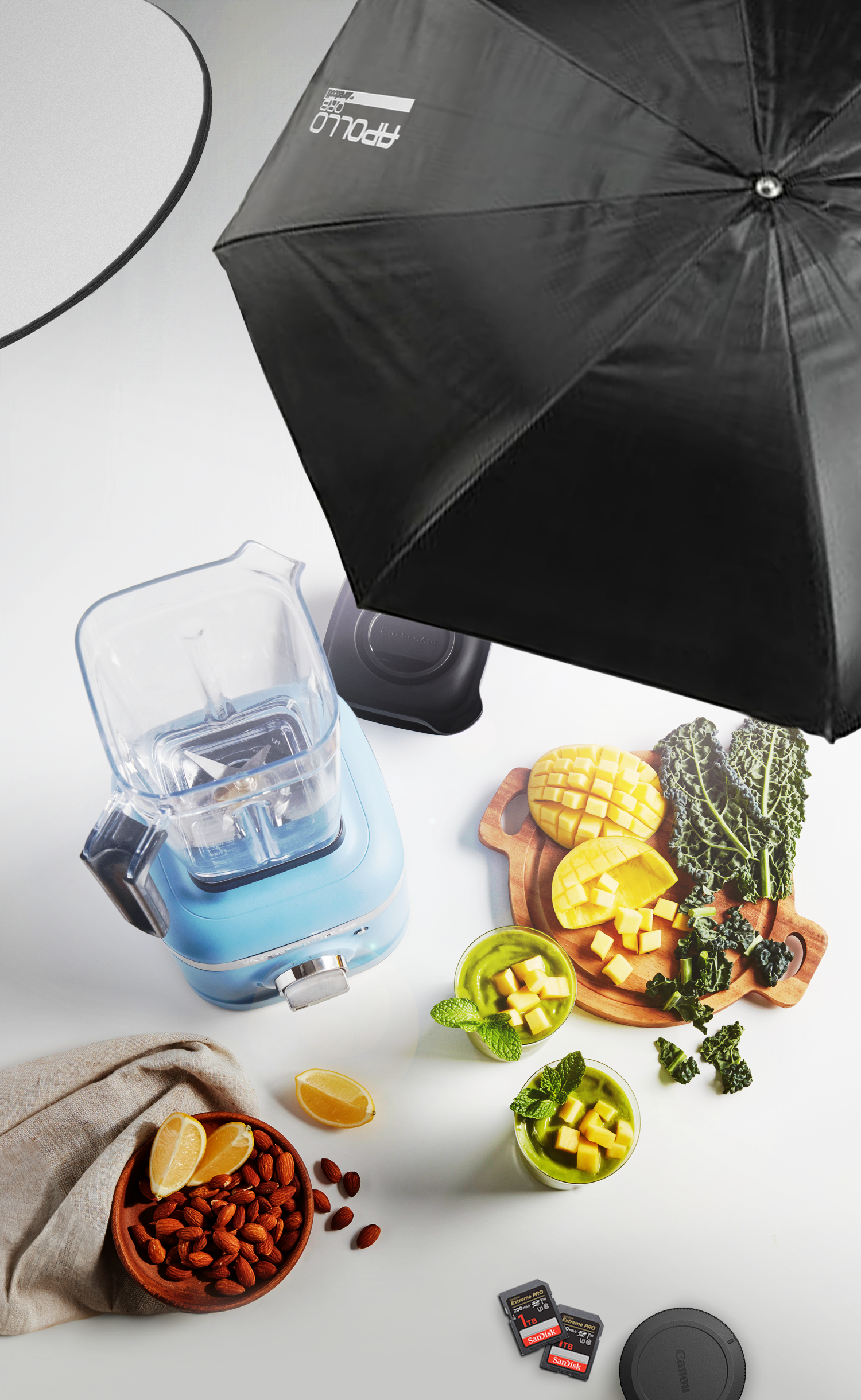
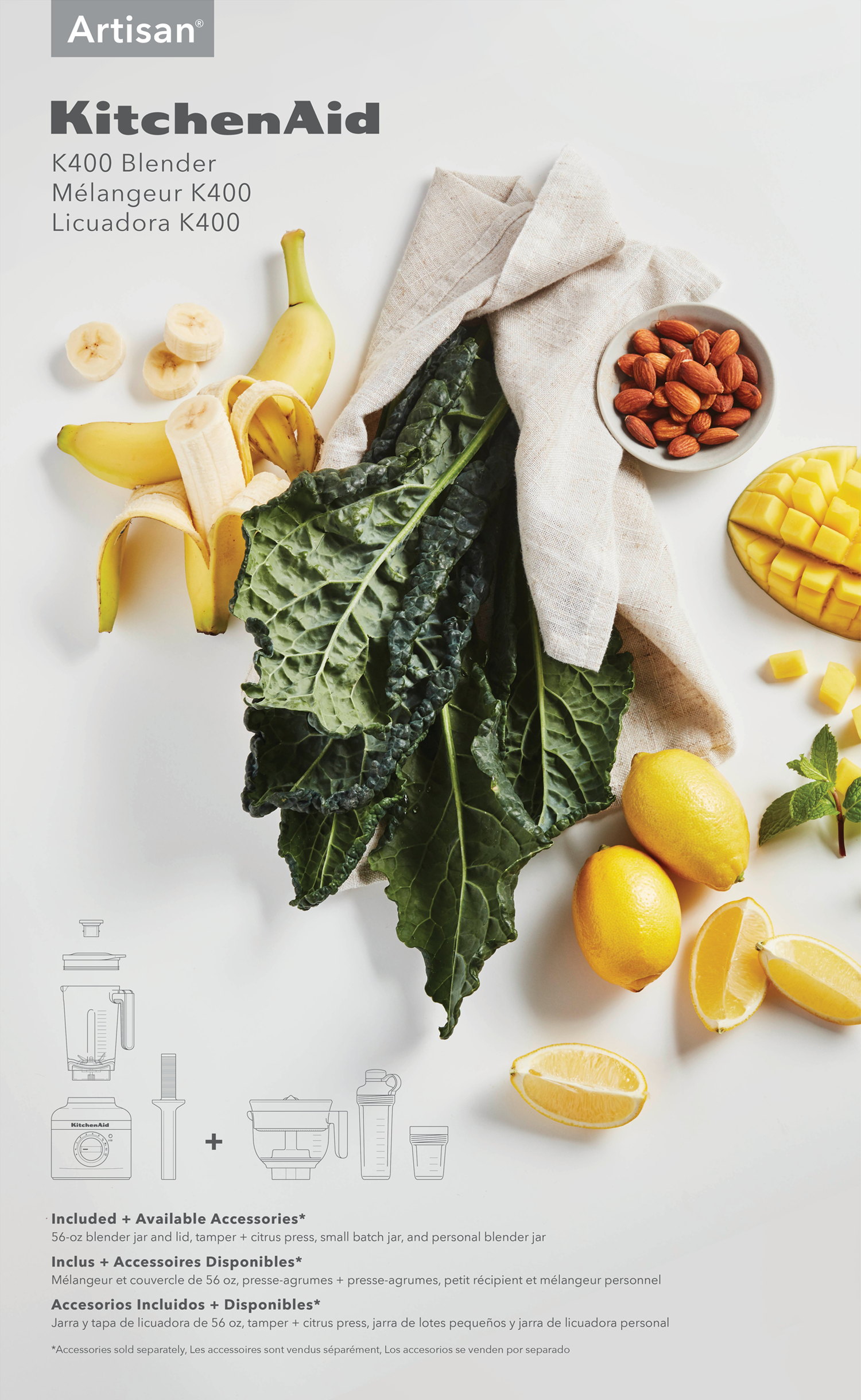
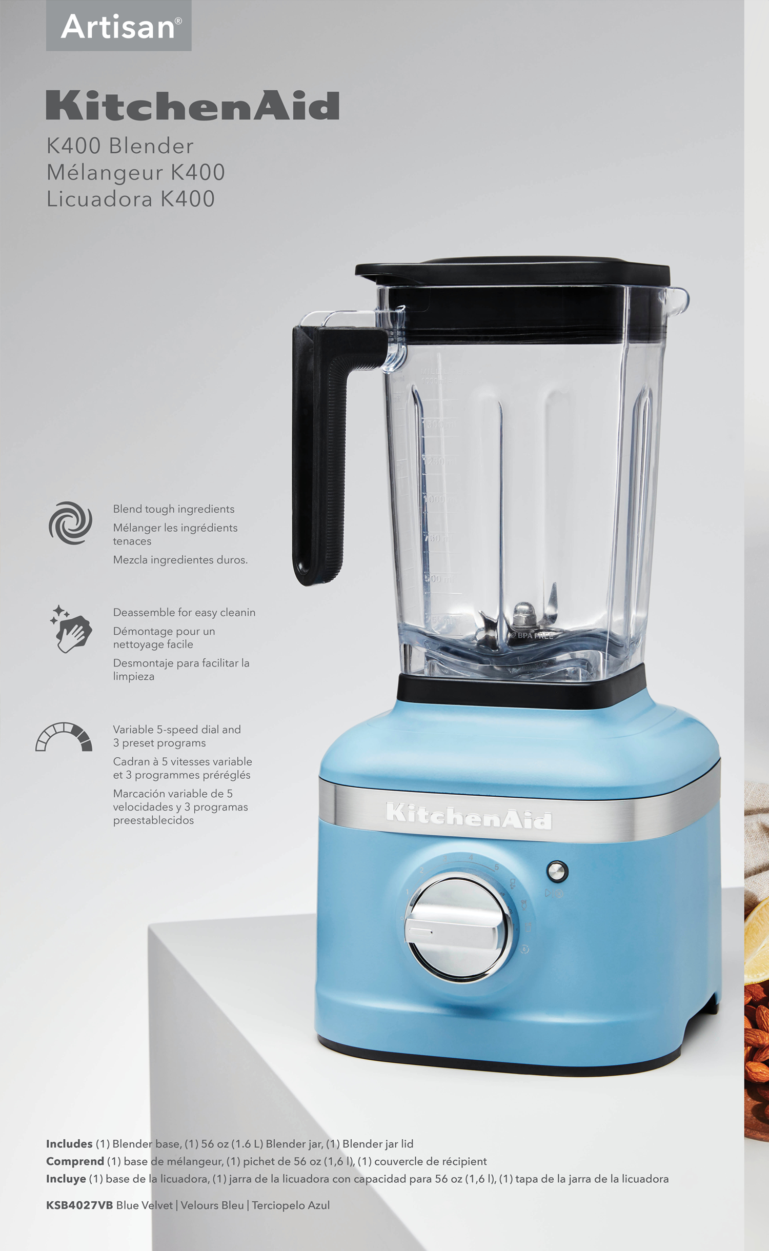
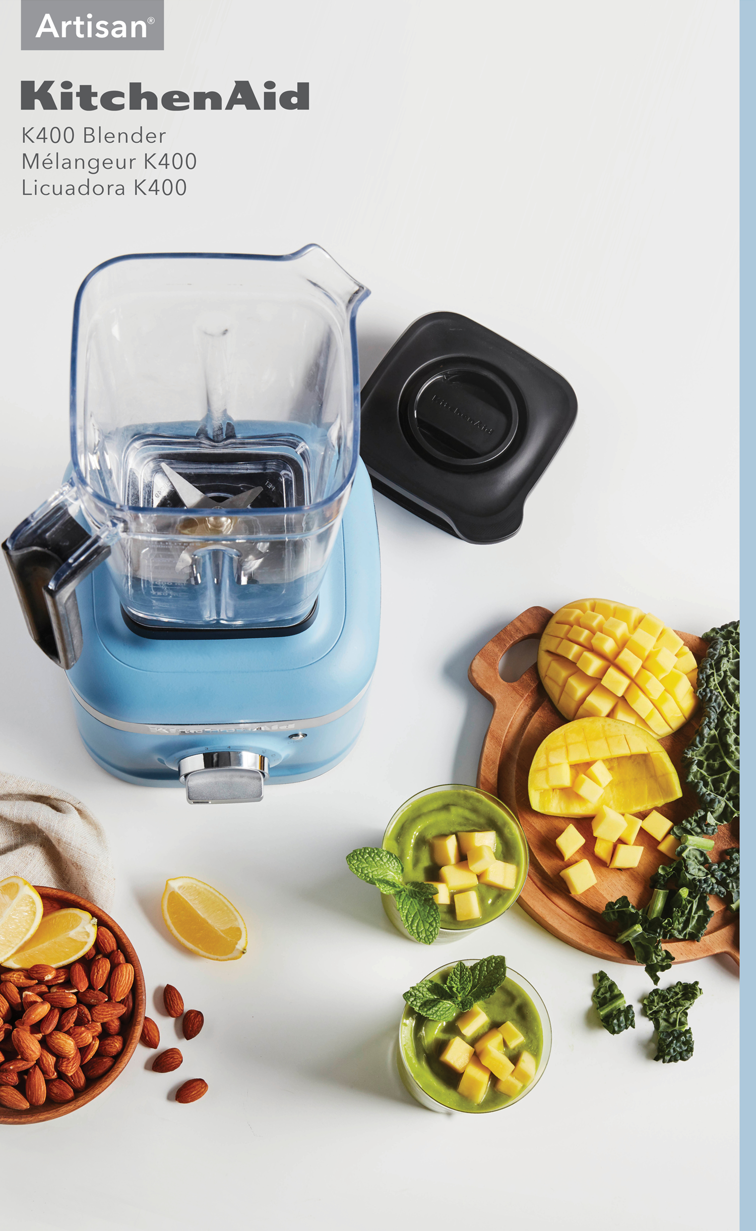
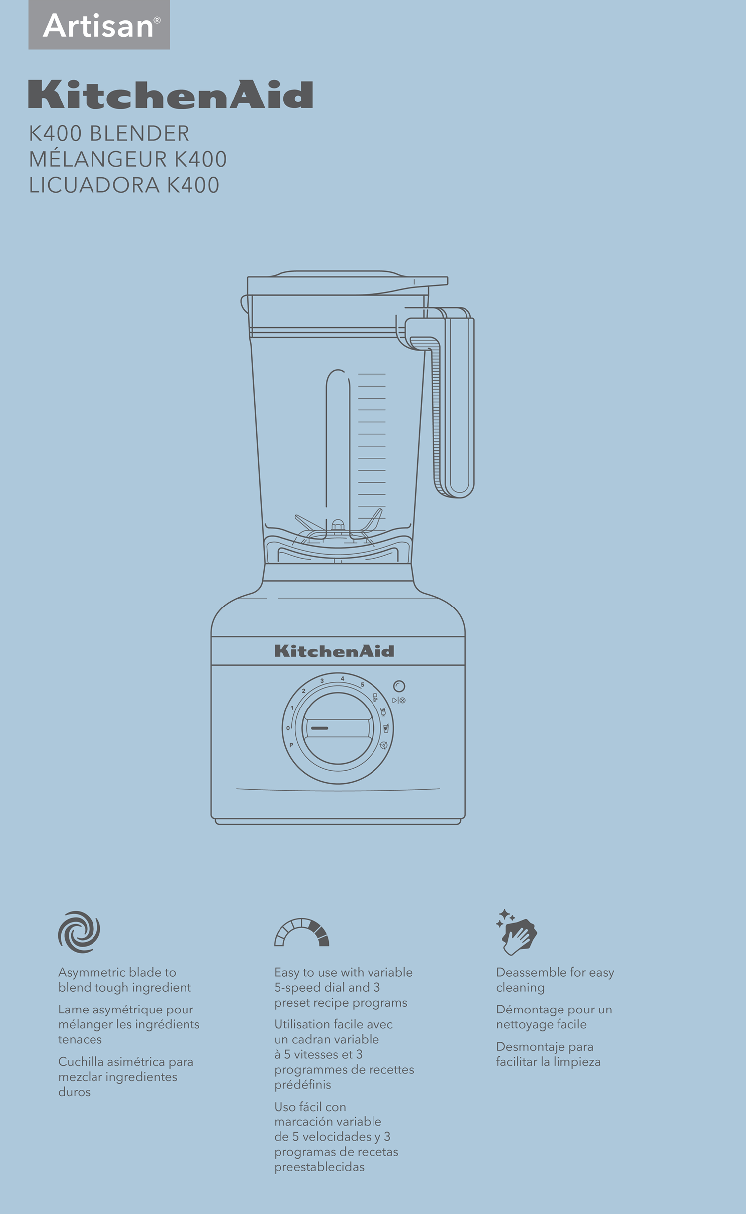
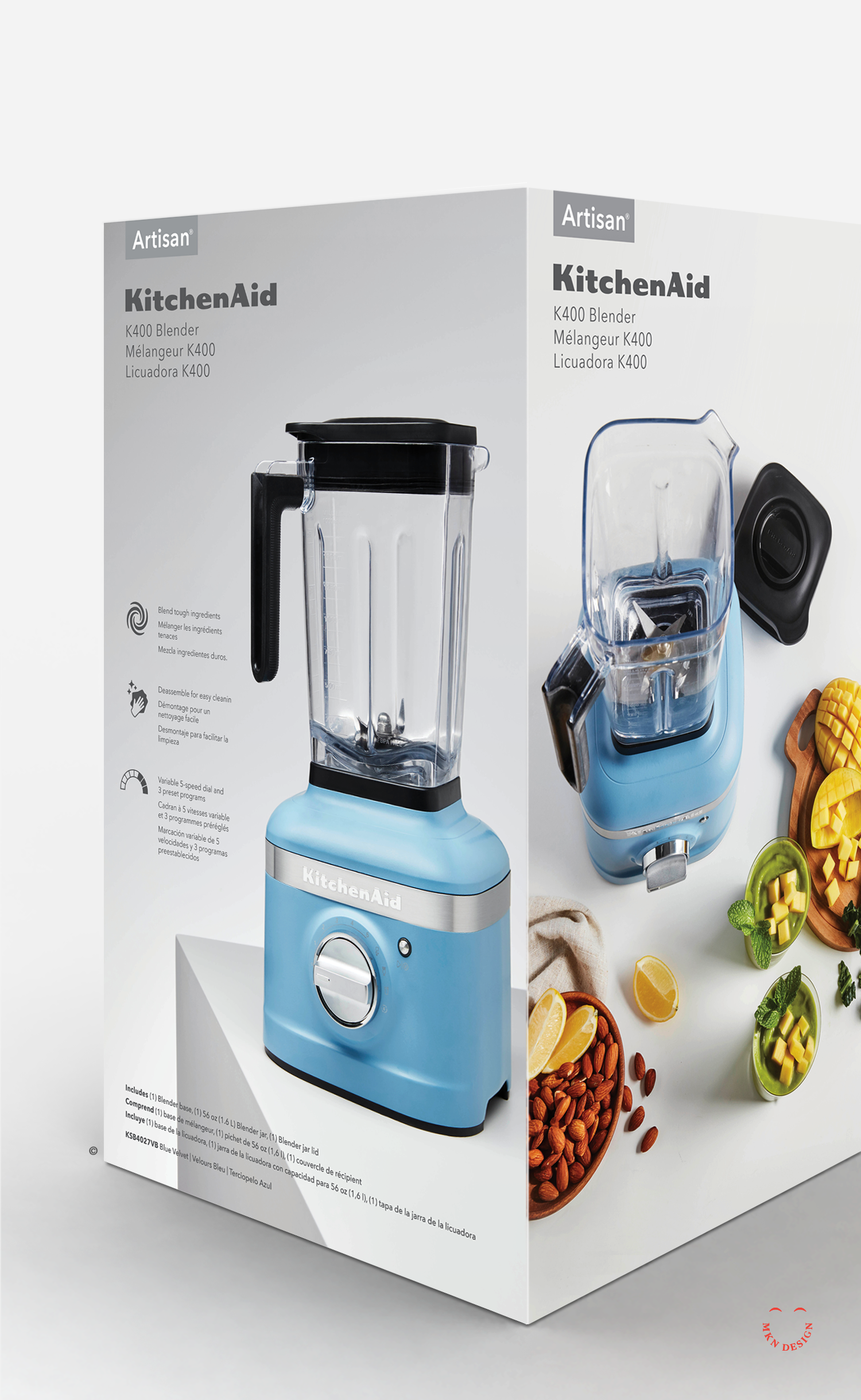
KitchenAid is the leader in home appliance brands. The company was established in 1919 and is headquartered in Saint Joseph, Michigan. Renowned for the innovative and iconic KitchenAid Mixer, now used in most kitchens around the world. The company sells an average of 2.5 million mixers per year.
KitchenAid partnered with MKN Design to define and develop new brand packaging using clean design, illustration and iconography.At the project onset, we gathered research on consumer trends, packaging, design, and illustrative styles. Using this research, we conceptualized packaging ideas and brought them to life in physical form. The result was a collection of innovative packaging concepts that highlighted KitchenAid's unique products, establishing them as a bold leader in kitchen appliances tailored to their consumers.
-
+ Packaging Design
-
+ Research (competitive, consumer, trend)
+ Concept Development
+ Sketching & Ideation
+ Graphic Design & Layout
+ Iconography
+ Instructional Illustrations
+ Product Illustrations
+ Mockups -
This project was a joint endeavor involving numerous individuals from both the KitchenAid design team and external independent contractors, such as Heather Tucker and myself.
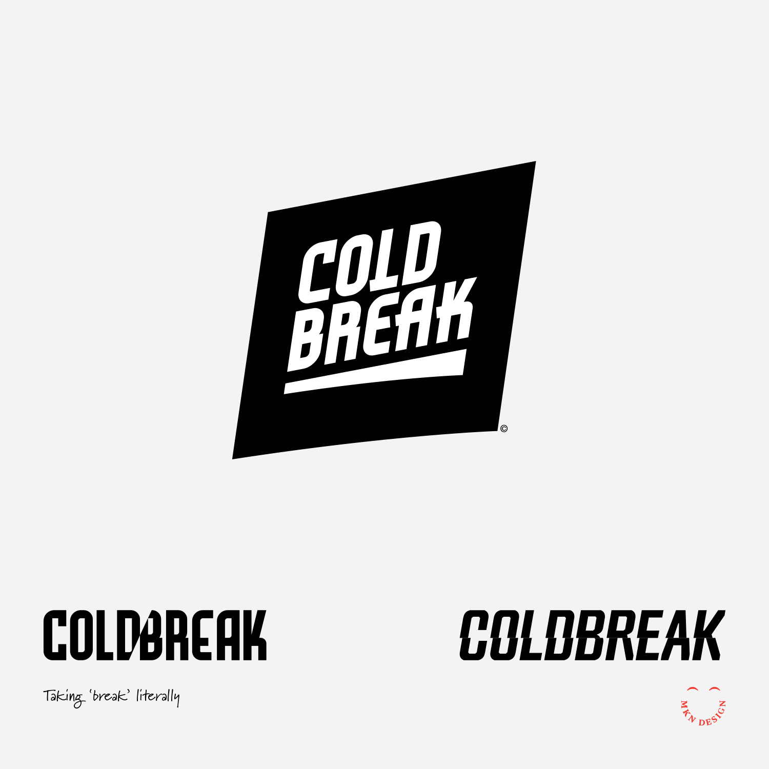
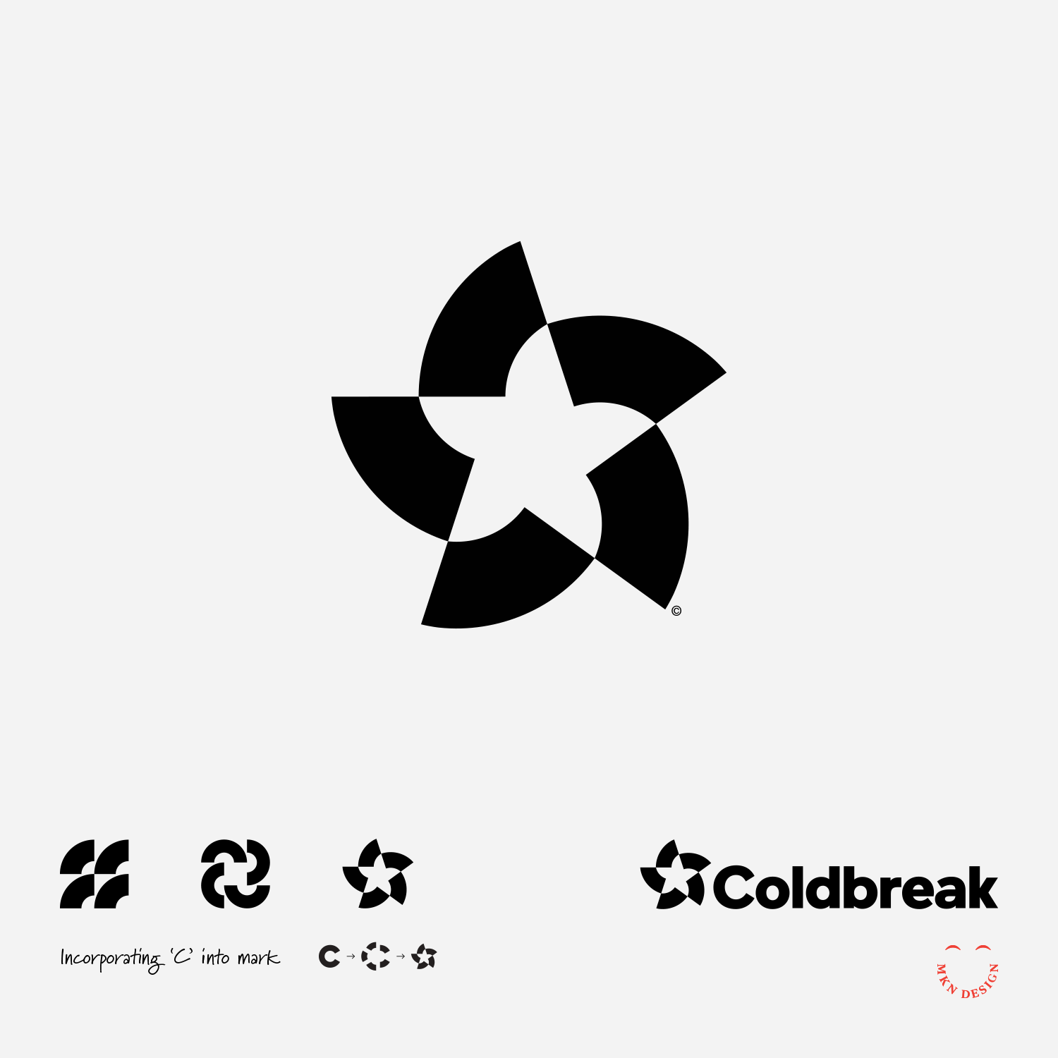
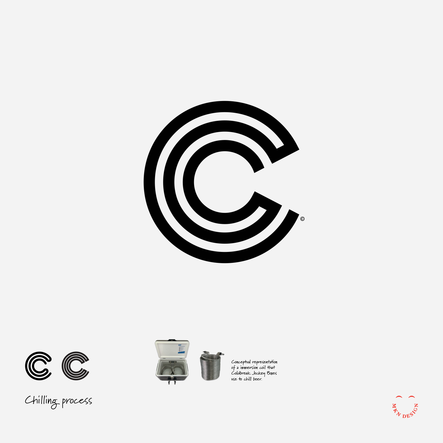
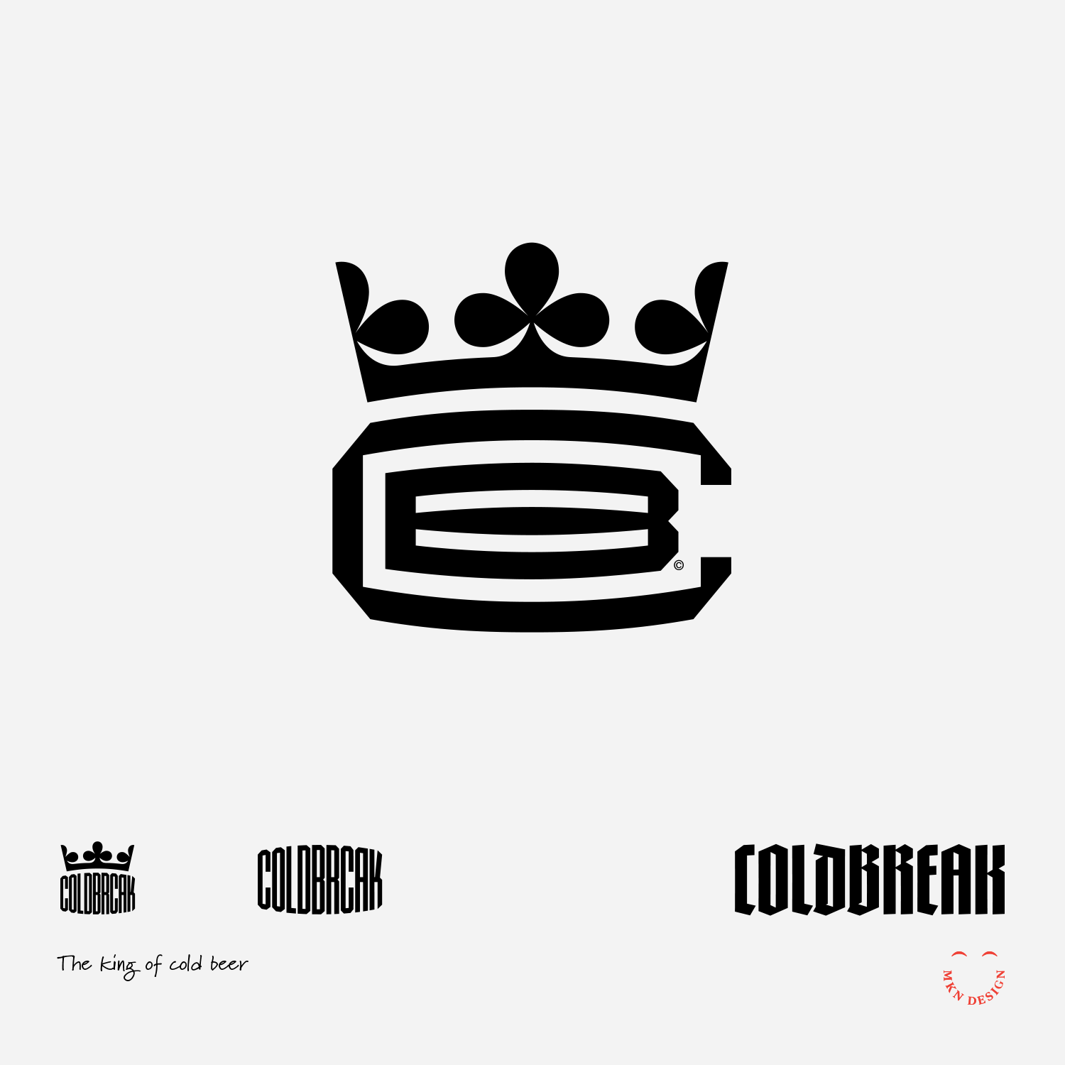
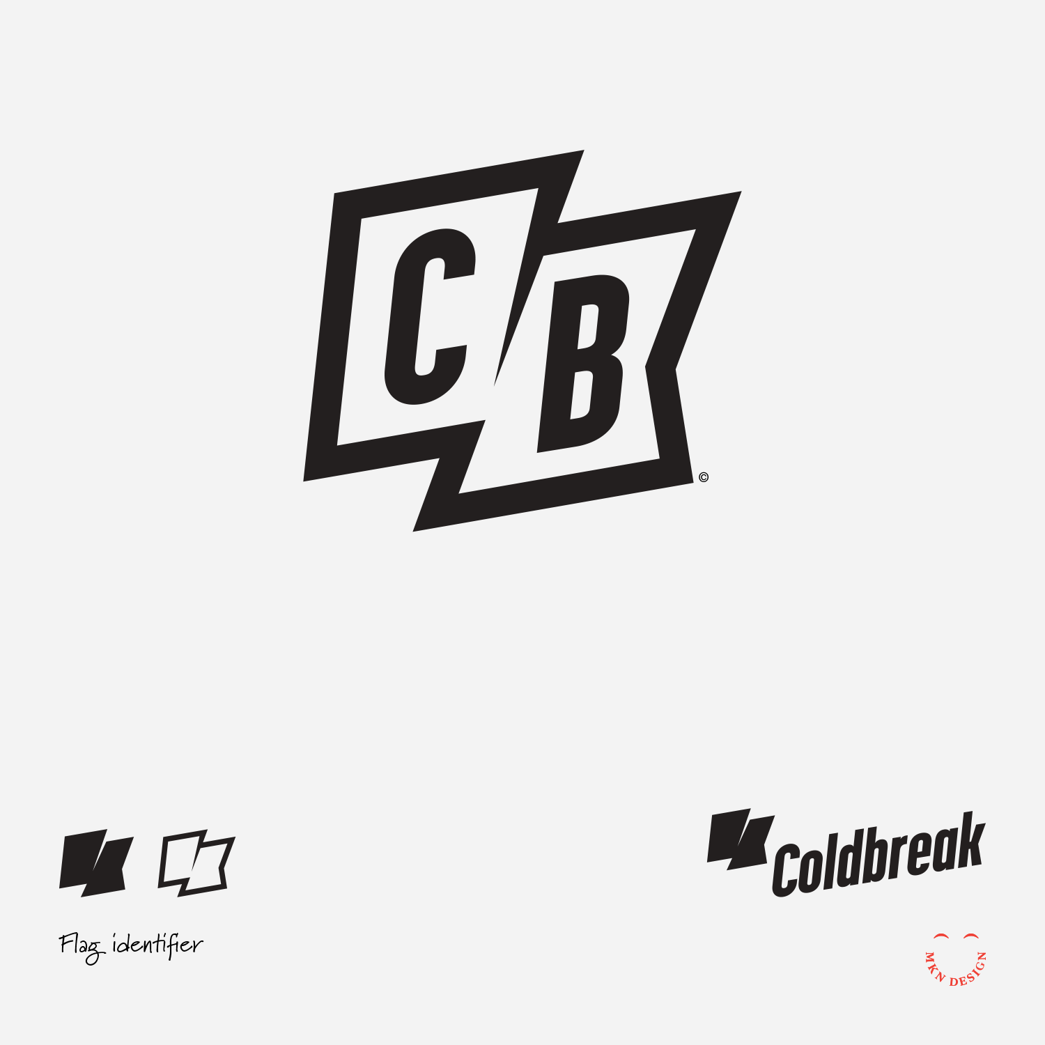
Coldbreak Mark Exploration
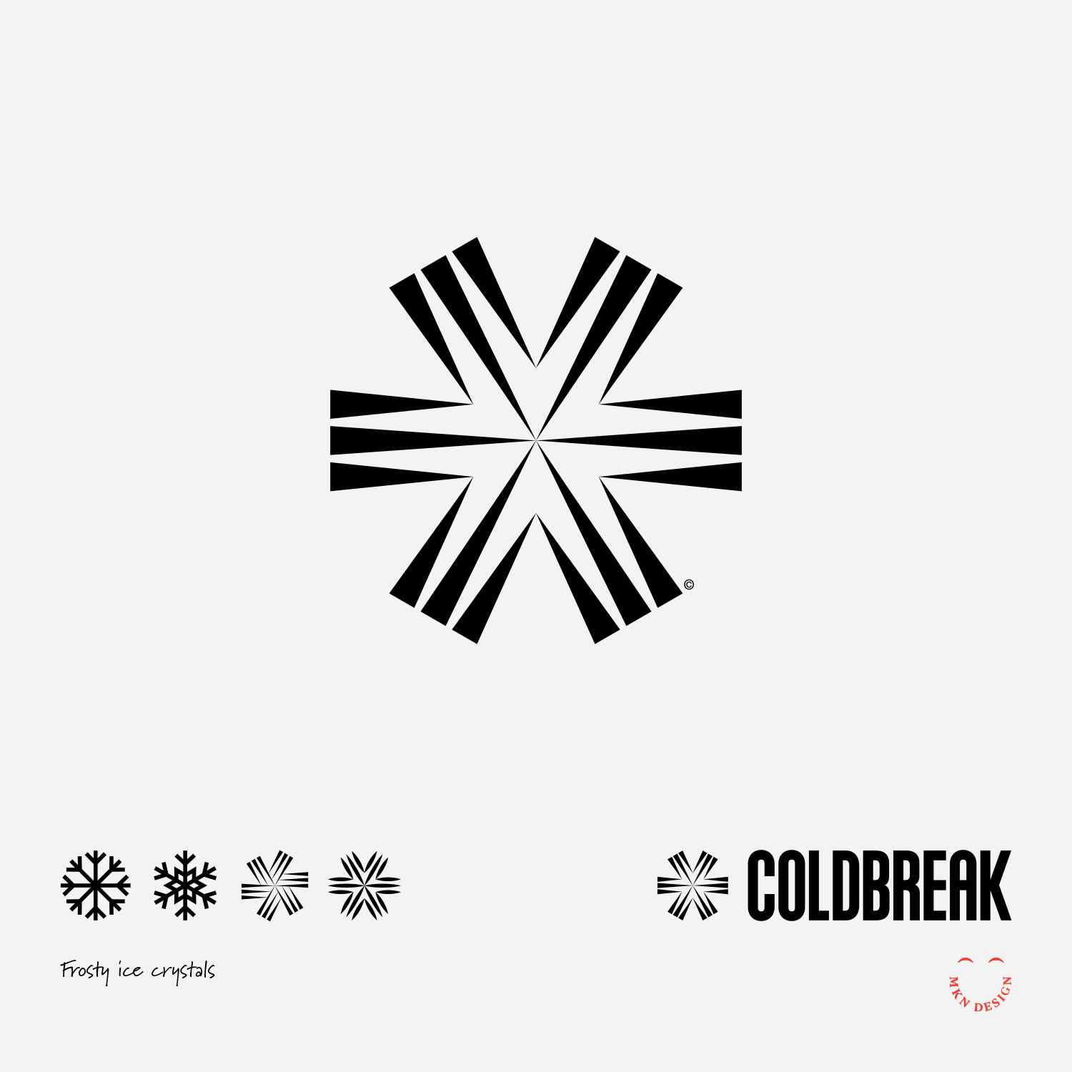
Client Project
December 2021
__
Coldbreak Mark Exploration
Though these marks where not selected by Coldbreak they laid the groundwork for refinement, ultimately leading to Coldbreak’s final brand identity.
These unselected marks where drawn from research and interviews conducted during the initial discovery phase. While they weren't ultimately chosen they served as a foundation for further refinement, contributing to the execution of Coldbreak’s brand identity. The sixth concept (bottom right) guided the direction towards Coldbreak's ultimate brand identity.
-
+ Branding
-
+ Research
+ Concept Development
+ Sketching & Ideation
+ Illustration -
View the completed brand strategy and identity project.
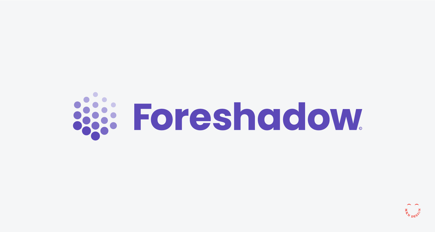
Foreshadow


Client Project
December 2021
__
Foreshadow
This startup developed a machine learning algorithm to preemptively identify potential threats of malicious phishing attacks. Their goal was to alert users of potential threats to their online security and privacy.
This startup developed a machine learning algorithm to preemptively identify potential threats of malicious phishing attacks. Their goal was to alert users of potential threats to their online security and privacy. With a staggering 97% of people unable to discern phishing attacks, their innovative solution aimed to bridge this critical gap in cybersecurity awareness for home use.
-
+ Brand Identity
-
+ Creative Direction
+ Research (competitive, consumer)
+ Concept Development
+ Sketching & Ideation
+ Iconography
+ Mockups
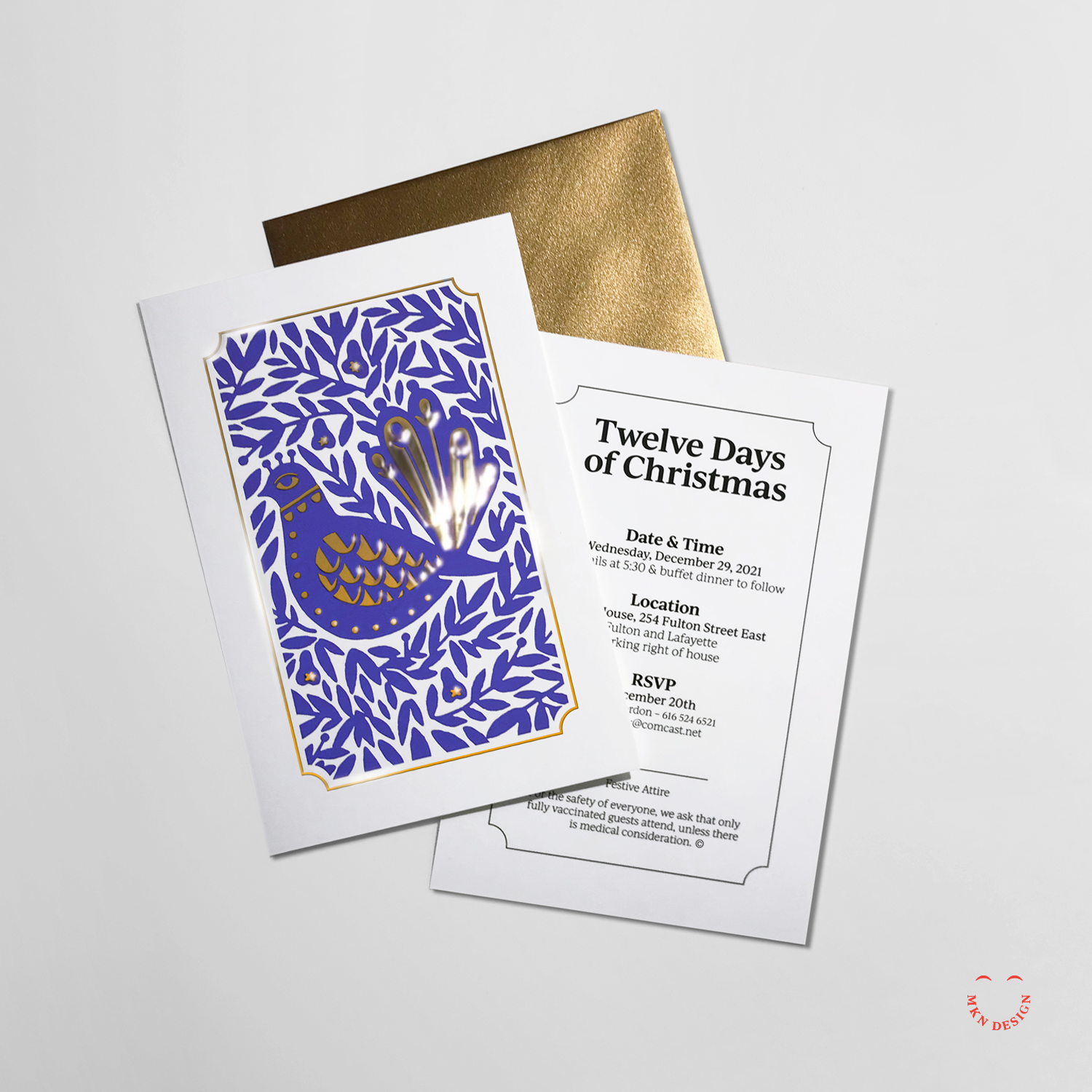
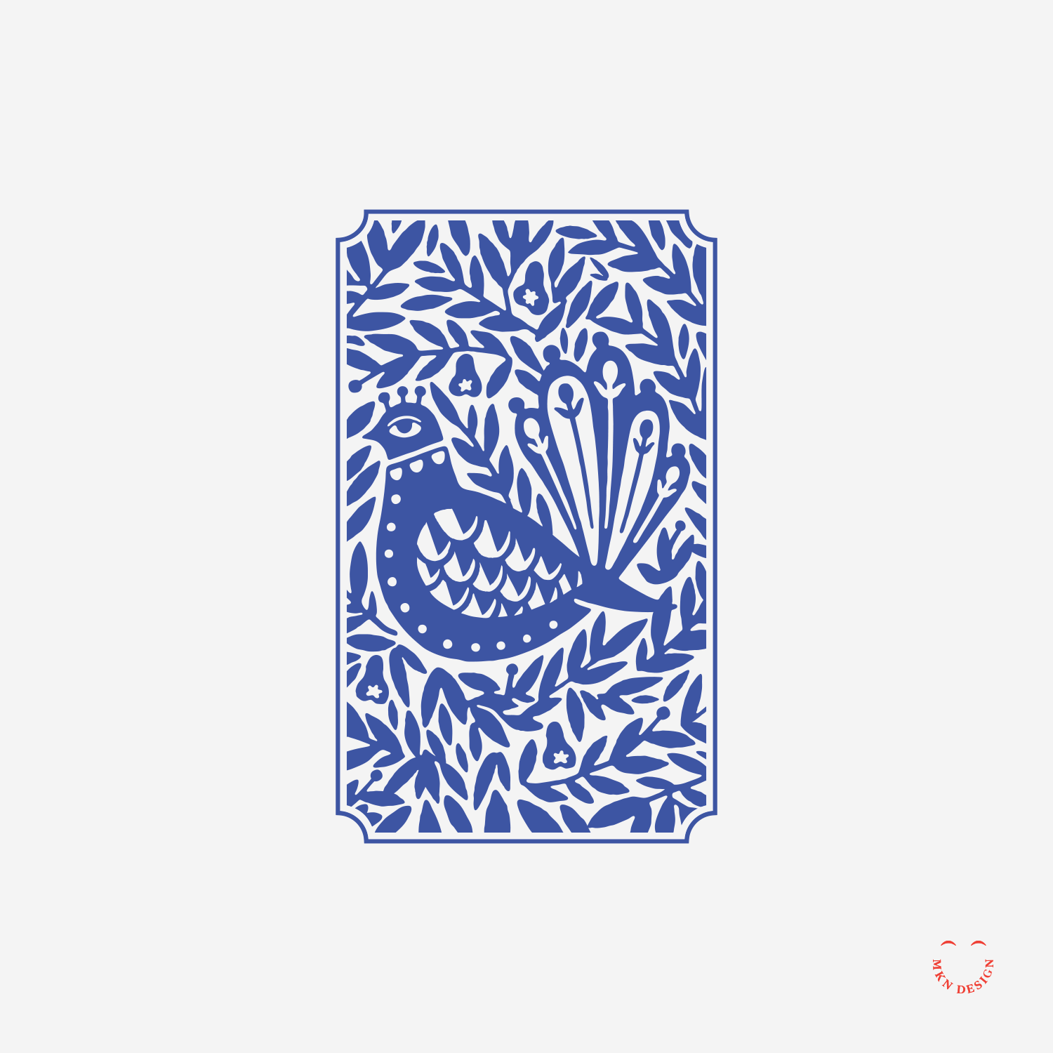
Twelve Days of Christmas
Client Project
November 2021
__
Twelve Days of Christmas
I designed these festive Christmas invitations for my neighbor, featuring the illustration of a partridge in a pear tree by CSA Design. To make it *pop*, I incorporated gold foil. The final invitations were printed by Moo.
-
+ Graphic Design
-
+ Creative Direction
+ Concept Development
+ Graphic Design & Layout
+ Print Management
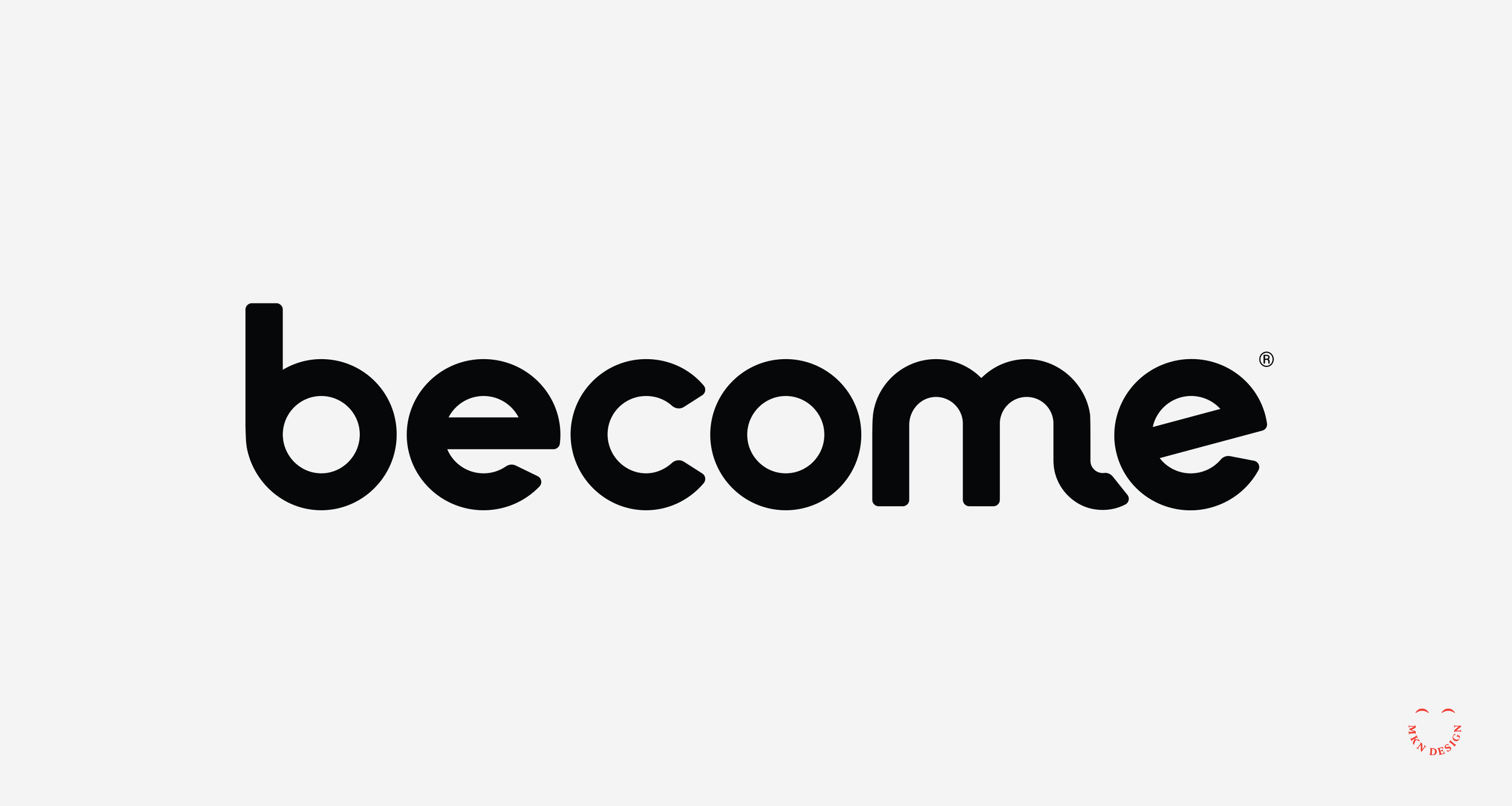
Become, Brand Strategy & Identity


Client Project
June 2021
__
Become, Brand Strategy & Identity
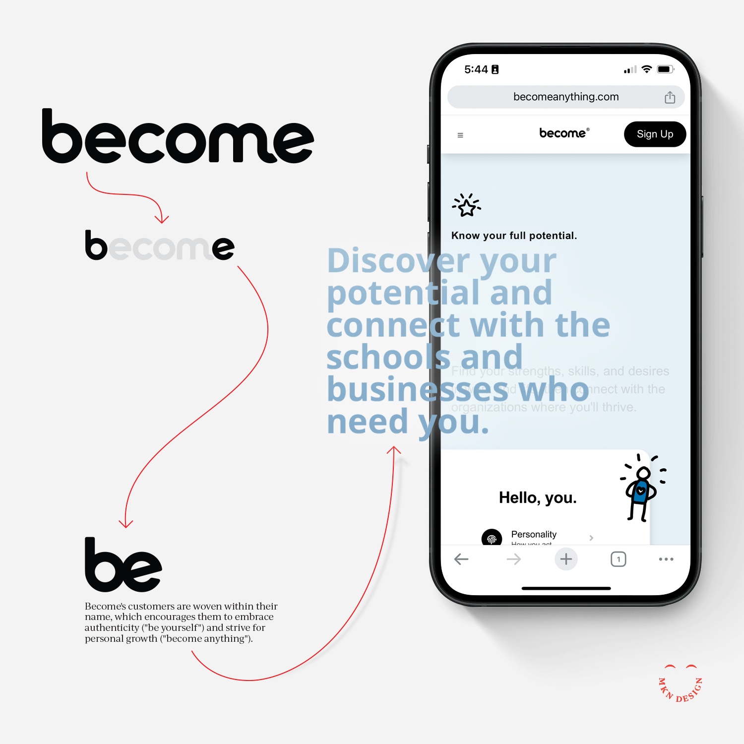
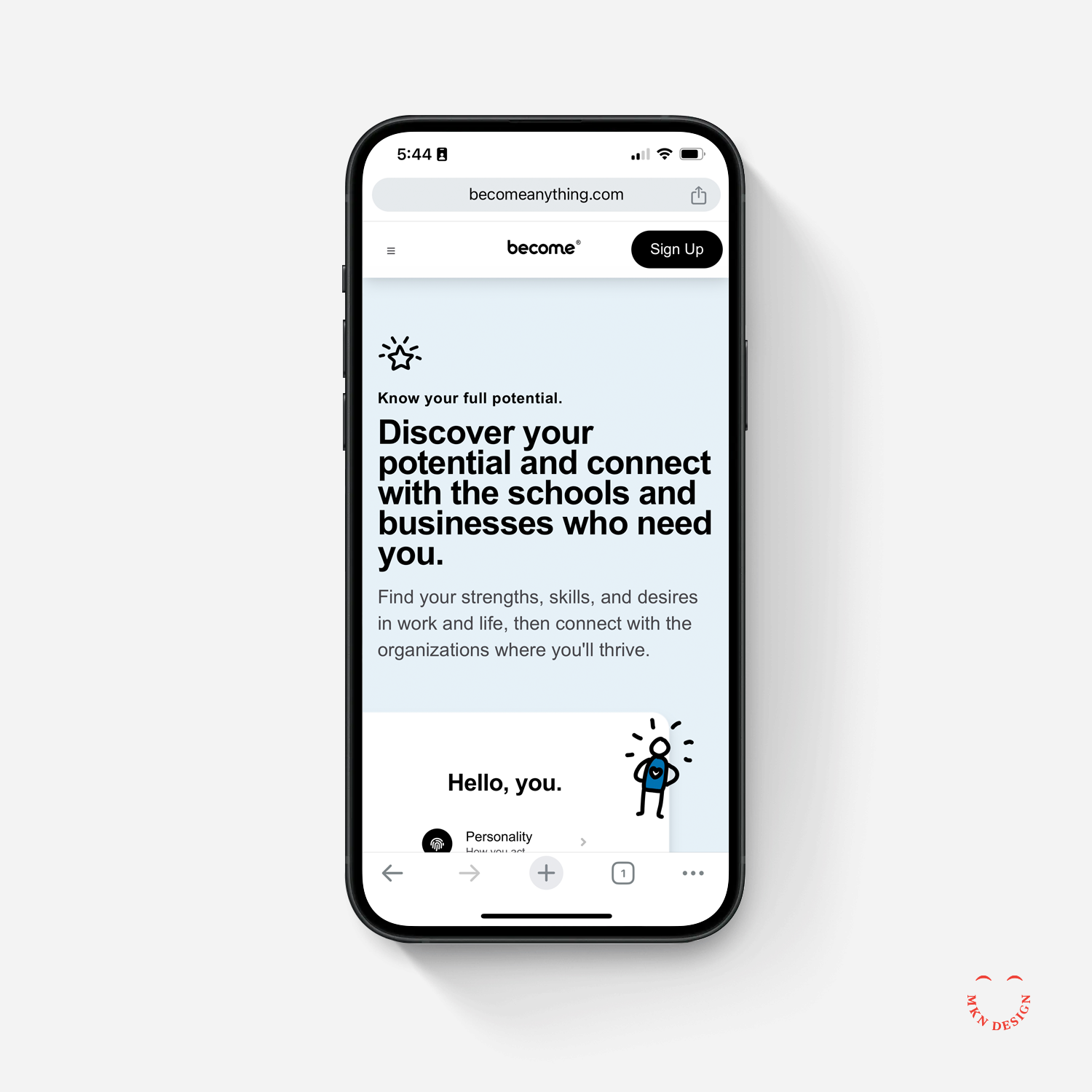
Become is an education and learning website that help individuals navigate and connect with schools and businesses through deep insights and data-backed guidance. My team worked closely with Become's founders to develop their brand design system, covering everything from messaging, naming to the identity.
I led a team in planning, development, and design of the Become brand identity. Through my comprehensive process we distilled insights gathered from audience and stakeholder interviews, shaping the foundation of the brand. This foundation delineated the brand’s tone, defined the voice and visual direction of the brand. As we progressed, additional interviews, journey mapping, naming, brand architecture, iterative brand development evolving into a simple, meaningful and approachable brand. After this effort a detailed brand guidelines was established.
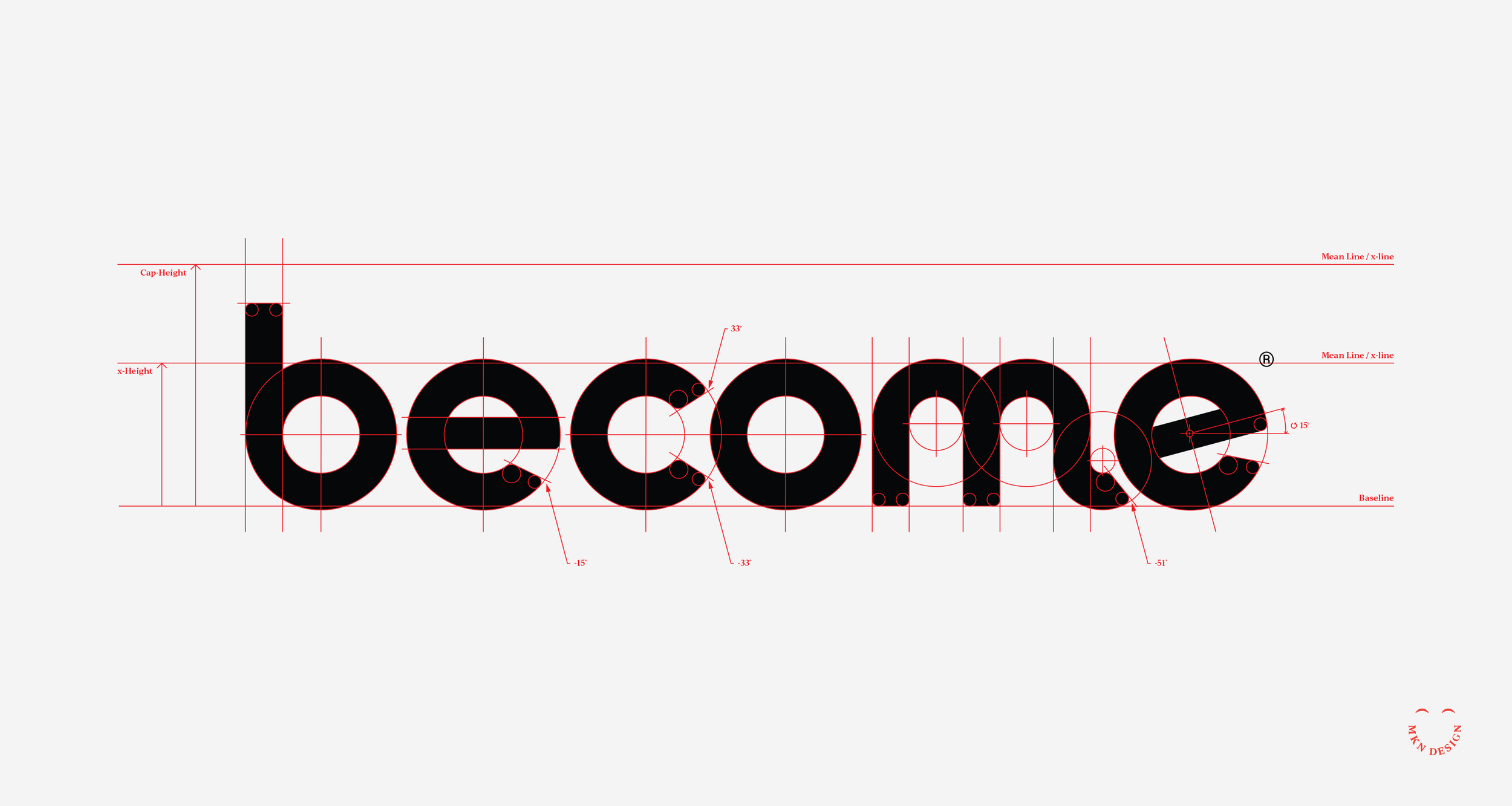
The word 'Become' was crafted by merging the space between its initial and final letters. This simple alteration embodies the concept of 'Become' as a companion throughout one's professional journey. Additionally, this modification transforms the tense of the word from future to present, implying that individuals can embrace their current selves or evolve into something new.
-
+ Branding
-
+ Team Leadership
+ Project Management
+ Creative Direction
+ Qualitative & Quantitative Research
+ Brand Messaging
+ Naming
+ Visual Identity -
Michael Nÿkamp served as a patient and adept navigator during our brand discovery expedition. His guidance enabled us to gain profound insights into our company's identity. Although the outcome was unexpected, it perfectly aligned with our aspirations. None of this would have happened without him and for that, we are very grateful.
— Ryan Montgomery, CEO of Become
-
View the initial mark exploration concepts for Become.
-
Phase III fun illustrations drawn by David Schofield.
Maggie Bandstra Studio


Client Project
March 2021
__
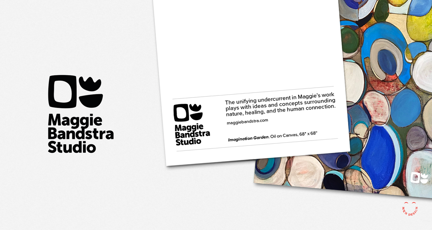
Maggie Bandstra Studio
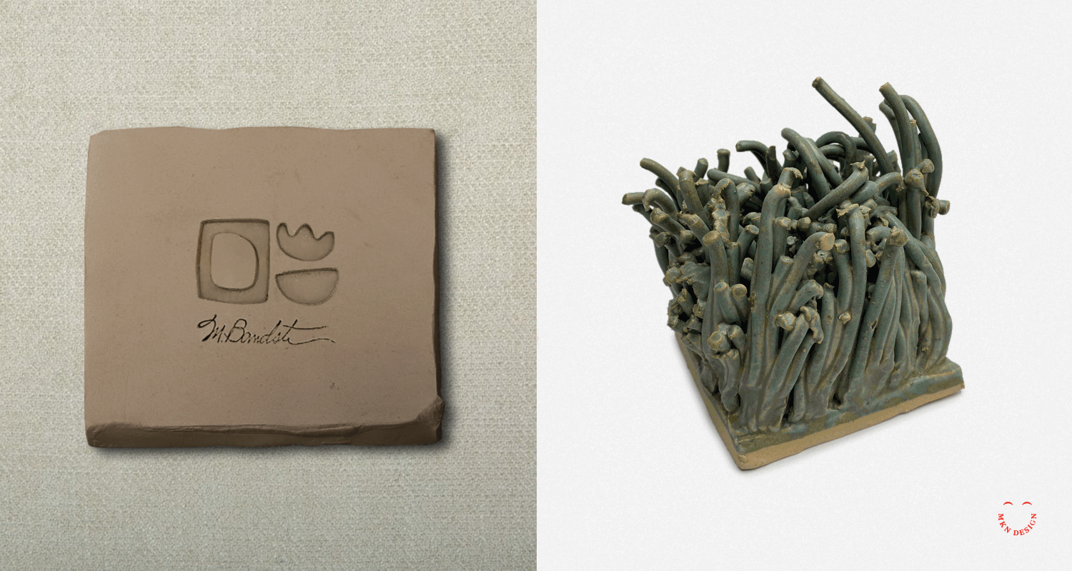
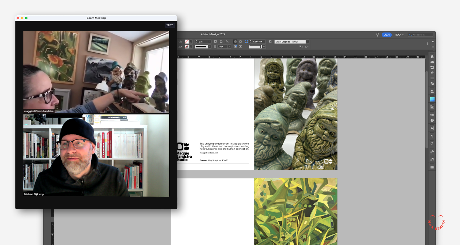
Maggie is a versatile artist and educator who seamlessly transitions between painting and crafting clay sculptures and pottery. Her creative endeavors are unified by a captivating exploration of themes such as nature, healing, and human connection.
The organic shapes within her logo are reflective of the forms recurrent in both her paintings and pottery creations. While her identity remains neutral, Maggie's vibrant personality permeates her work, ensuring that her art takes center stage. During the exploration phase, it became evident that Maggie required multiple logo marks to accommodate diverse applications across her artwork and to maintain a professional presence across various stamped, printed and digital platforms.
-
+ Brand Identity
-
+ Creative Direction
+ Qualitative Research
+ Visual Identity
+ Stationery Design
Portrait Style Evolution
Client Project + Product
March 2021
__
Portrait Style Evolution
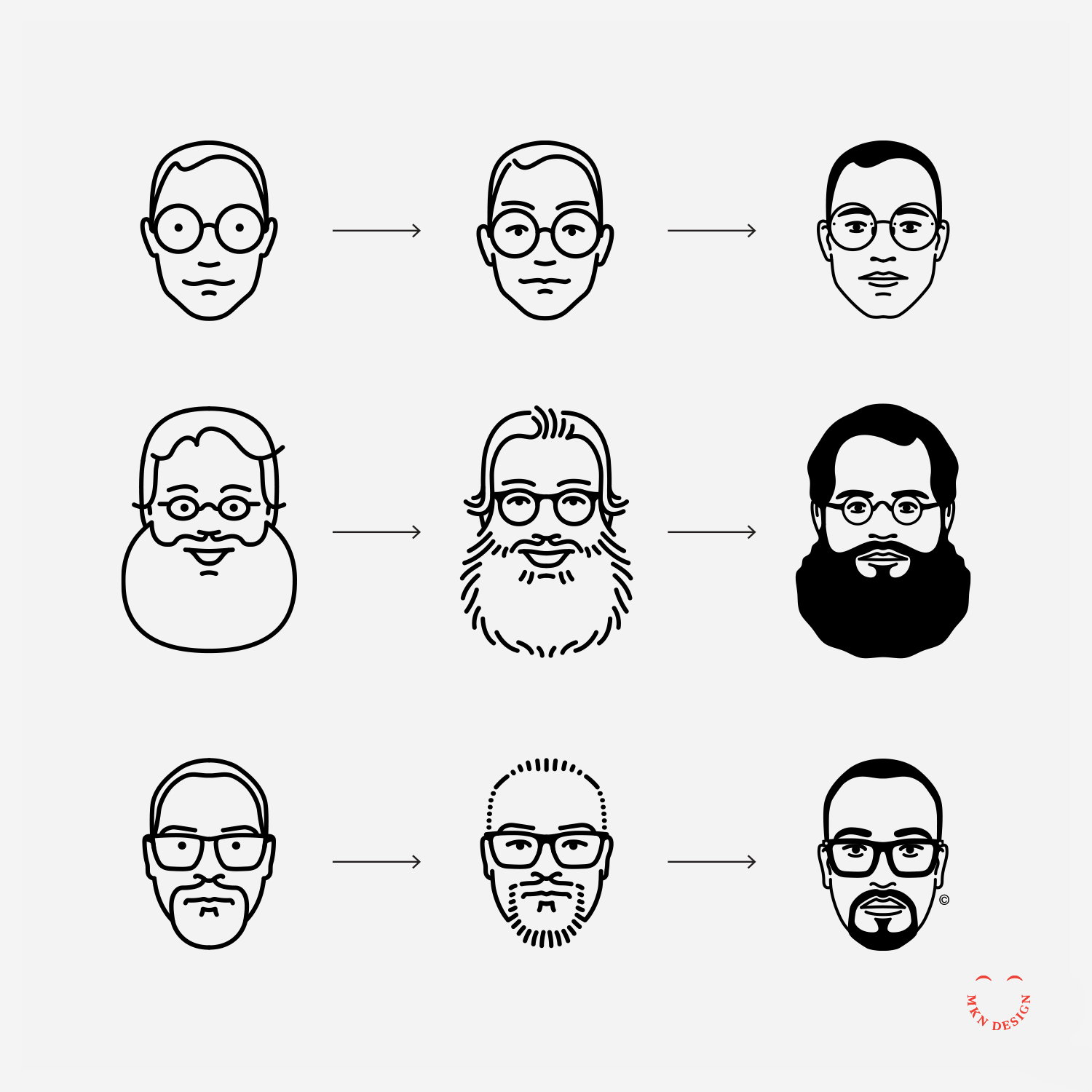
These portraits illustrations started as a self-initiated project in 2013 as a stratagem, but also to expanded my skill as an illustrator.
The project began with drawing a few of my Facebook friends and turned into a series of paid client projects for the CanUX Conference, Herman Miller, Fast Company, and IxDA. This personal initiative were simple portrait line studies and evolved to a refined style without compromising its minimalist feel. Portraits from top to bottom: Sam Bleckley, Steve Frykholm, and Hamad Al Zemami.
-
+ Portrait Illustration
-
+ Style Development
+ Sketching & Ideation
+ Illustration -
Looking for a custom illustrated portrait of yourself or a group? Reach out via email for further information and details.
Hamad Al Zemami

Client Project
November 2020
__
Hamad Al Zemami
I was commissioned to create a portrait of Hamad. The minimalist illustrative style began with simple lines and has since evolved with the addition of bold fills. These portraits are part of a continued series inspired by a self-promotional project I initiated in 2012, named Facebook Friends.
-
+ Portrait Illustration
-
+ Style Development
+ Sketching & Ideation
+ Illustration -
Looking for a custom illustrated portrait of yourself or a group? Reach out via email for further information and details.
Sidewalk Serenade
Client Project
August 2020
__
Sidewalk Serenade
An invitation I designed for my neighbors, Barbara & George Gordon, who annually host a delightful tradition in our neighborhood. Every summer, they arrange for a small ensemble from the Grand Rapids Orchestra to serenade us in their front yard. The cards I created featured a touch of elegance with flashes of gold foil, adding a touch of bling, bling to the invitation.
-
+ Graphic Design
-
+ Creative Direction
+ Graphic Design
+ Print Management
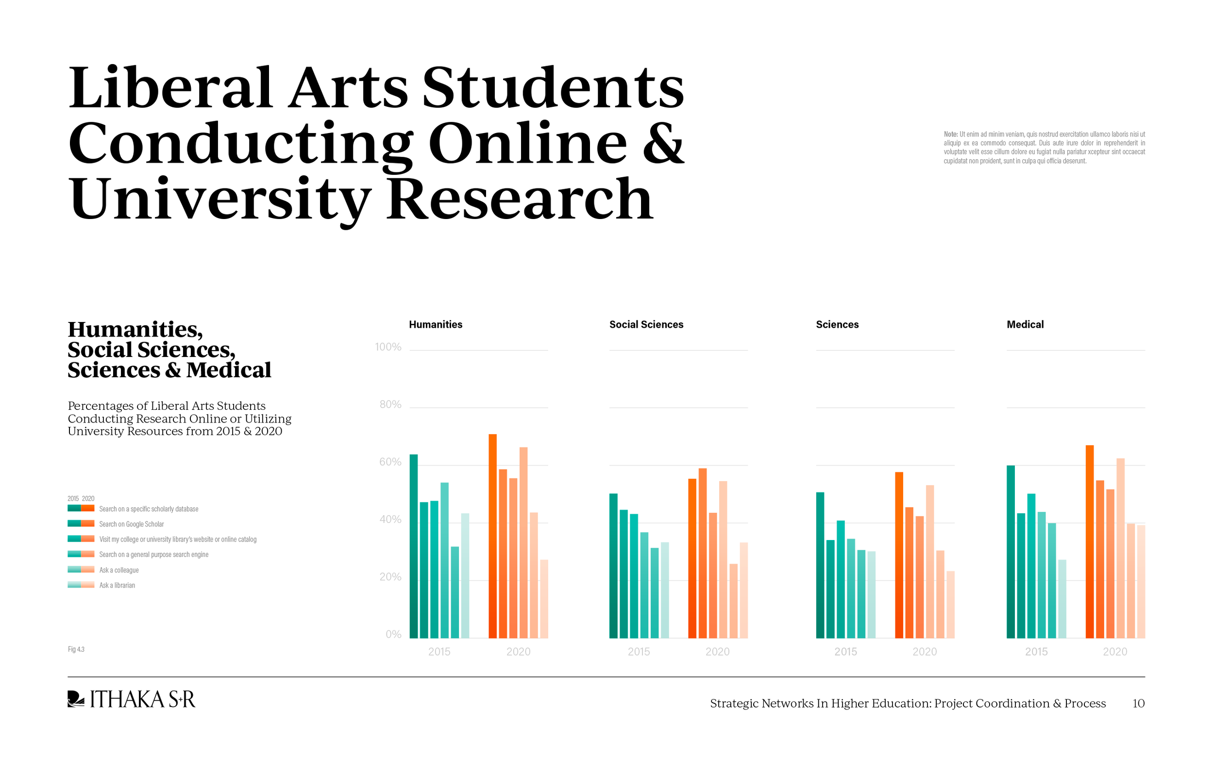
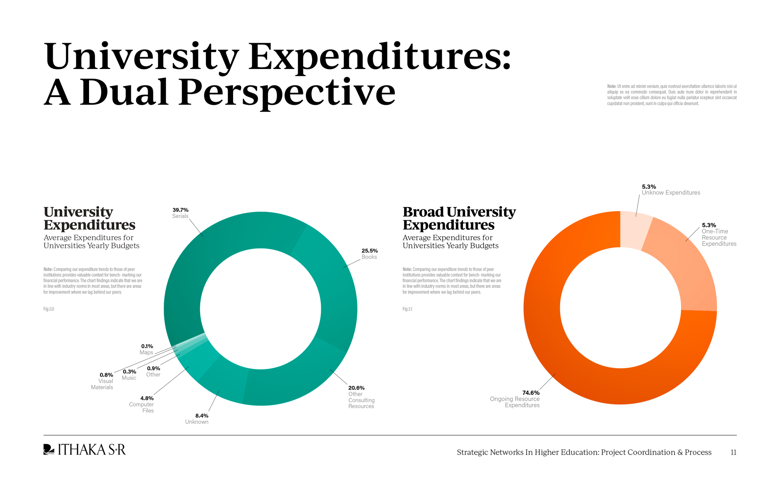
ITHAKA S+R

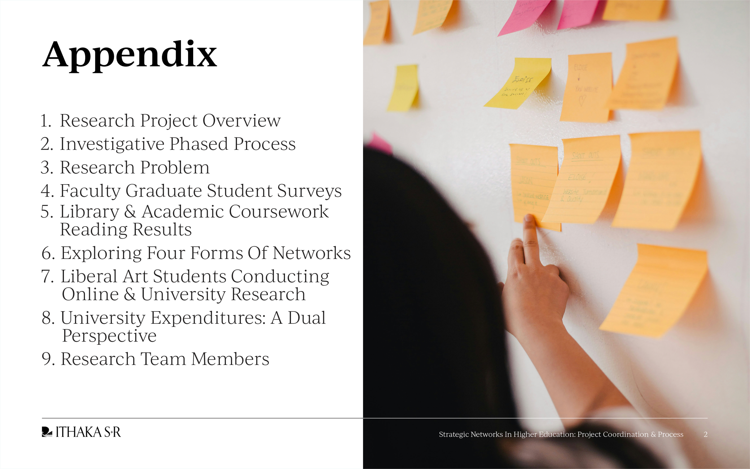
Client Project
April 2020
__
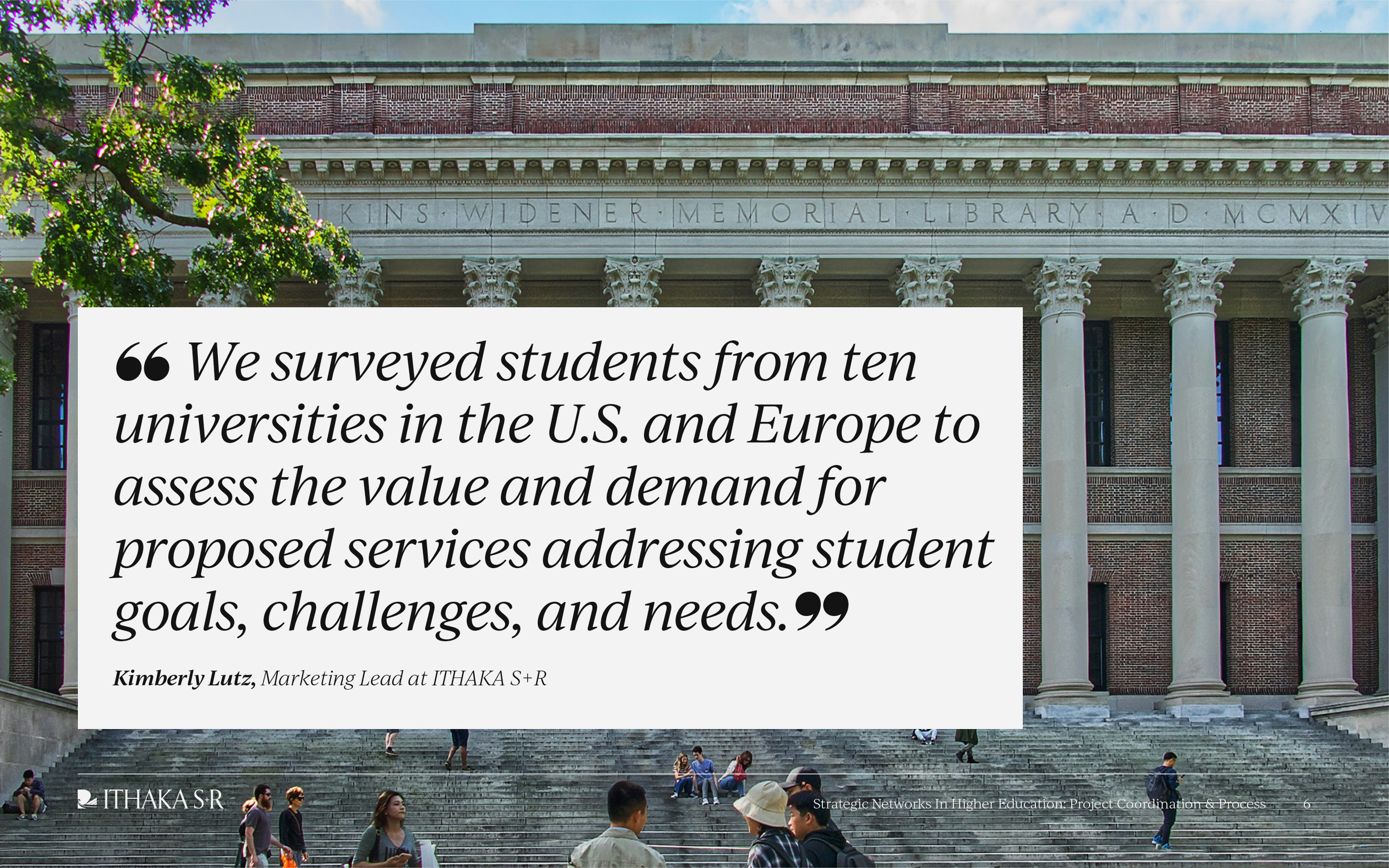
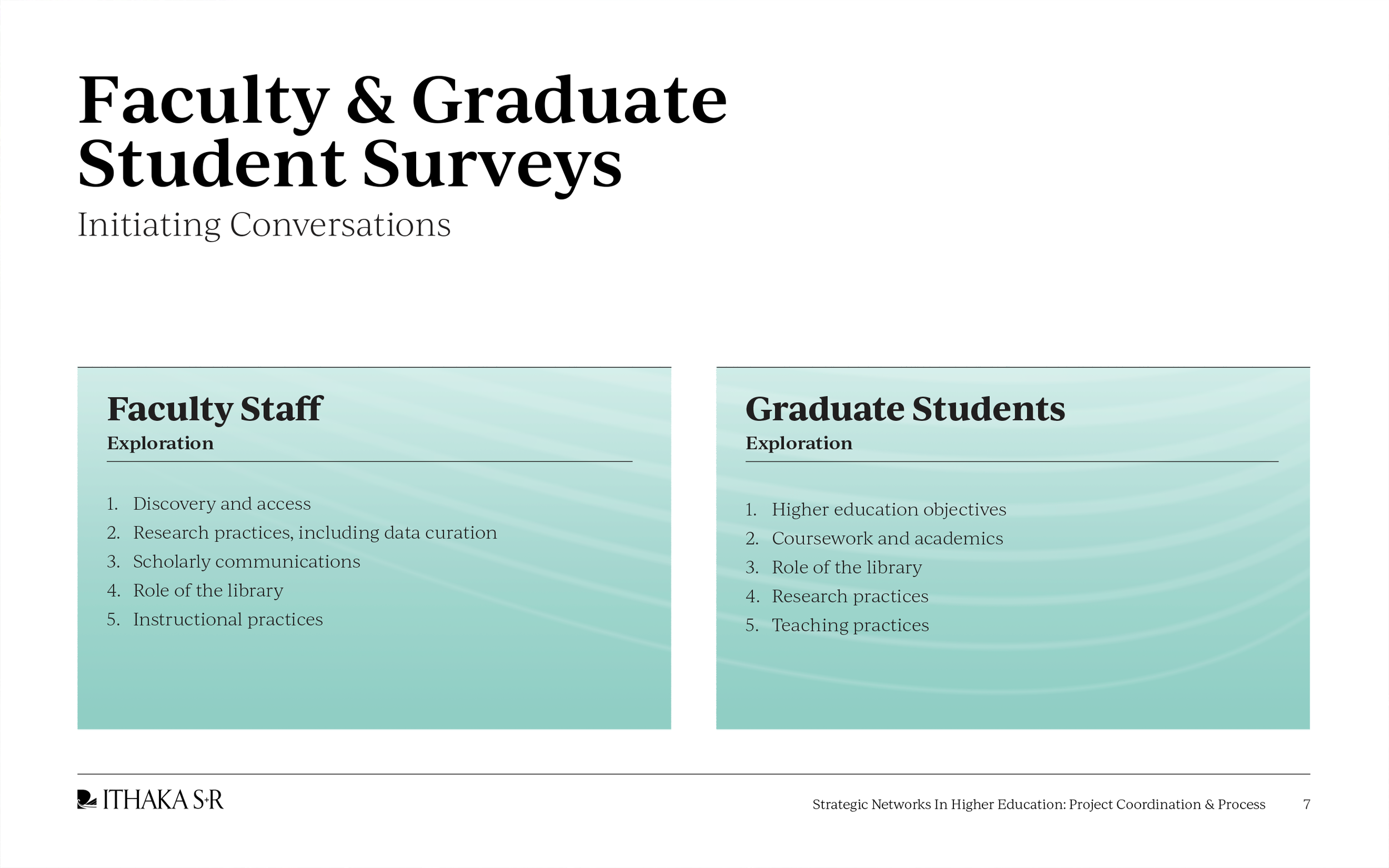
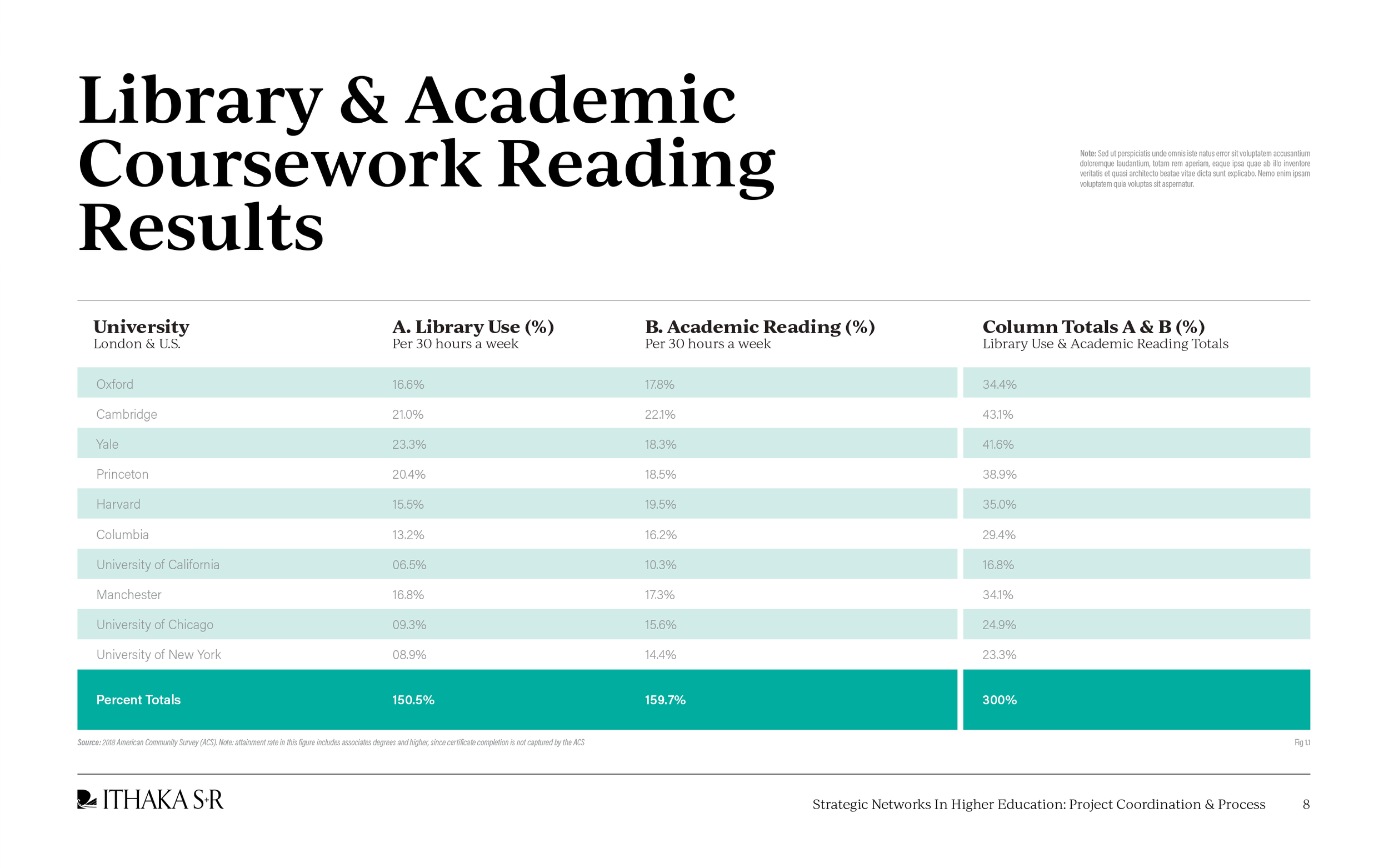
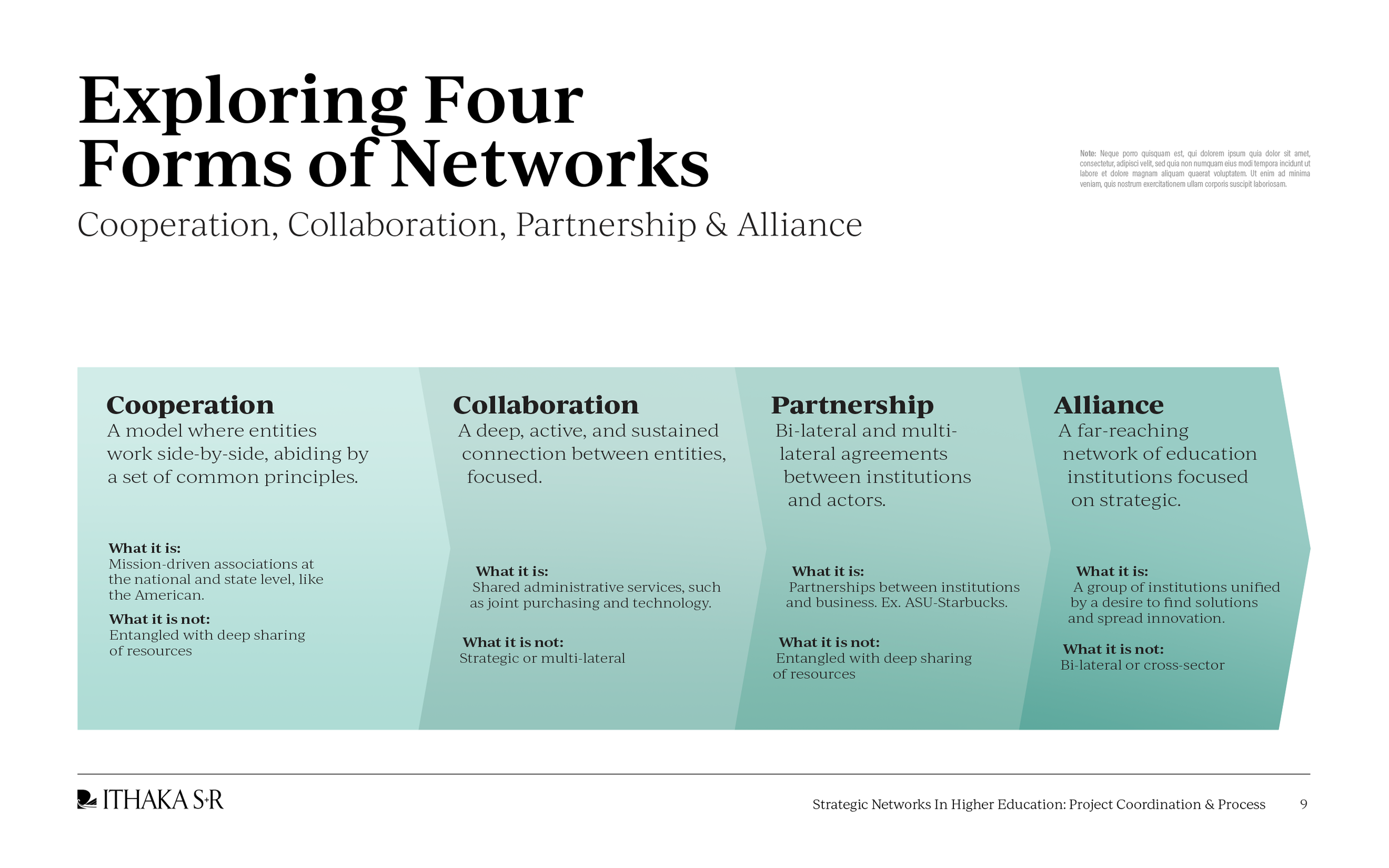
ITHAKA S+R
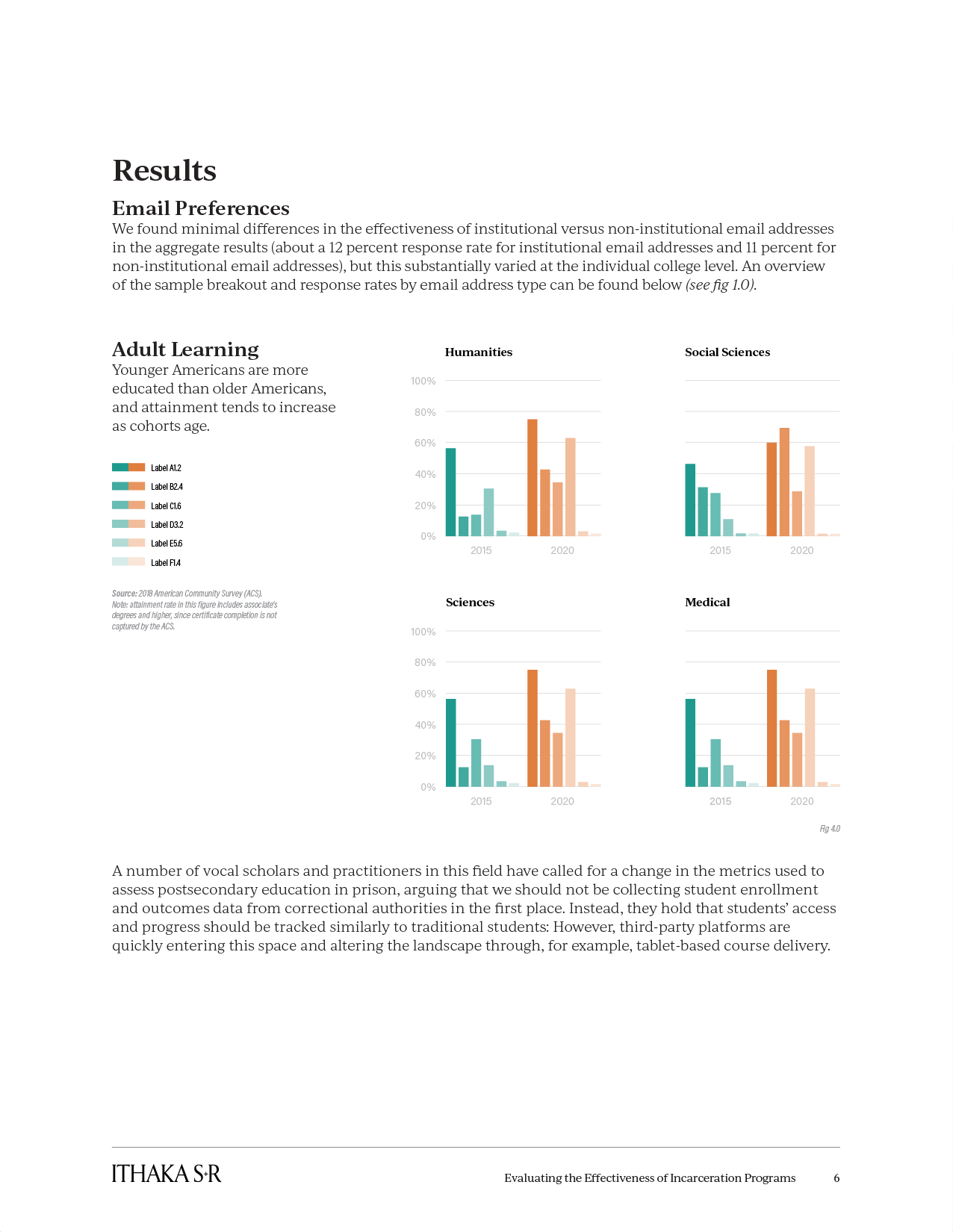
Dedicated to supporting higher education's digital transformation, ITHAKA S+R is a nonprofit conducting research, offering strategic guidance, and providing consulting services. Working closely with ITHAKA S+R, I revamped and modernized their existing design system, creating a beautiful and distinctive visual identity.
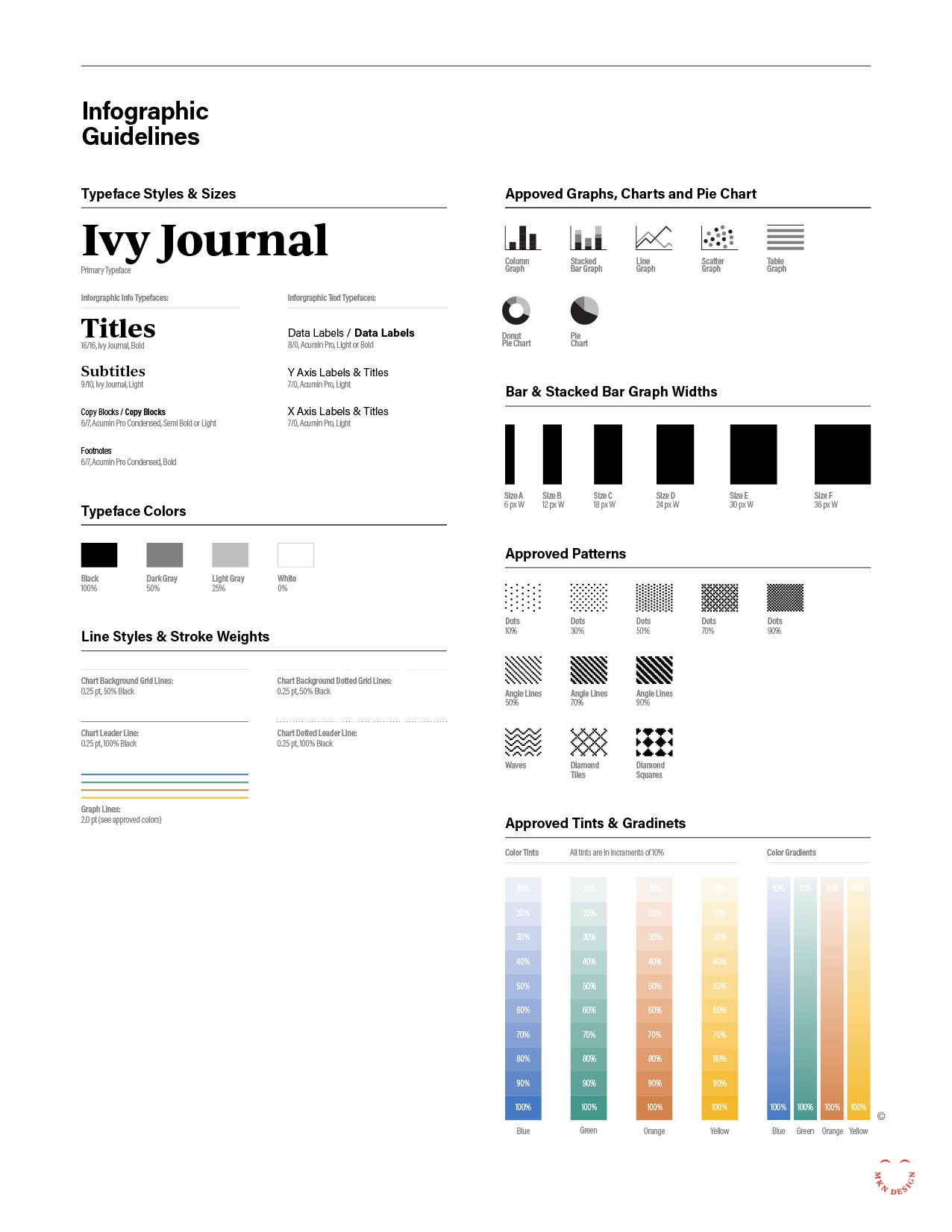
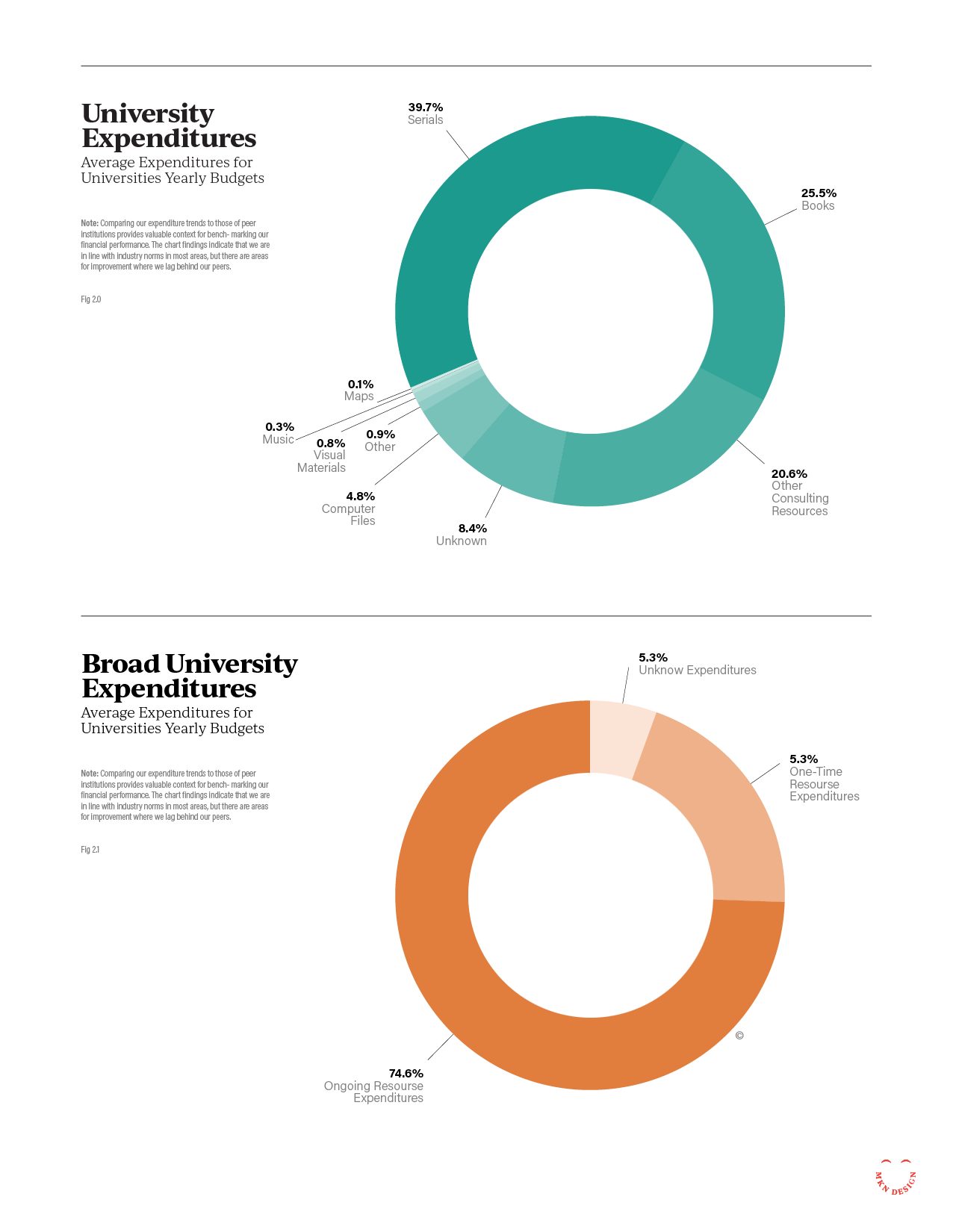
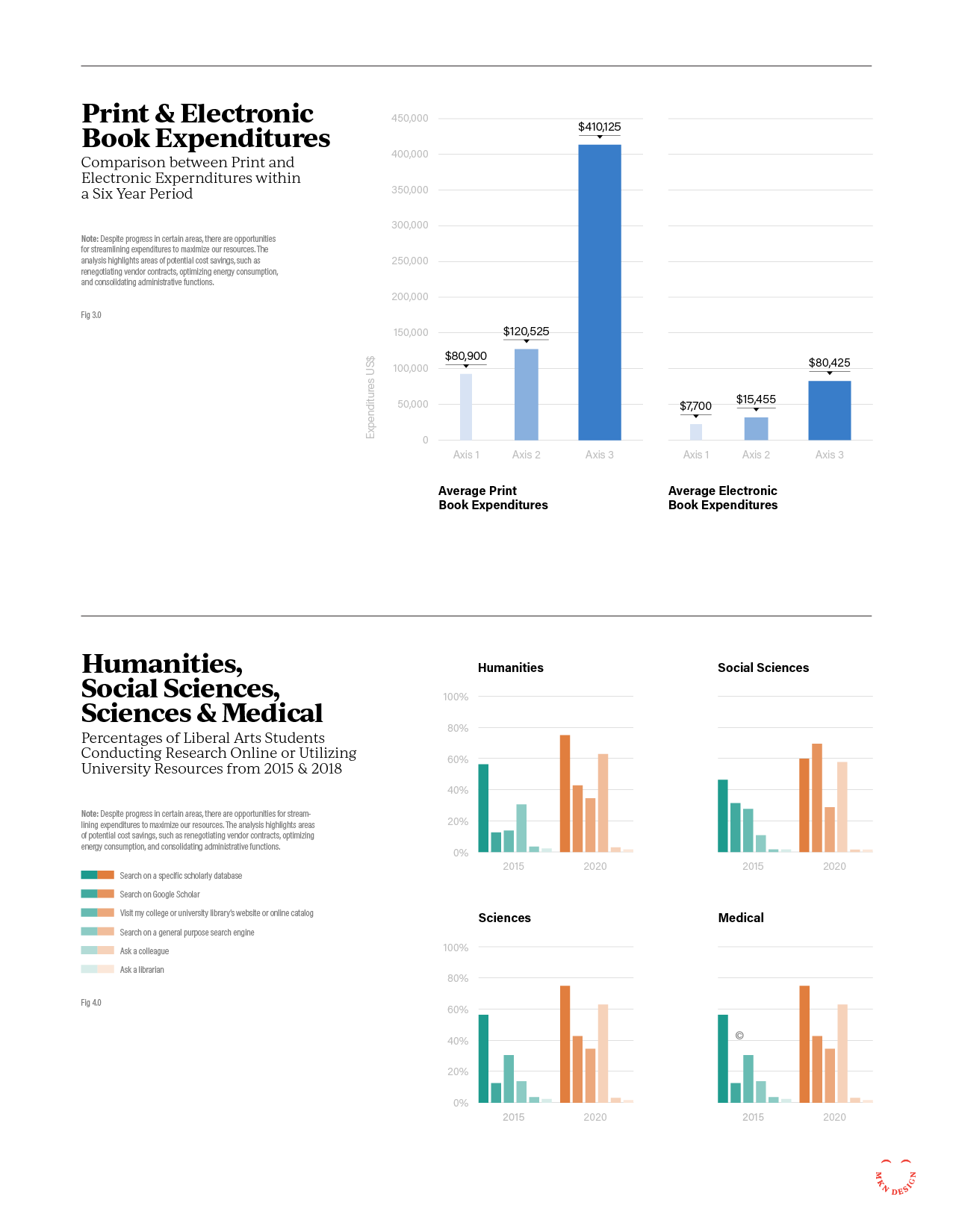
ITHAKA S+R enlisted me to modernize their design for reports, presentations, and infographics, emphasizing enhancements in design, color, and typography within a clear and comprehensive design system. The project had strict requirements, including adherence to brand guidelines, consideration of color blindness and visual impairments, and the need for distinct visual cues for various document types. Additionally, staff needed the capability to create or update all redesigned materials. After research, it was determined that Google Workspace (Docs, Slides, and Sheets) would be the optimal solution for creating these materials. The result was a unified design system that stayed true to ITHAKA S+R’s brand guidelines while providing a distinct visual identity for educational research materials and presentations.
-
+ Design System
-
+ Creative Direction
+ Project Management
+ Qualitative Research
+ Concept Development
+ Graphic Design & Layout
+ Presentation Design
+ Infographics
+ Illustration
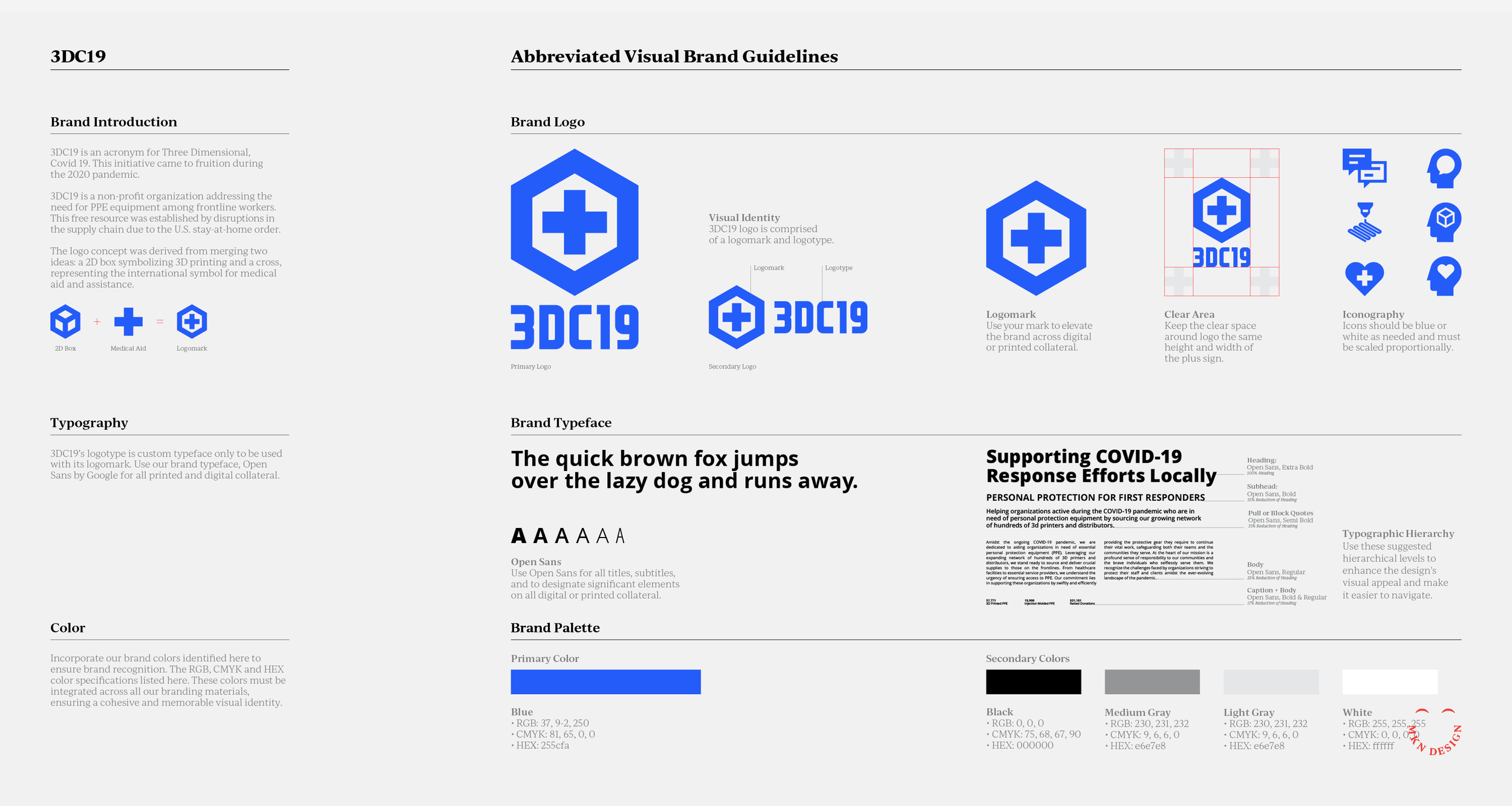
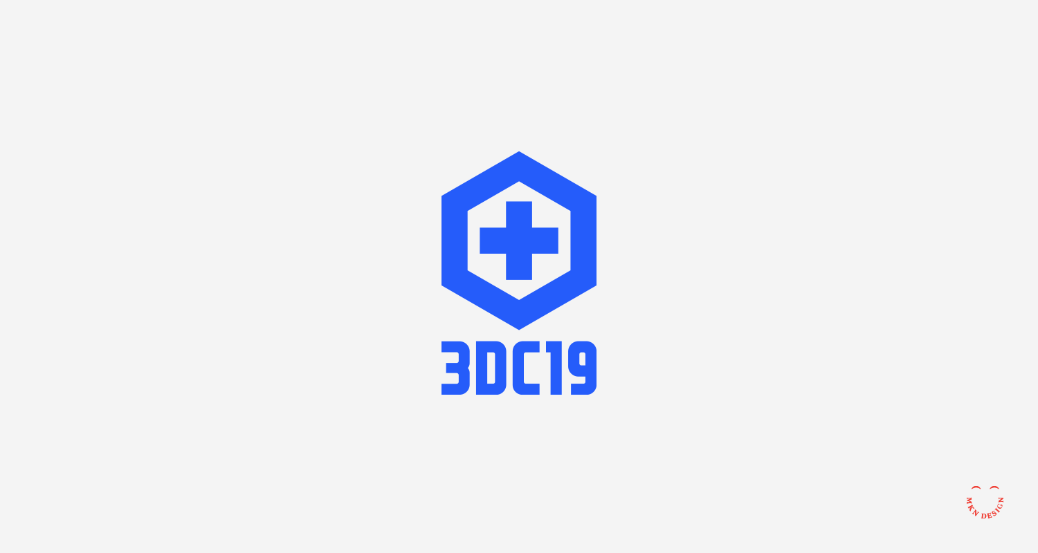
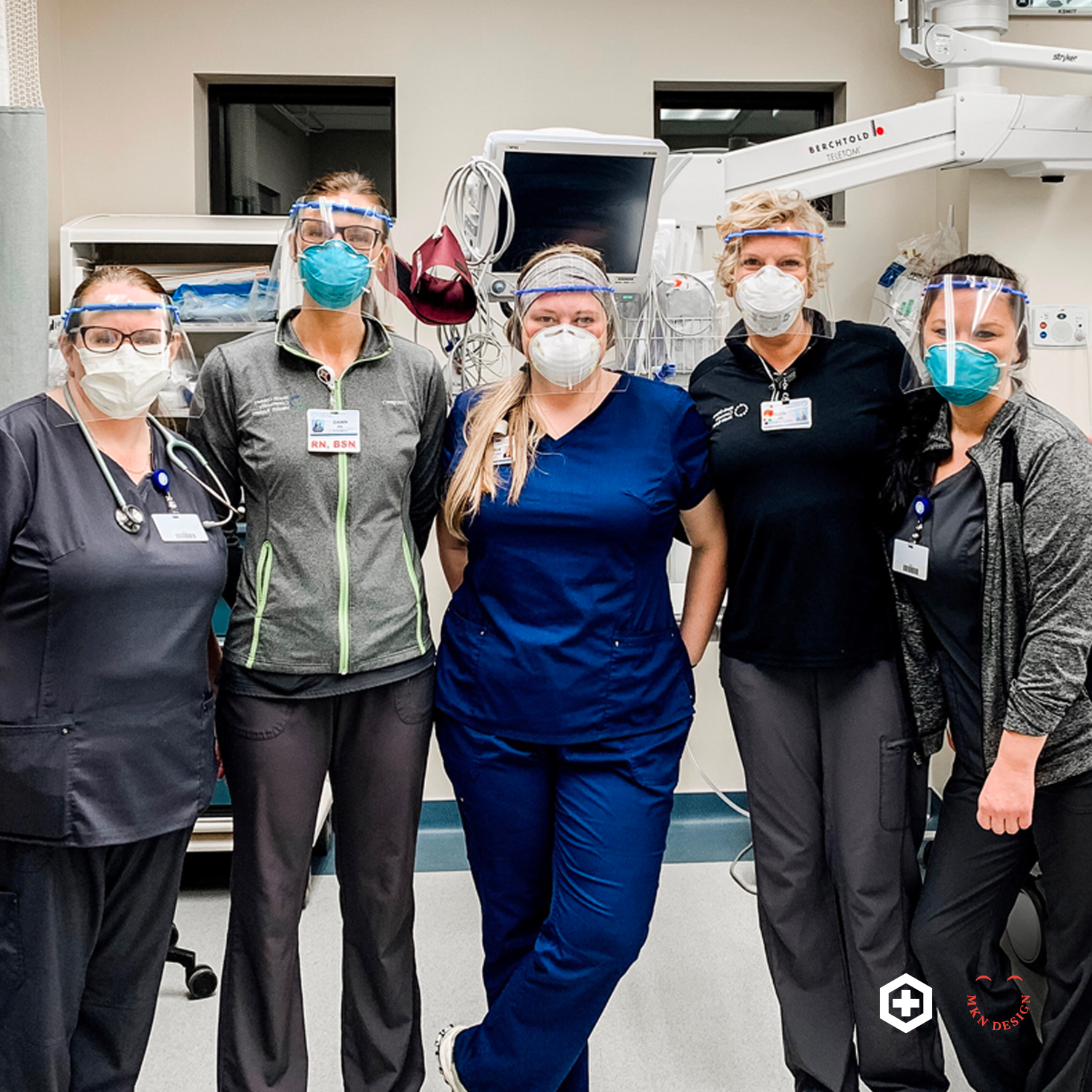
3DC19


Client Project
April 2020
__
3DC19
During the 2020 pandemic, 3DC19 emerged as a response to the heightened demand for PPE among frontline workers. This initiative was prompted by disruptions in the supply chain caused by the U.S. stay-at-home order.
To tackle this challenge, a group of makers, creators, and volunteers based in West Michigan collaborated to print 3D face shields, ear savers and more. This collaborative effort brought together individuals with a shared objective to address the pressing need for protective equipment.
In this collaboration, my role involved assisting the 3DC19 team in crafting a logo, icons, and brand guidelines to enhance their visibility within their communities and on social media platforms. The group and I contributed time, materials, and resources to manufacture PPE equipment free of charge for frontline workers.
-
+ Brand Identity
-
+ Creative Direction
+ Project Management
+ Qualitative Research
+ Concept Development
+ Iconography
Brand Motion

Client Projects + Creative Musings
January 2020
__
Brand Motion
These various logos and marks have been created by using simple motion design. Integrating subtle motion not only elevates the visual appeal of your brand but also contributes to narrating a captivating brand story, making it easier for your audience to relate and remember your brand.
Looking for assistance in establishing a brand or revitalizing an existing one, contact me!
-
+ Brand Identity & Animation
-
+ Creative Direction
+ Concept Development
+ Sketching & Ideation
+ Illustration
+ Motion Design
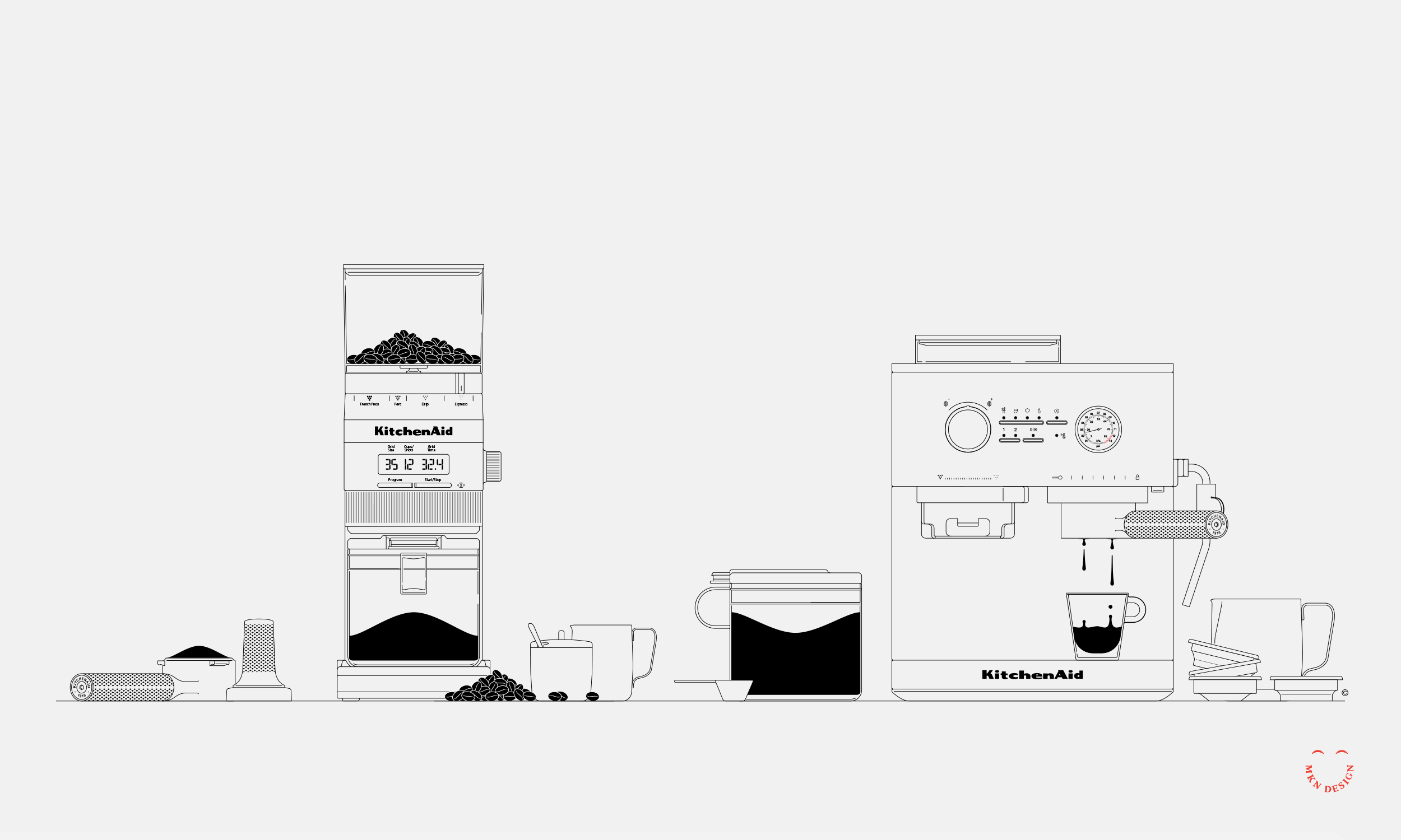
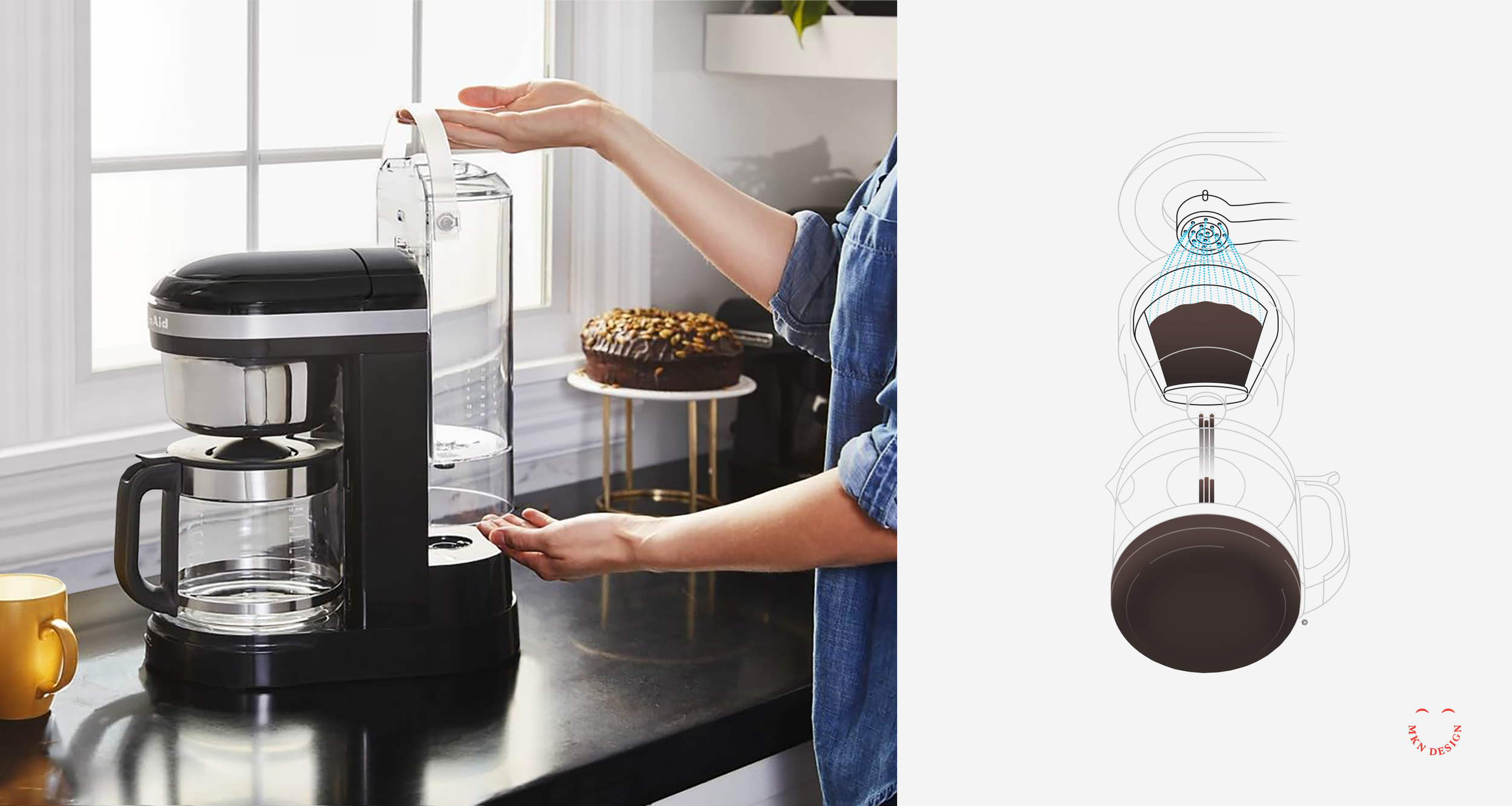
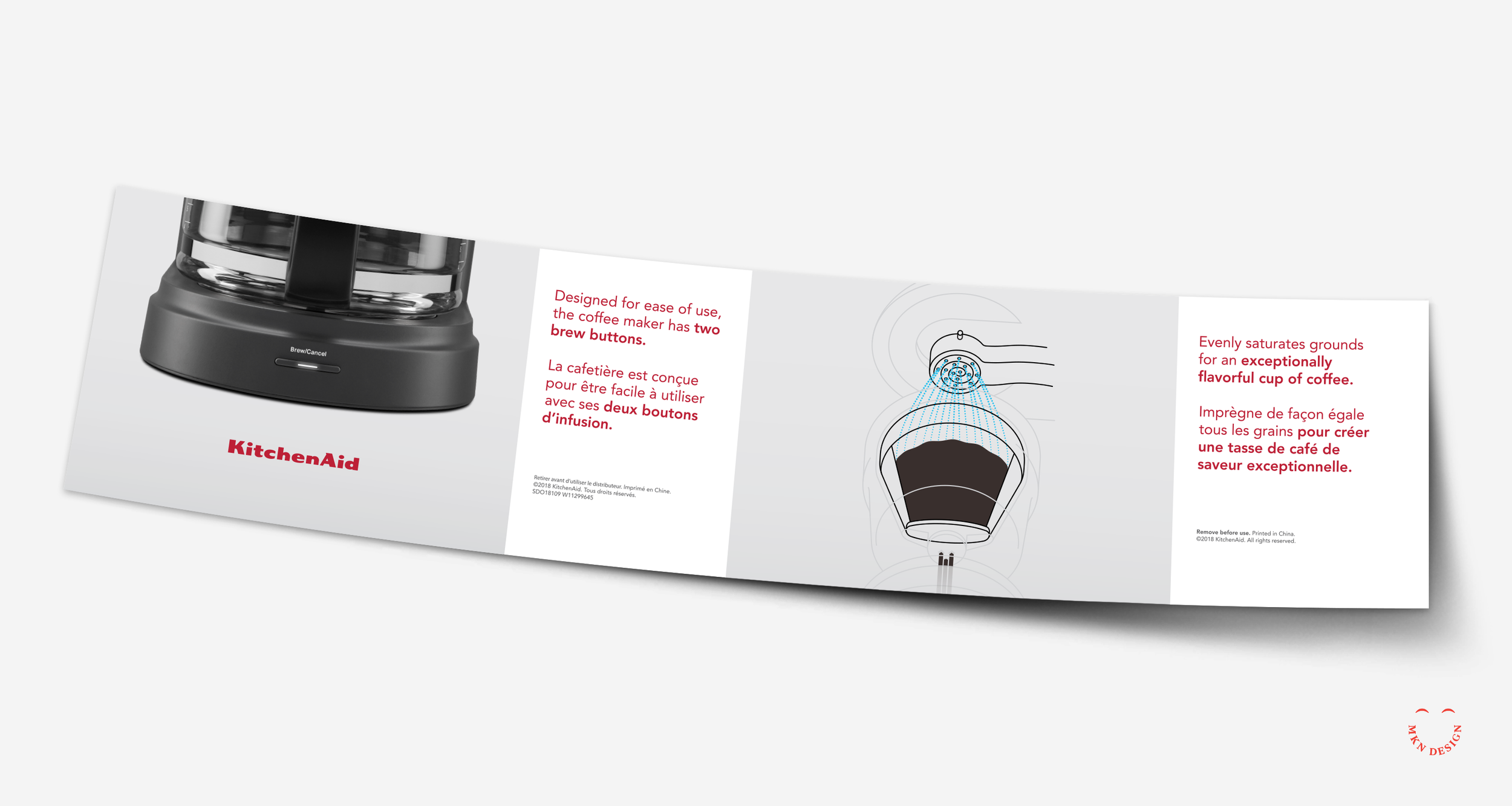
KitchenAid Coffee Drip


Client Project
June 2019
__
KitchenAid Coffee Drip
Renowned as a leader in kitchen product design and innovation, KitchenAid stands as one of the most recognizable brands in the industry. Within their extensive product catalog, KitchenAid offers coffee makers that seamlessly blend innovative design with precision engineering, ensuring exceptional brewing experiences tailored to both casual coffee drinkers and connoisseurs. KitchenAid enlisted my expertise to visually illustrate their latest drip coffee maker, showcasing its innovative approach to evenly saturating coffee grounds.
Drawing from my comprehension of the innovative Spiral Head feature's functionality, I created a series of sketches to depict its role in ensuring consistent water saturation of coffee grounds for optimal flavor extraction. The project progressed through various stages, from discovery to concept sketching and ideation. Incorporating diverse perspectives, we determined the most impactful approach to illustrate the idea. This resulted in a straightforward line drawing with nuanced coloring and a phantom-style technical illustration.
-
+ Product Illustration
-
+ Research
+ Concept Development
+ Sketching & Ideation
+ Product Illustration
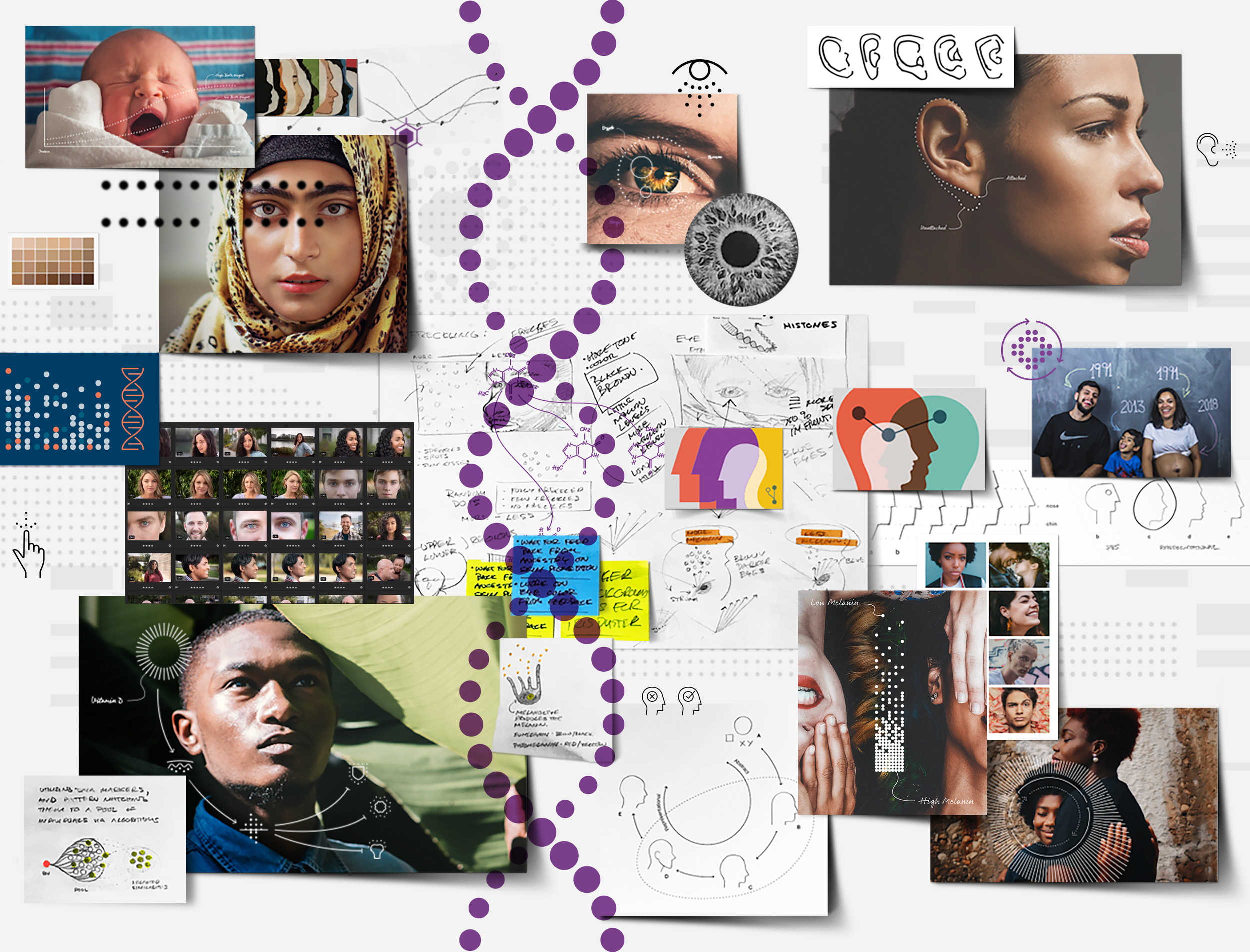
Ancestry DNA
Client Project
April 2019
__
Ancestry DNA
Ancestry DNA offers a fascinating journey into one's past, using cutting-edge DNA technology to uncover ancestral origins and connections. By analyzing a simple saliva sample, Ancestry DNA provides individuals with detailed insights into their genetic ethnicity, connecting them with distant relatives and unraveling the mysteries of their family history. I worked closely with Ancestry DNA to develop a visual design system for their online products.
I led a comprehensive initiative to shape and establish a visual language for Ancestry DNA products. Employing an agile methodology, we navigated through stages of empathy, user interviews, research, illustration and iconography. The resulting visual design system adopted a conceptual and minimalist approach, enriched by overlaying the visual language on diverse human-centric photography.
-
+ Visual Design System
-
+ Concept Development
+ Illustrative Direction
+ Qualitative & Quantitative Research
+ Sketching & Ideation
+ Graphic Design
+ Illustration
+ Iconography -
The image college shown is a representation of a 6-month coalesce of project artifacts.
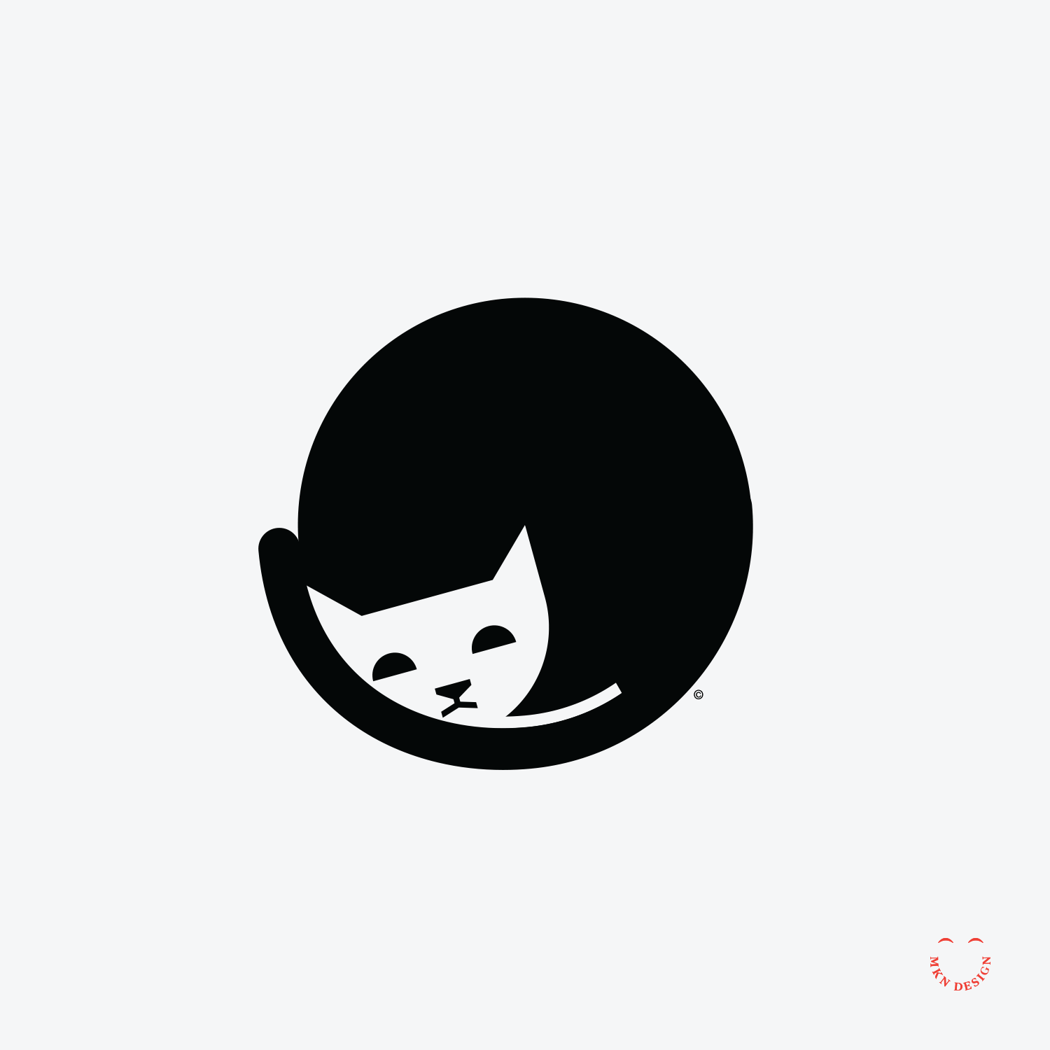
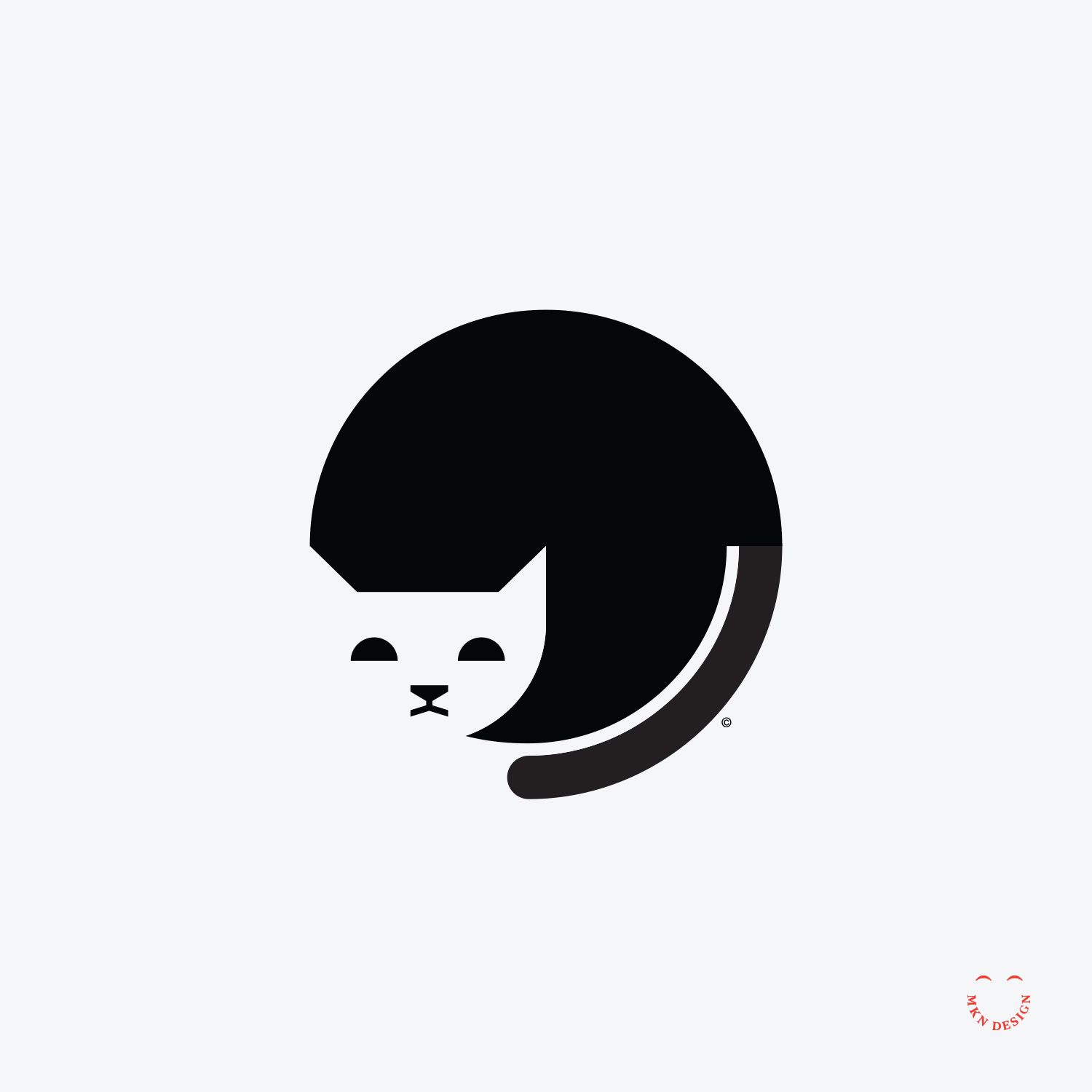
Sleepy Cat
Creative Musing
January 2019
__
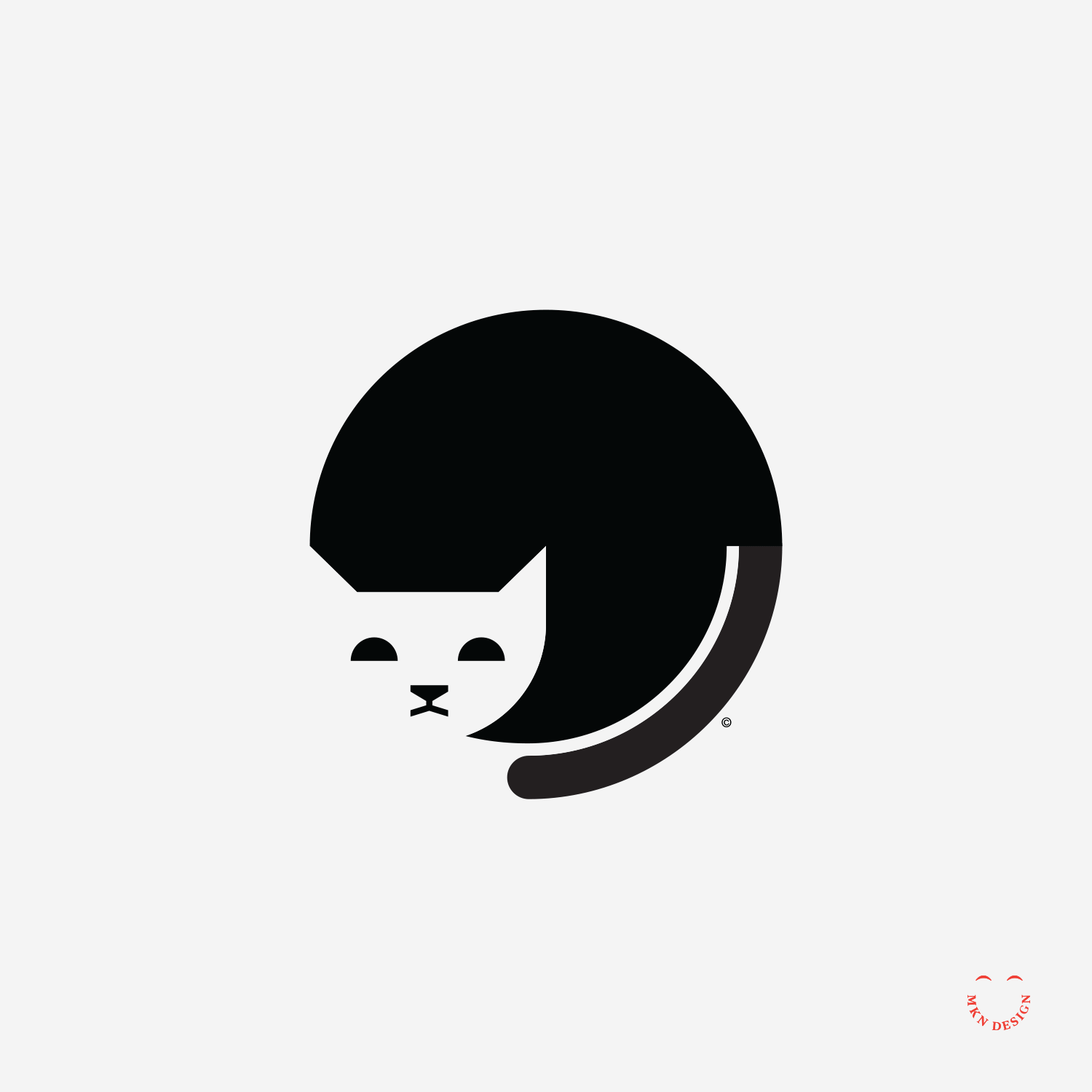
Sleepy Cat
My goal for this small illustration and animation was to depict a simple sleeping cat while maintaining its circular shape. During the sketching and ideation phase, I created numerous variations to ensure the effectiveness of how the animation behaved.
Patagonia

Client Project
January 2019
__
Patagonia
Patagonia, a renowned outdoor clothing and gear company, embodies a commitment to environmental sustainability and ethical business practices while offering high-quality products for outdoor enthusiasts. I was hired by Patagonia to create several sketches and illustrations based on their prompt, "Eat Local."
I created a range of concept sketches inspired by the "eat local" theme and collaborated with Patagonia, iterating until we achieved mutual satisfaction. From these skteched concepts, Patagonia chose a refined illustration titled "Eat Local, Watering Can," which was selected and printed on their tees.
-
Illustration
-
+ Concept Development
+ Sketching & Ideation
+ Illustration
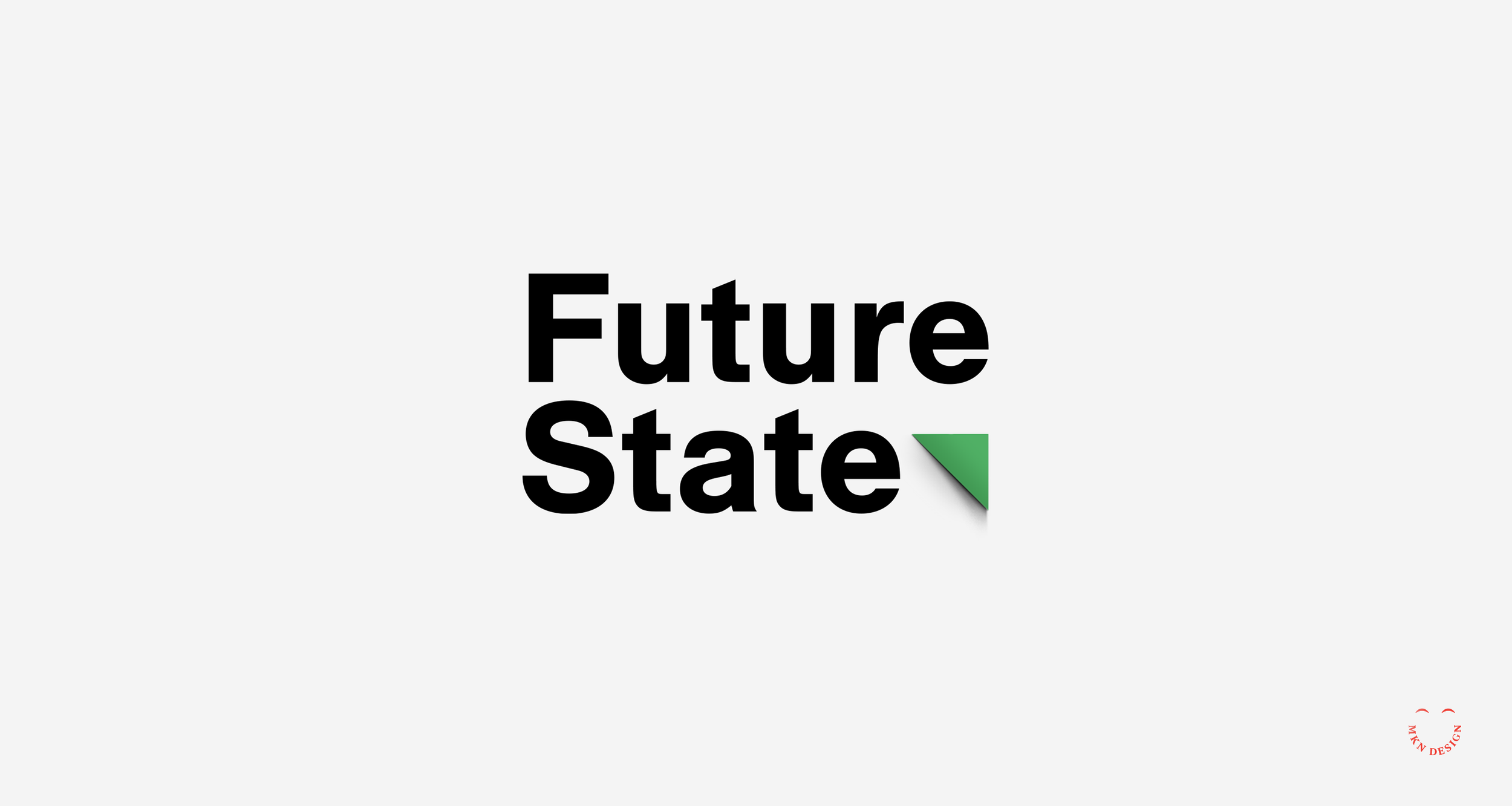
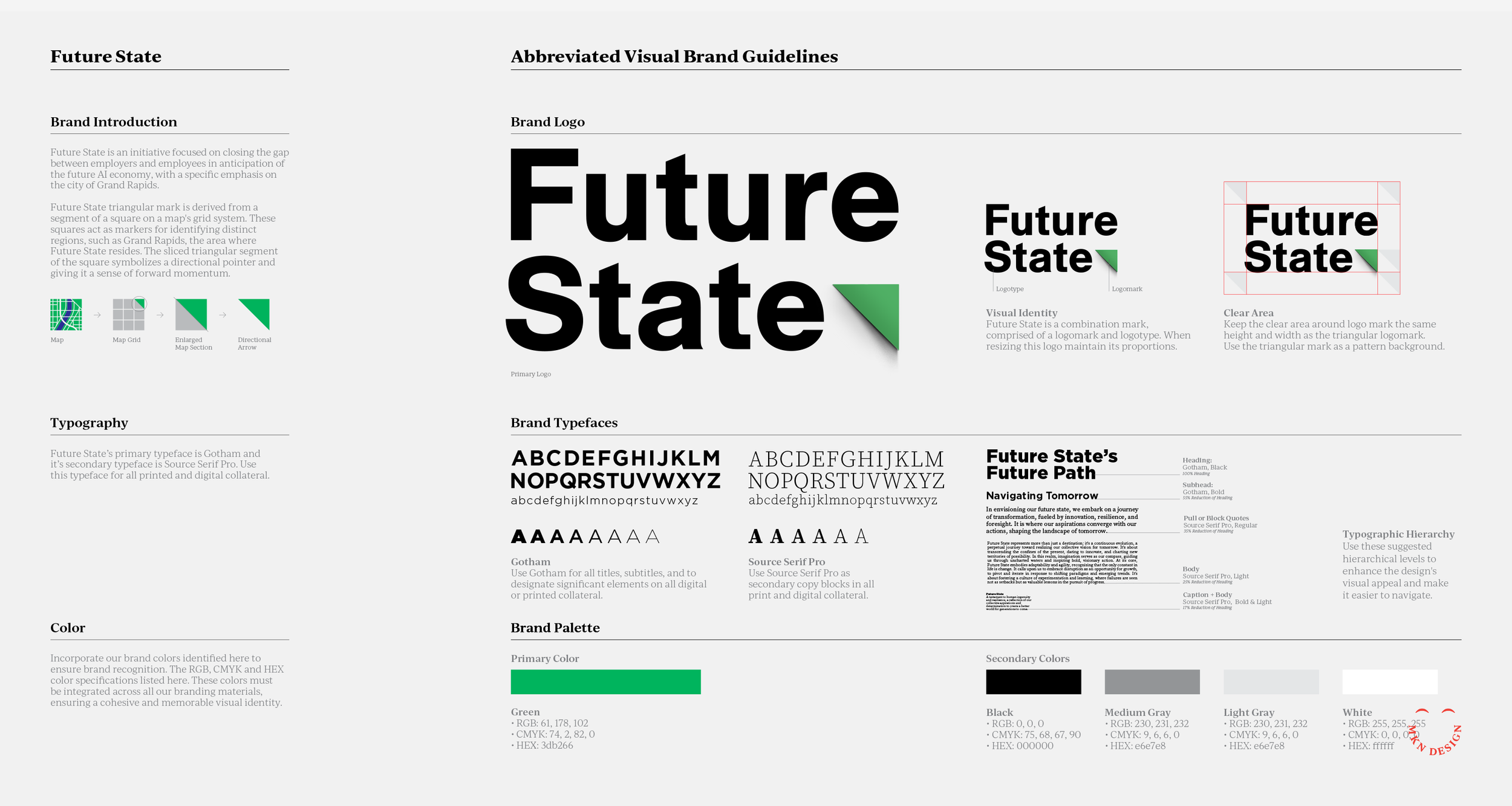
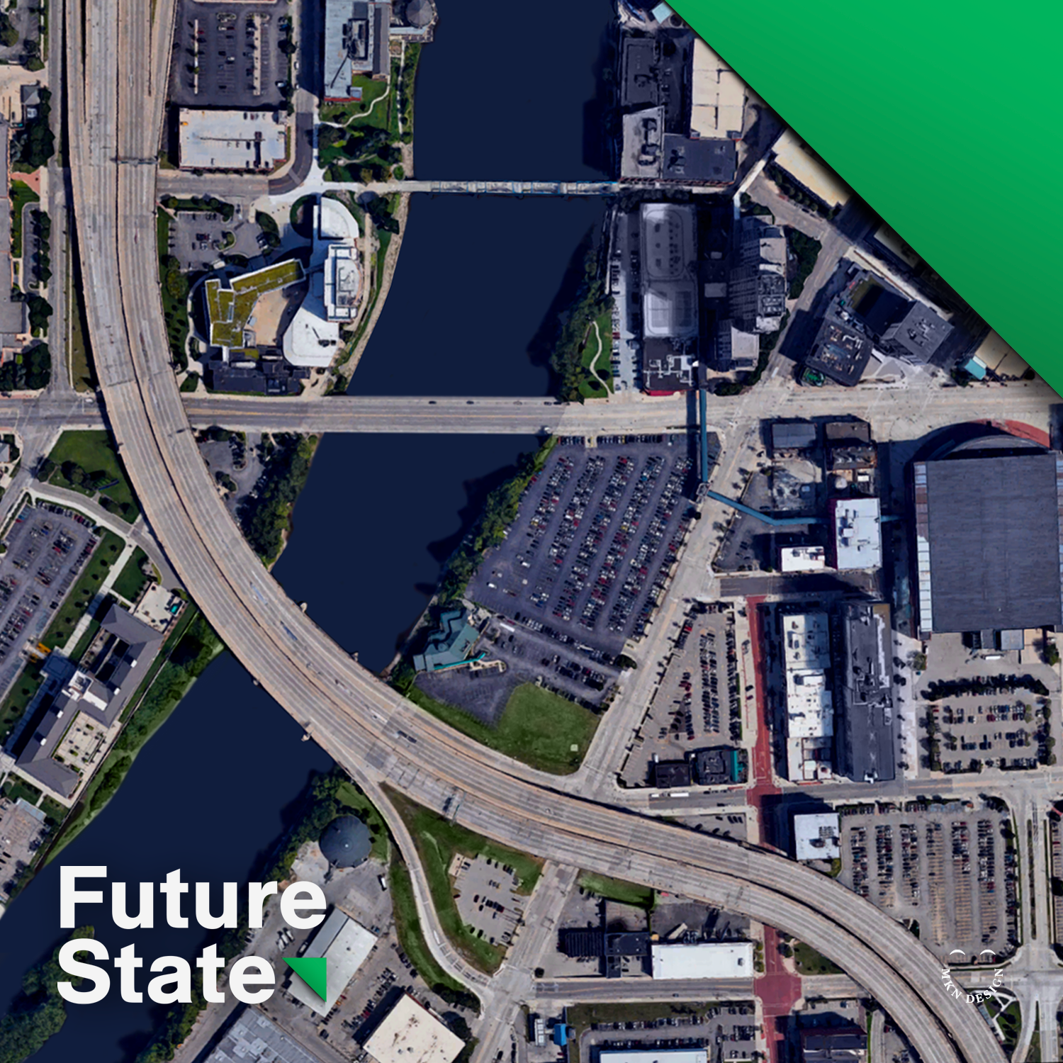
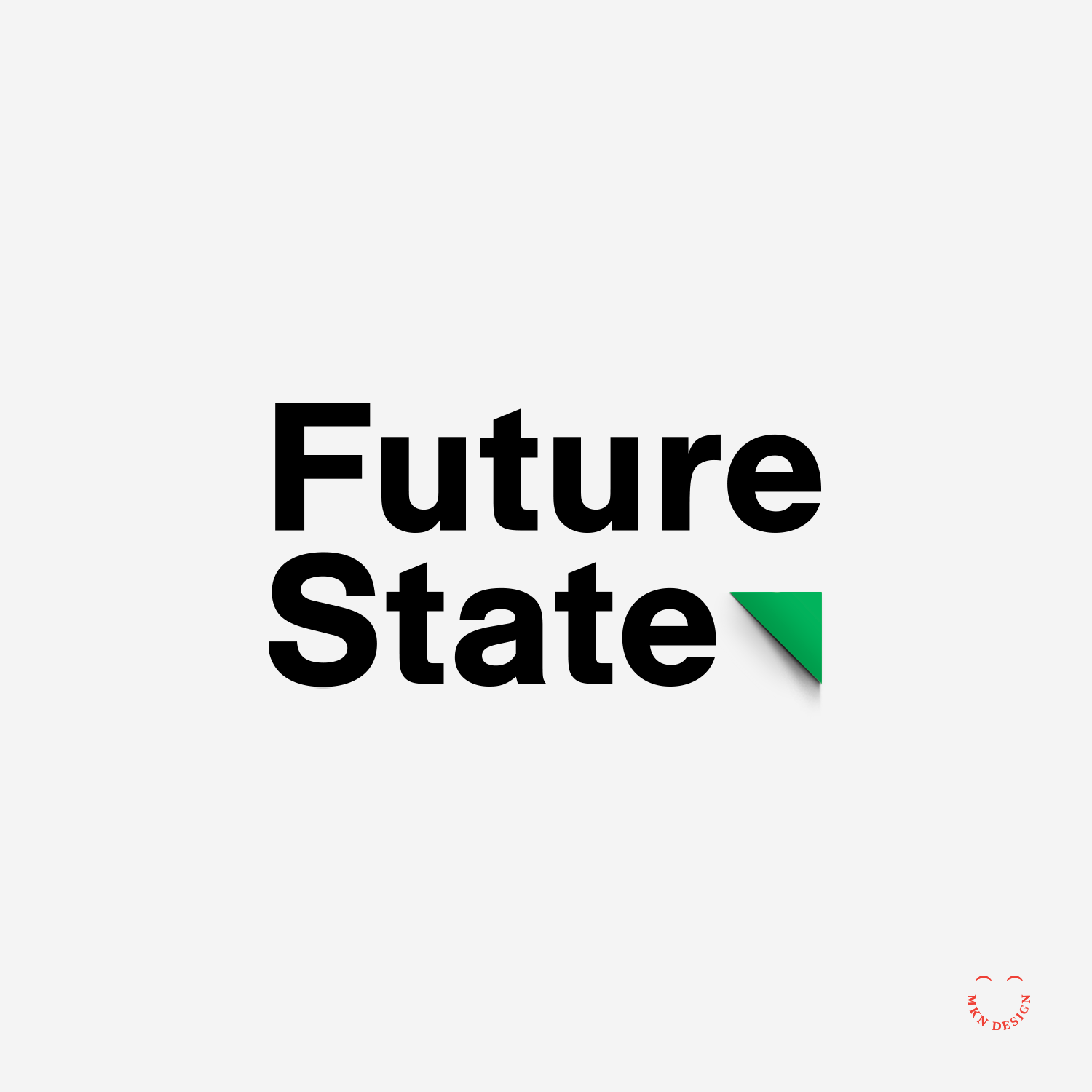
Future State
Client Project
September 2018
__
Future State
Future State was developed for the key stakeholders and the City of Grand Rapids, aimed to establish a council to facilitate engagement and foster connections between employers and employees within the AI economy.
The triangular mark used for Future State’s mark is derived from a segment of a square, symbolizing a map's grid system. The squares represented on a map serve as markers for finding distinct regions, such as Grand Rapids – serving as the the area where Future State resides. The sliced triangular segment of the square acts as forward momentum.
-
+ Brand Identity
-
+ Creative Direction
+ Concept Development
+ Sketching & Ideation
+ Graphic Design -
This project was a collaborative effort, with Kevin White.
Spectrum Health

Client Project
December 2017
__
Spectrum Health
A prominent healthcare provider dedicated to delivering exceptional medical services and improving community health, Spectrum Health (now Corwell Health) plays a vital role in enhancing the well-being of individuals across various West Michigan. Working alongside a team of engineers and developers, I helped design and develop functional prototype application named My Chart.
The application catered to both new and returning patients of Spectrum Health facilities, offering features such as iPad-based check-in for hospital and doctor appointments, seamless access to medical records, and entertainment options. This endeavor required a strategic approach, including the use of personas, iterative wire-framing, and meticulous design iterations to craft a compelling and user-centric digital journey for patients.
-
+ Customer Journey Storytelling
+ UX/UI Design -
+ Design Direction
+ Qualitative & Quantitative Research
+ Concept Development
+ Sketching & Ideation
+ Illustrative Storytelling
+ User Experience -
This project was developed in collaboration with Mutually Human.
Fultonwood Type Foundry


Client Project + Product
September 2017