Creative Musing
December 2023
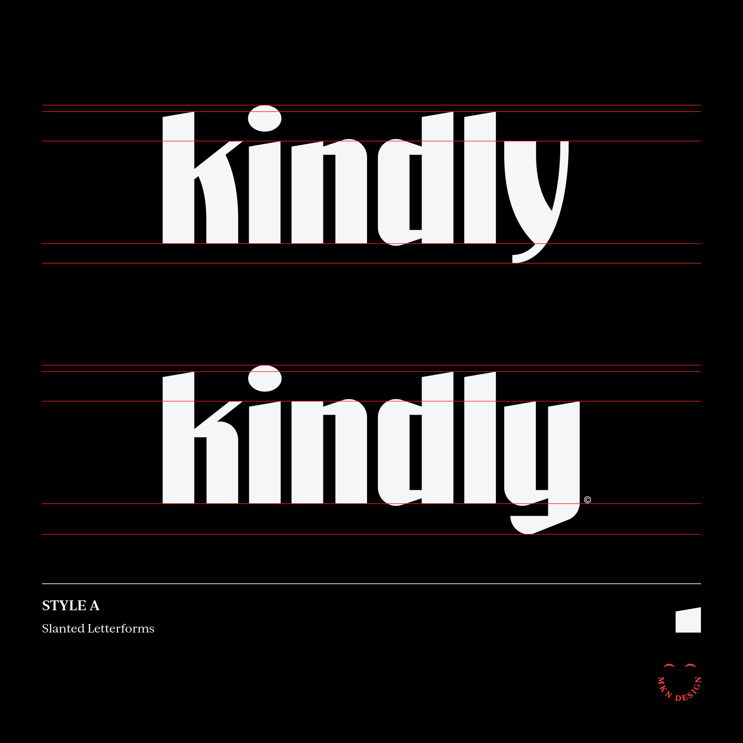
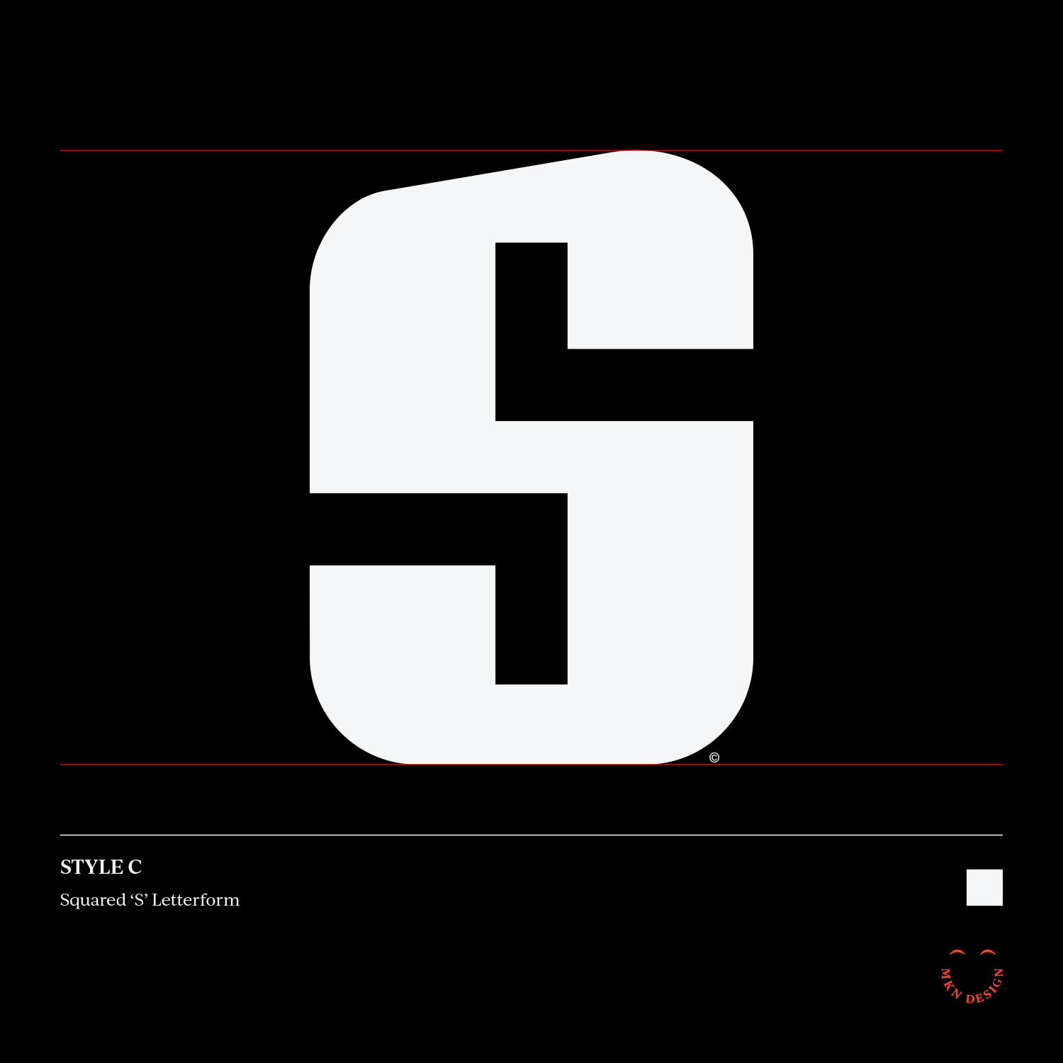
Creative Musing
December 2023
Creative Musing
February 2022
Panda graphic tee is available for purchase. Check out more graphic tees on my Cotton Bureau profile page.
__
Note: All Cotton Bureau apparel comes in a variety of clothing types, styles, fits, sizes, materials, and colors.
Creative Musing
January 2022
Creative Musing
July 2021

Creative Musing
June 2021


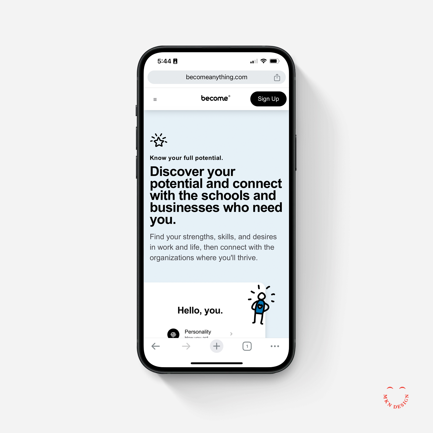
Client Project
June 2021
+ Branding
+ Team Leadership
+ Project Management
+ Creative Direction
+ Qualitative & Quantitative Research
+ Brand Messaging
+ Naming
+ Visual Identity
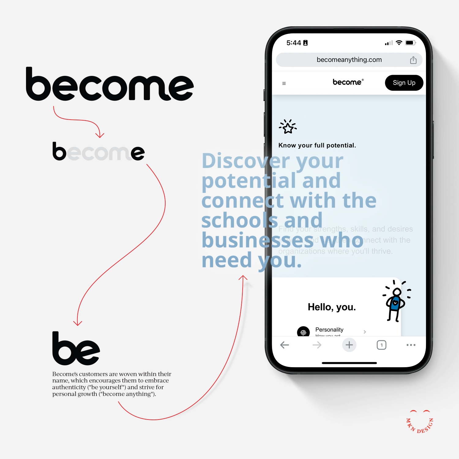
Michael Nÿkamp served as a patient and adept navigator during our brand discovery expedition. His guidance enabled us to gain profound insights into our company's identity. Although the outcome was unexpected, it perfectly aligned with our aspirations. None of this would have happened without him and for that, we are very grateful.
— Ryan Montgomery, CEO of Become
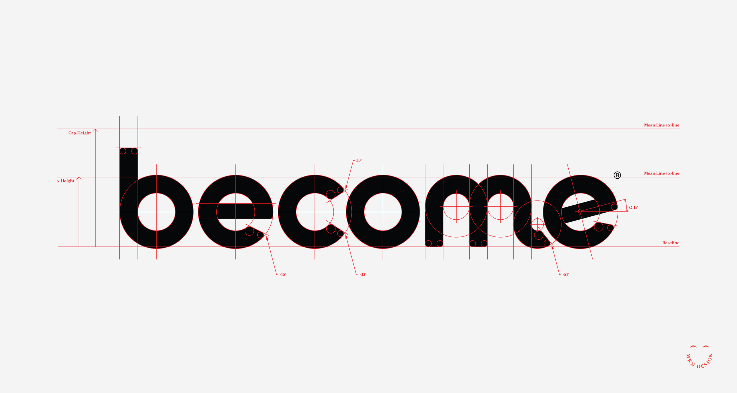
View the initial mark exploration concepts for Become.
Phase III fun illustrations drawn by David Schofield.
Creative Musing
February 2021

Creative Musing
February 2021
Client Project
January 2021
Visual Identity
+ Creative Direction
+ Project Management
+ Custom Typography
+ Illustration

Creative Musing
November 2020
Creative Musing
April 2020

Creative Musing
March 2020
Creative Musing
November 2019
Creative Musing + Product
November 2019
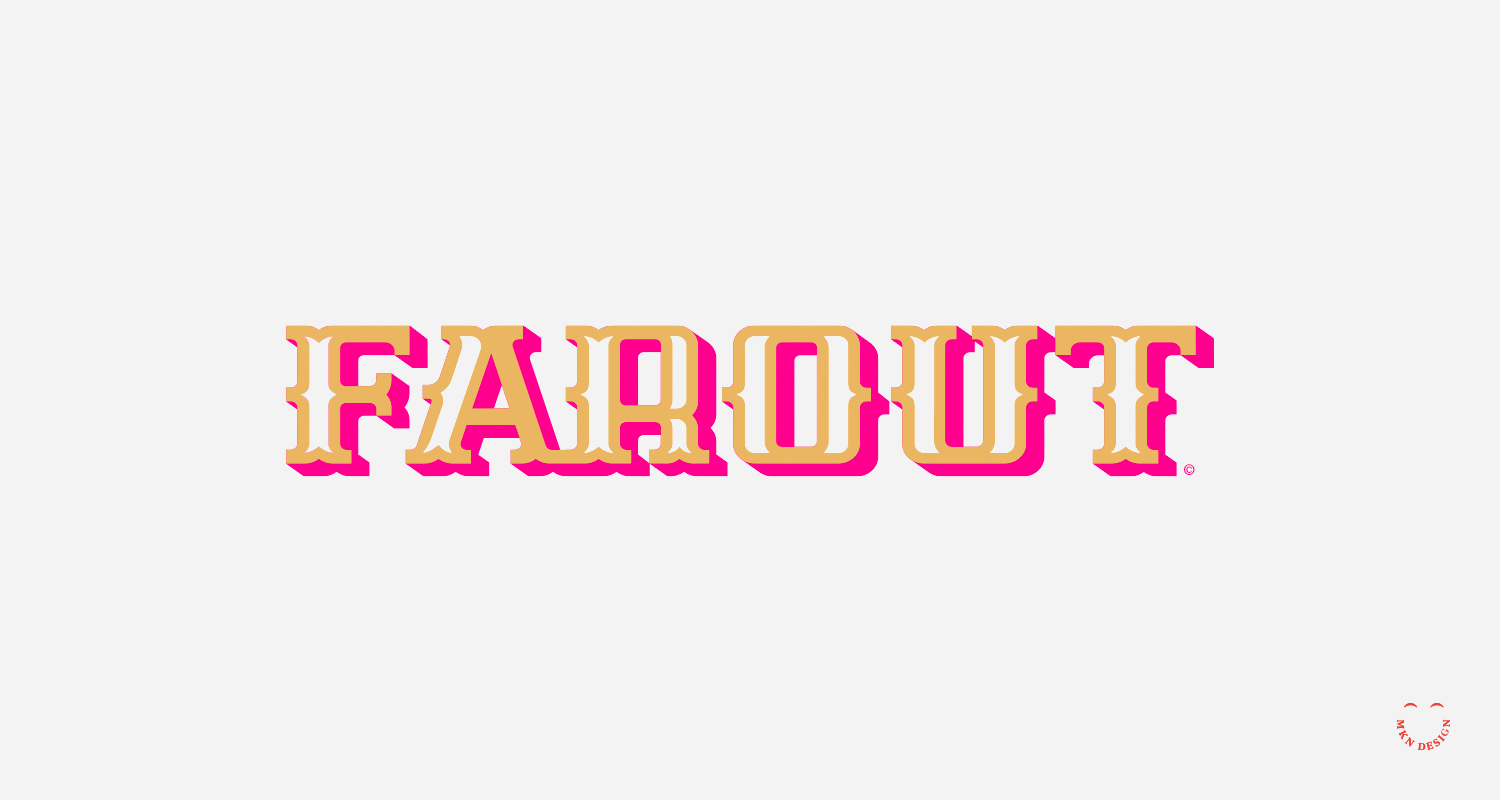
Farout was created using the Flying Dutchman display typeface. If you're interested in purchasing this typeface, please email email me for licensing and cost.
Creative Musing
April 2018

Creative Musing
March 2018
MKN Design
michael@mkn-design.com
1 616 915 1941
Good design is complexity presented simply
MKN Design LLC © 2025
Originally from Ontario, Canada, and now based in West Michigan, Michael Nÿkamp is dedicated to helping organizations develop and refine creative strategies into clear, impactful solutions that captivate and engage.