Article + Creative Musing + Product
February 2024
__
America’s Obsession
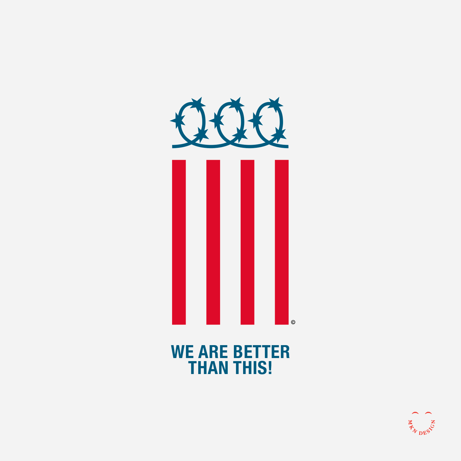
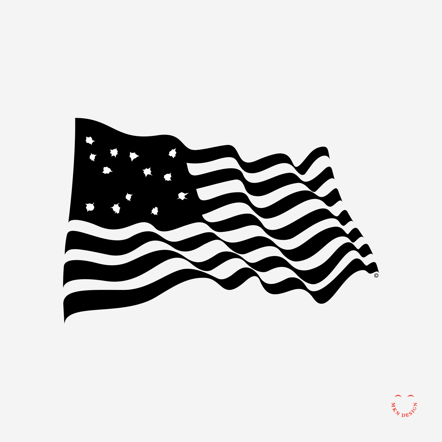
I often explore national and political perspectives through iconic symbolism. The diptych, titled "America's Obsession," delves into the complex and often contentious relationship between firearms and the American flag.
This diptych highlights the historical ties and ongoing debates surrounding firearms in the U.S., emphasizing how deeply entrenched this issue is in the nation's identity. The title hints at a critical viewpoint, suggesting that the country's focus on guns has surpassed mere heritage or rights, evolving into an obsession. Though the two panels are physically separated, the symbolic reach of the bullet extends to the flag, that have replaced the stars with bullet holes.
The artwork invites viewers to contemplate the implications of this obsession and its effect on the nation's identity.
-
America’s Obsession pocket tee (flag & bullet holes) is available for purchase on Cotton Bureau. Check out more graphic tees on my Cotton Bureau profile page.
__
Note: All Cotton Bureau apparel comes in a variety of clothing types, styles, fits, sizes, materials, and colors.