
Creative Musing
August 2015
Unify

Creative Musings
June 2015
__
Unify
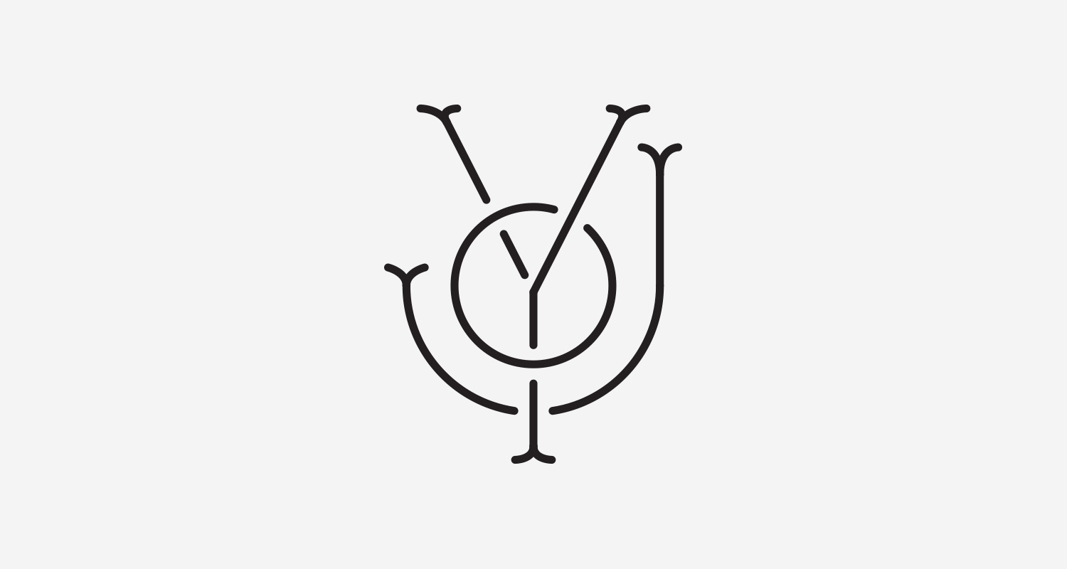
Created these after hearing the constant barrage from media outlets on talk about tensions between minorities and police, republican vs. democrat this past year. Unify is a verb, meaning to make or become united. In the image on the right the letterforms are a custom typeface designed specifically to for this mark, Try to locate the 'F' and a representation of the US flag.
The Illustration League

Article + Client Project
May 2015
__
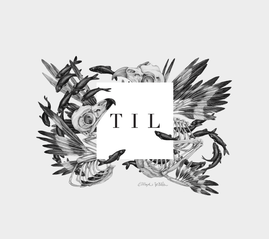
The Illustration League
TIL is a group of illustrators, artists, and letterers. Lucy Engelman and I founded The Illustration League with the aim of educating members on best practices in client relations, licensing contracts, pricing, and fostering community through illustration talks.
Once we understood our group's objective, we chose to abbreviate The Illustration League to TIL, also a nod to 'Today I Learned,' aligning with our mission. We selected a simple yet impactful square design featuring kerned-out TIL letters. The square logo symbolizes a canvas or digital artboard and is paired with the typeface Linotype Didot designed by Adrian Frutige from Monotype.
Given that TIL represents a community of diverse individuals with exceptional talents, it was crucial for the logo to embody our collective spirit. With this in mind, we engaged our members to contribute personal illustrations that would envelope, complement and embrace the boxy logo. This collaborative initiative resulted in a vibrant gallery showcasing the diverse talents within our community. Not only did this collection of artwork enhance the TIL brand, but it also exemplified the richness of the illustration community as a whole.
-
+ Brand Identity
-
+ Creative Leadership
+ Project Management
+ Research
+ Concept Development
+ Sketching & Ideation
+ Graphic Design
+ Illustration -
View the entire logo series by TIL members on the Selected Projects page.
-
This branding project was a collaborative effort by various artists, illustrators and designers. TIL artwork creations, from top left to right:
1. Christina Mrozik & Zoe Keller
2. Libby VanderPloeg (TIL Postcard)
3. Jody Williams
4. Jonathon Wolfer
5. Michael Nÿkamp
6. Elyse Flynn
7. Neil Hubert
8. Chas Appleby
9. Yolanda Gonzalez
6. Mike Williams
Good To The Bone

Client Project
April 2015
__
Good to the Bone
Invited by AIGA, West Michigan to design a fun graphic for Design For Good participants. I came up with this quirky illustration, Good to the Bone. The Design For Good is a three-day event for dedicated to helping non-profits in creating design assets that align with their business and mission.
-
+ Illustration
-
+ Creative Direction
+ Concept Development
+ Sketching & Ideation
+ Illustration -
View the entire AIGA, Design for Good brand identity system.
Ferris State University, Portfolio Reviews

Article
April 2015
__
Ferris State University, Portfolio Reviews
I had an opportunity this morning to review some graduating design students portfolios from Ferris State University at the Downtown Market, in Grand Rapids, Michigan.
Steelcase Showroom Illustrations


Client Project (via Jody Williams)
January 2015
__
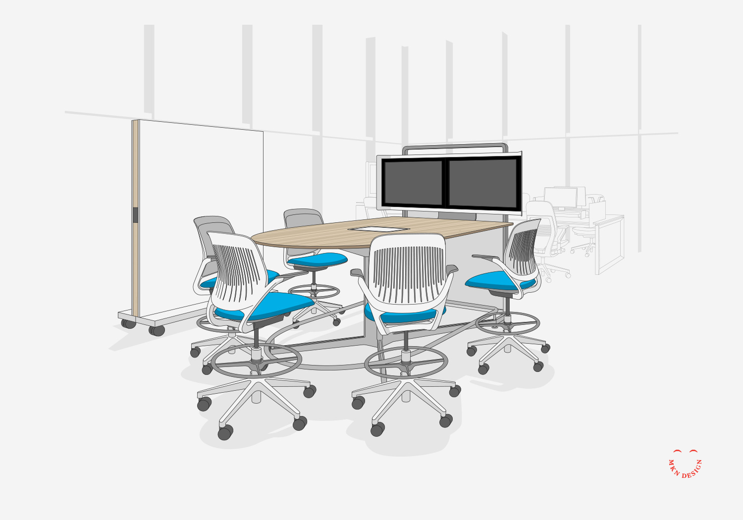
Steelcase Showroom Illustrations
We produced a series of 23 environment illustrations for Steelcase’s showroom in Los Angeles. Each illustration originated from an interior scene within the showroom and was divided into three distinct layers to emphasize its significance within the space. These layers were comprised of the primary products rendered in full color, the background environment delineated with gray lines, and the showroom's architectural framework presented in gray.
-
+ Product Illustration
-
+ Technical Illustration
+ Research -
This project was a joint endeavor with Jody Williams, freelance illustrator.
Case Study No.8

Client Project
February 2015
__
Case Study No.8
Thesis is a small and experianced design agency nestled in St. Joseph, Michigan, their process is embodied in their name and distinctive approach. Thesis approached me with a request to acquire a license for the Eames House illustration I had created several years ago.
Thesis utilized the Eames House illustration I created by having it letterpressed and using it as a gift for their clients.
-
Illustration
-
• Creative Direction
• Research
• Sketching & Ideation
• Illustration -
Explore additional illustrations from my collection of Mid Century Modern homes.
WMCAT Tour
Article
February 2015
__
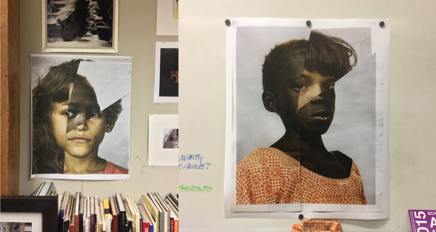
WMCAT Tour
During my tour of WMCAT, Adam Weiler and I came across these fantastic photo collages displayed on the wall in their photography studio. Absolutely love them!
eSpring Infographic Illustration

Client Project via Detergent Design
August 2015
__
eSpring Infographic Illustration
Collaborated with the Amway eSpring and Detergent Design to develop a collection of illustrative materials. These visuals were designed to assist the sales team to effectively communicate the water journey—from water sources to household water taps. Furthermore, the illustration was repurposed into a video articulating the significance of eSpring’s pivotal role at the end of the water journey. This project received an AAF Addy award.
-
+ Brand Strategy
-
+ Creative Direction
+ Research
+ Concept Development
+ Sketching & Ideation
+ Illustration -
This project was a joint endeavor with Detergent Design.
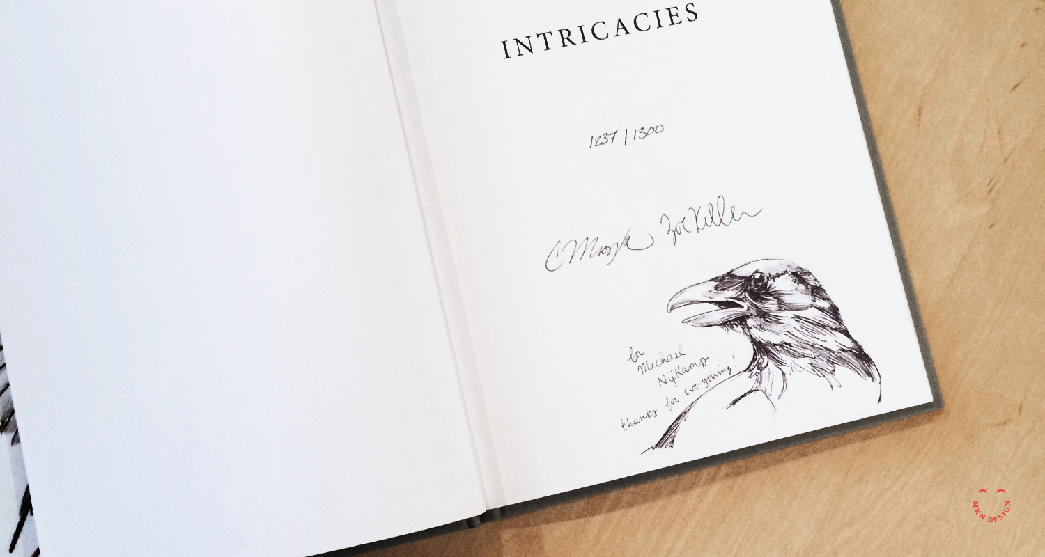
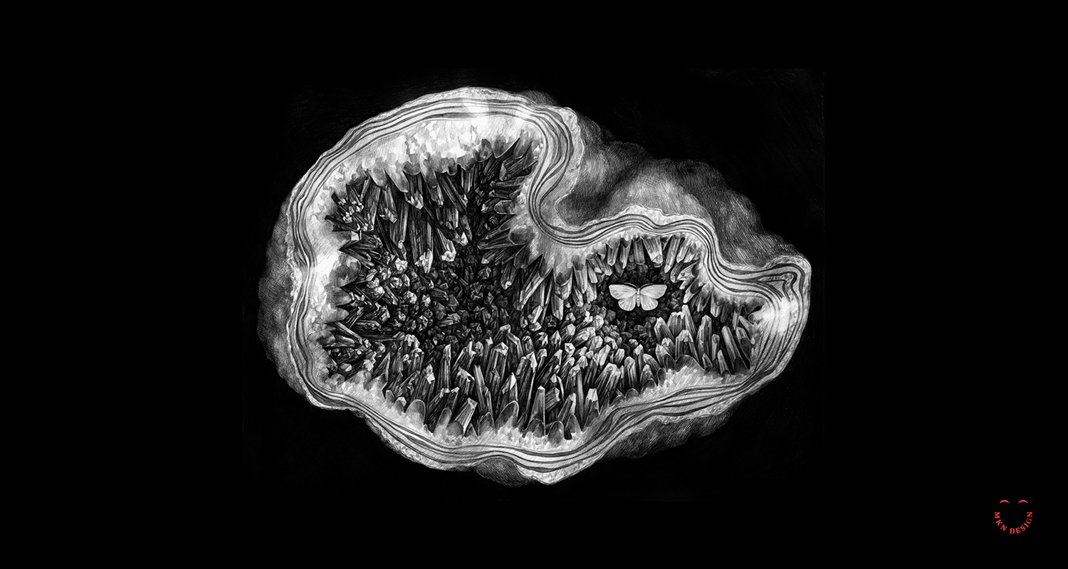
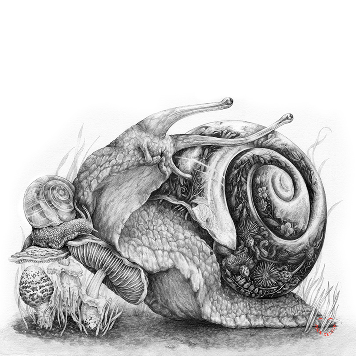
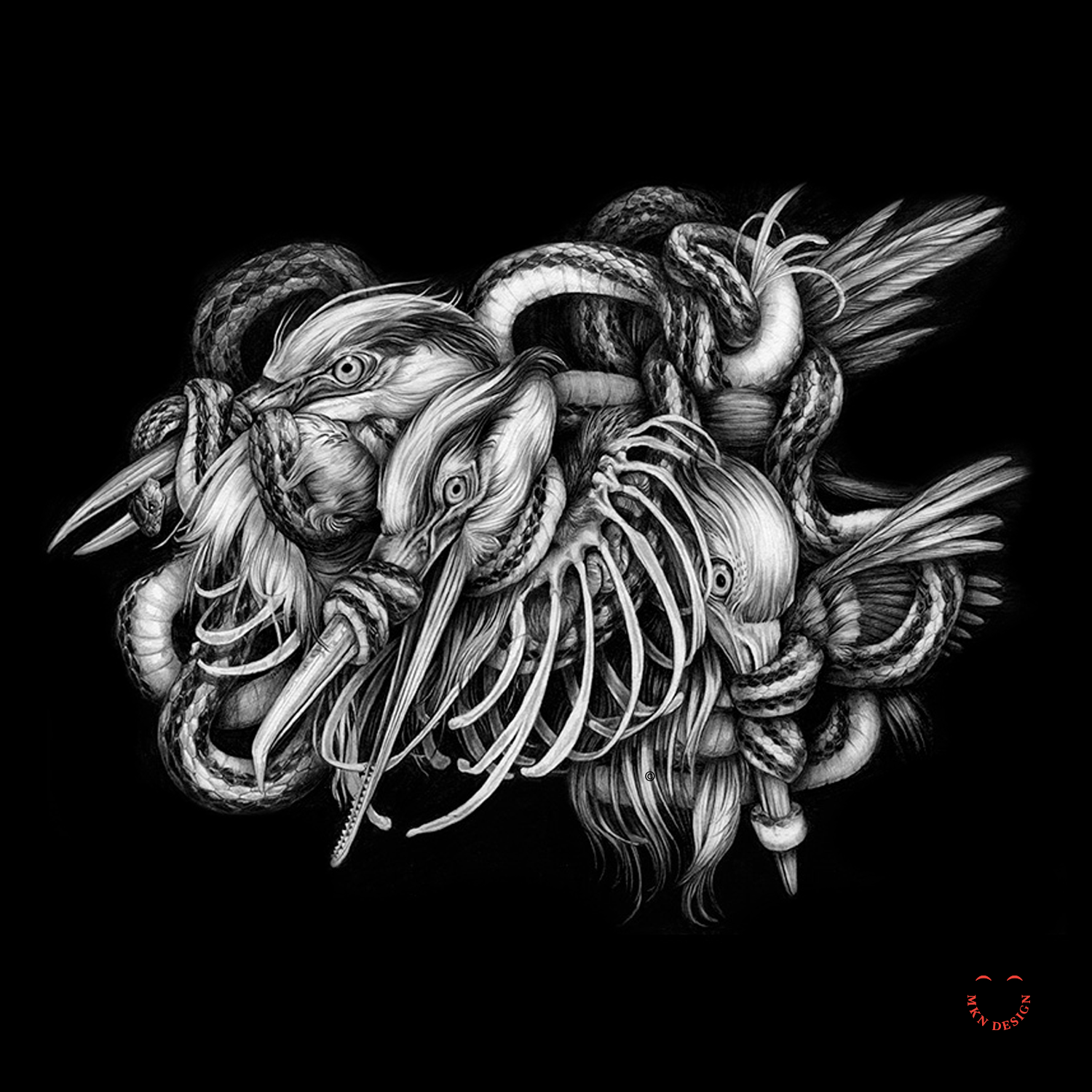
Intricacies
Article
January 2015
__
Intricacies
Just got my hands on a signed copy of Intricacies—incredibly stunning body of work! This book features collaborative drawings by artists Christina Mrozik and Zoe Keller. Produced in the summer of 2014, it presents a range of intricate graphite illustrations capturing the intertwining of nature with animals, insects, and humans.
Privacy
Creative Musing
January 2015
__
Privacy
My thoughts on the topic of social media privacy.
JOY Monogram
Creative Musing
December 2014
__
Joy Monogram
Wishing you abundant joy during this festive season! The letterforms are a custom typeface designed specifically to for this monogram.
Citizen Project

Article + Product
November 2020
__
Citizen Project: Collaboration, Freedom, Purpose
The Citizen Project is a collaborative of four creatives in Grand Rapids, Michigan—designers Jody Williams, Brian Edlefson, type designer Terrance Weinzierl, and illustrator and designer Michael Nÿkamp. Formed by Williams, the collective was established with the intent of collaborating on side projects with a purpose: to raise awareness of the amazing talent in Grand Rapids.
“As independent creatives, corporate projects tend to keep us isolated. We wanted to find ways to collaborate with our friends and peers. The Citizens Project lets us choose a common cause and theme, then produce our own visual interpretation of it. We hope to collaborate on at least one new project every year and bring other artists with other skills and interests to our effort.”
— Jody Williams, Designer.
Williams added that the goal of the collaboration allows the friends and artists to work on a personal project with a common theme. “We set our own goals and guidelines and we choose a project that interests all of us. This allows us to work together on a single project that means something to all of us.”
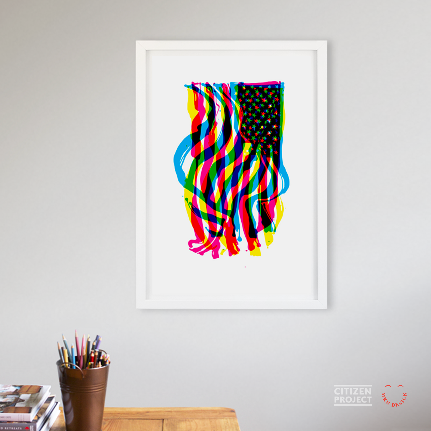
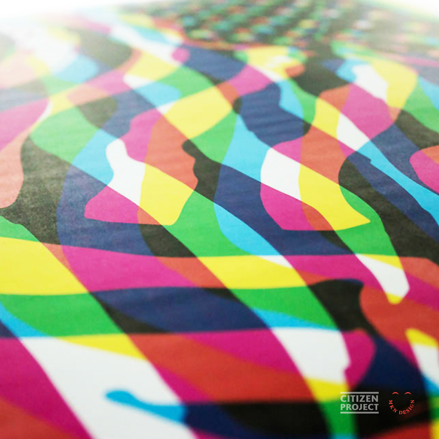
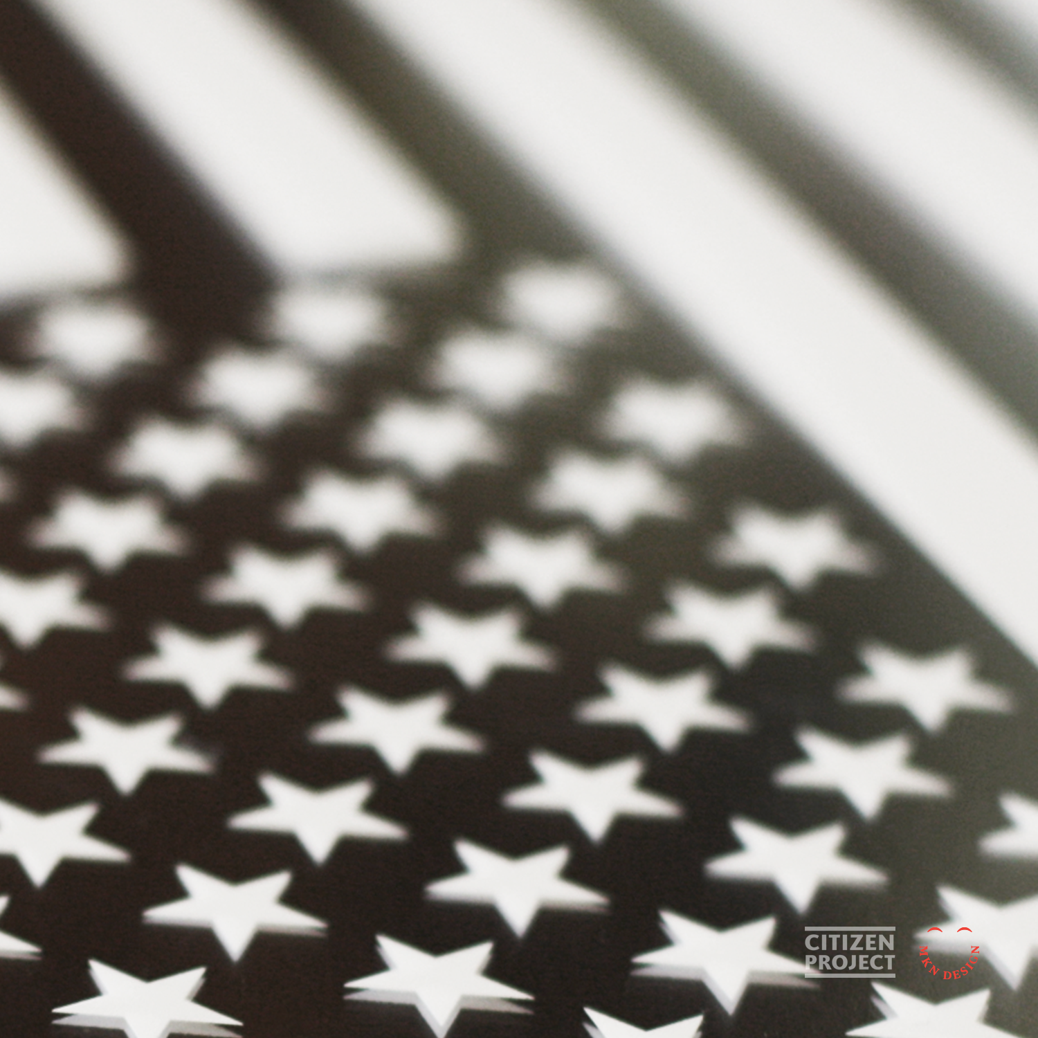
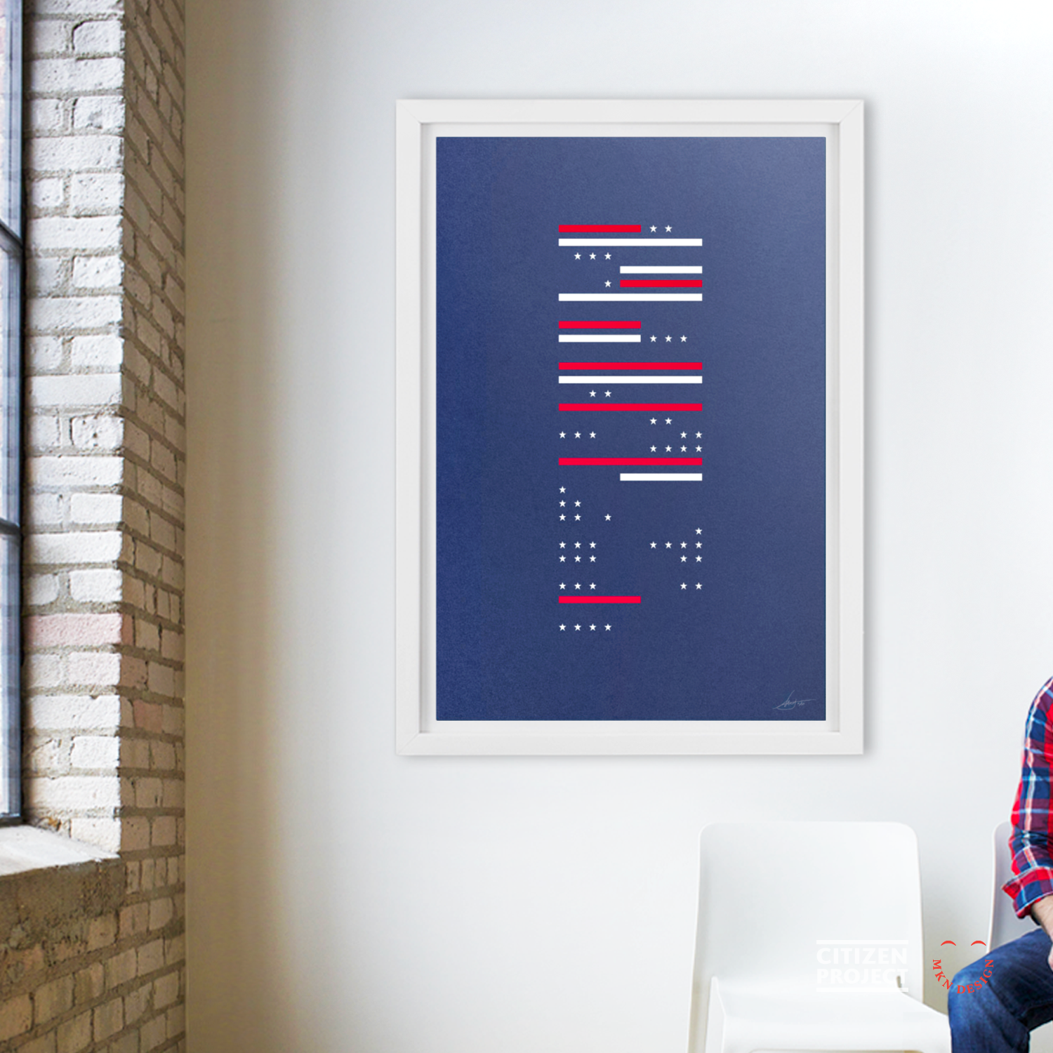
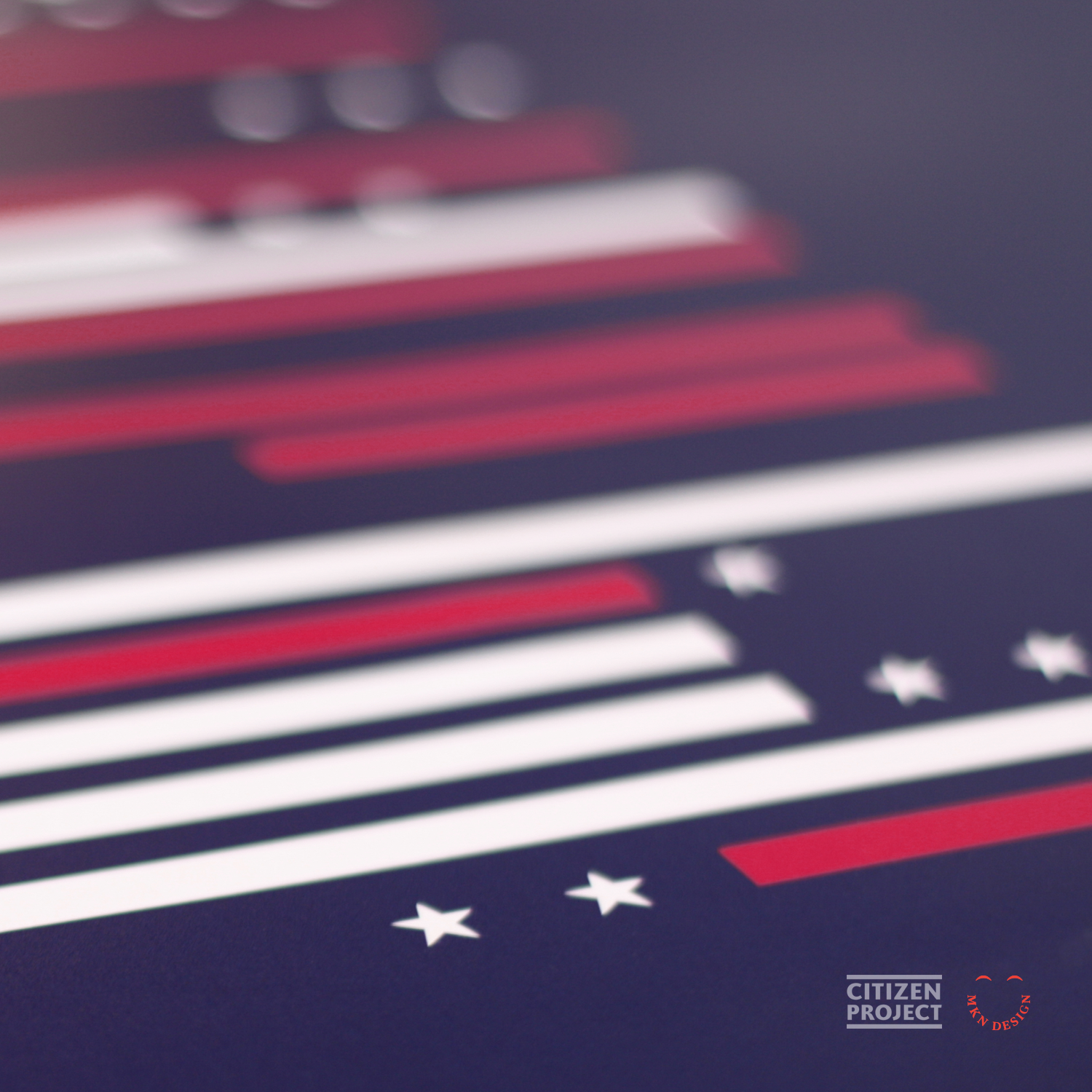
“We would meet up once or twice a month to discuss concepts and how to fund the project,” Michael Nÿkamp recalls. They devised this year’s theme commemorating the 200-year anniversary of Francis Scott Key’s writing of the Star Spangled Banner. Each artist will designeda limited-edition poster that will be silkscreen-printed by Continental ID. “We all created an inspired poster featuring our interpretation of the American Flag,” Nÿkamp added.
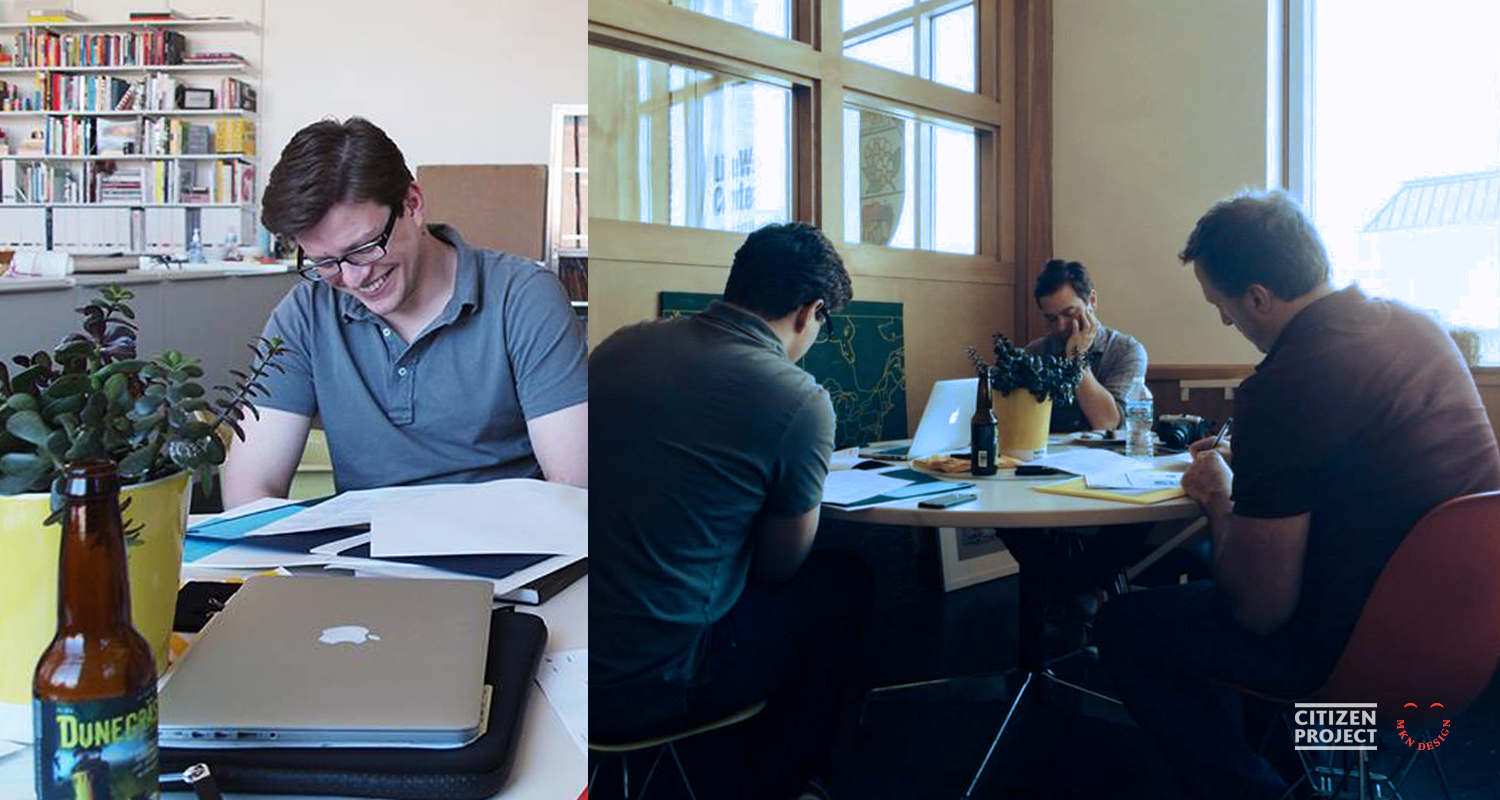

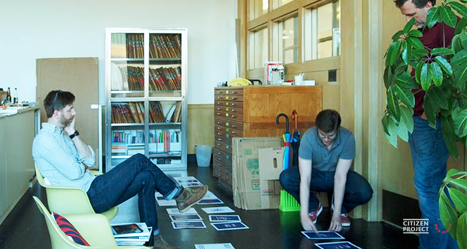
▲ We gathered at Thesis in St. Joseph, Michigan a few times to discuss our concepts.
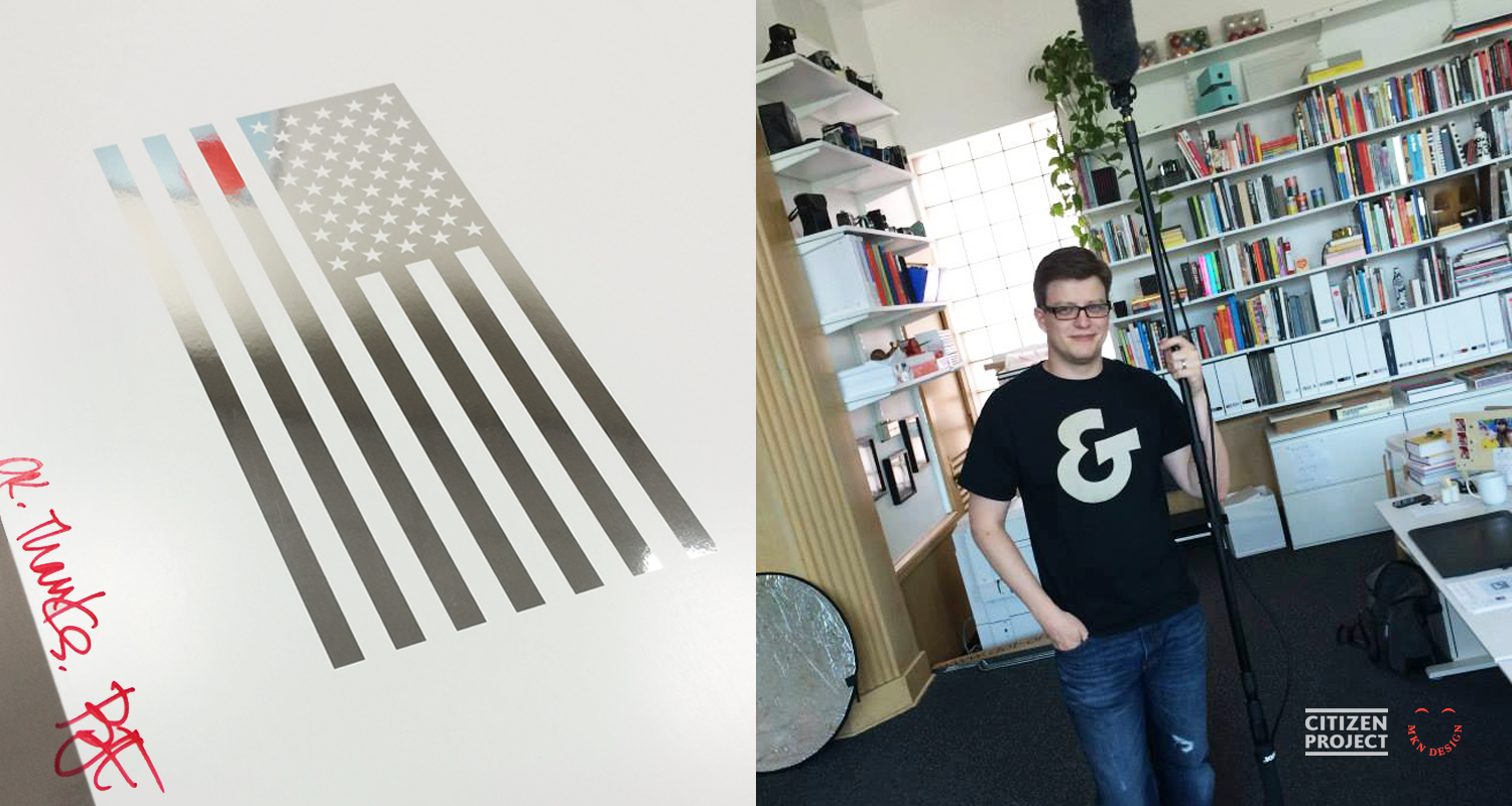
Citizen Project used Kickstarter to help fund paper and printing costs, with print runs limited to 250 of each poster. Donors receive a set of four signed and numbered posters. Chuck Oleniczak at Central Michigan Paper helped the artist choose a sheet that would work best for each design. Nÿkamp’s poster is printed on Neenah’s Classic Crest® Cover Avon Patriot Blue. Brilliant choice!
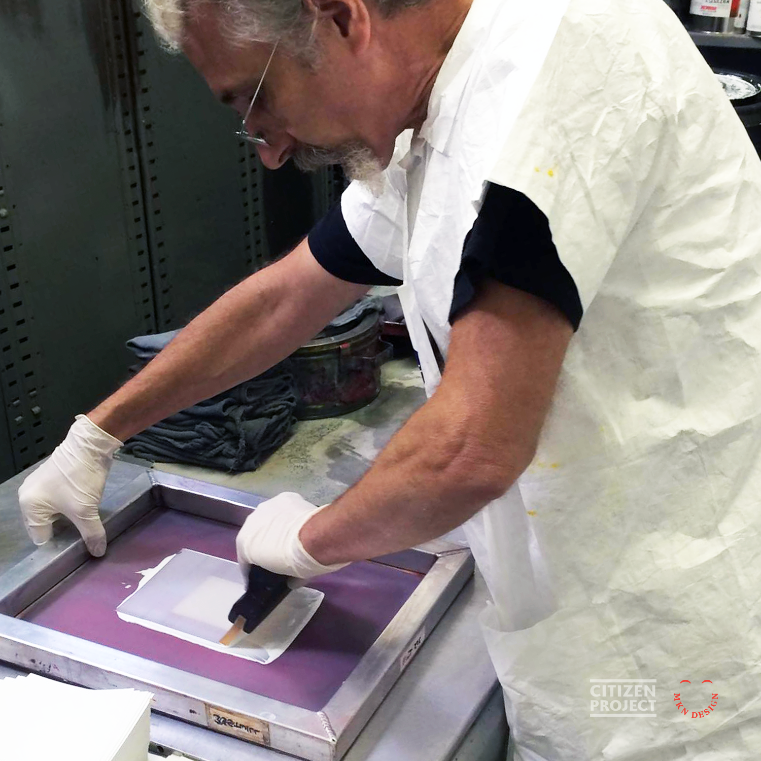


▲ Color samples being made on our paper selections at Continental Print.


▲ Left to Right:
1. Terrance rocking the ampersand tee and holding a mic boom.
2. Terrance and Brian signing their posters
3. Thirteen Stripes, Fifty Stars and Color Wave being displayed at the UICA, in Grand Rapids Michigan.
This article was written by Emily Potts has been an editor and writer working in the graphic design publishing trade for more than 20 years. In that time she’s managed a slew of publications, people, and events. Since July 2014, she has been an independent writer, editor, and consultant working for a diverse range of clients including Neenah Paper, Creative Live, AIGA, Goodtype, Elements, and more. Emily loves interviewing people and telling their stories.
Weinzierl, of course, employed typography for his poster design, while the others used more literal forms of the flag in their interpretations with varying results. Three of the four posters were shown in a Star Spangled Banner 200th anniversary exhibit in Baltimore, Md., with Nÿkamp’s design receiving an Award of Excellence.
“A future goal is to work on a project that either generates income for a cause and/or serves a non-profit or other needy institution with our respective skill sets,” says Williams. “The original intention of this year’s project was to exceed the printing costs of the poster run and donate proceeds to a veteran’s organization. Kickstarter, ultimately did not allow that to be part of the funding parameters. As we move forward, we may choose another source to fund the project, which will allow more flexibility.”
The Citizen Project hopes to broaden its pool of collaborators. The core group of four wants to draw in artists with different talents to collaborate on future projects. “The side effect of this process has been that we created new personal and working relationships with each other and had an amazingly fun time doing so,” says Nÿkamp.
Collaboration. Freedom. Purpose. New friendships. That is a what we’d call a Star Spangled success.

▲ Left to Right:
1. Jody Williams
Color Wave, 2014
Printed on Smart White from French Paper Company
3. Terrance Weinzierl
Thirteen Stripes, Fifty Stars, 2014
Printed on Smart White from French Paper Company
2. Brian Edlefson
American Portrait, 2014
Printed on Brilliance, Super Reflector Film from Decorated Paper
4. Michael Nÿkamp
Thirteen Stripes, Fifty Stars, 2014
Screen Printed on Neenah’s Classic Crest Cover Avon Patriot Blue
▲ Being interviewed by Shelley Irwin on WGVU Morning Show about the Citizen Project.
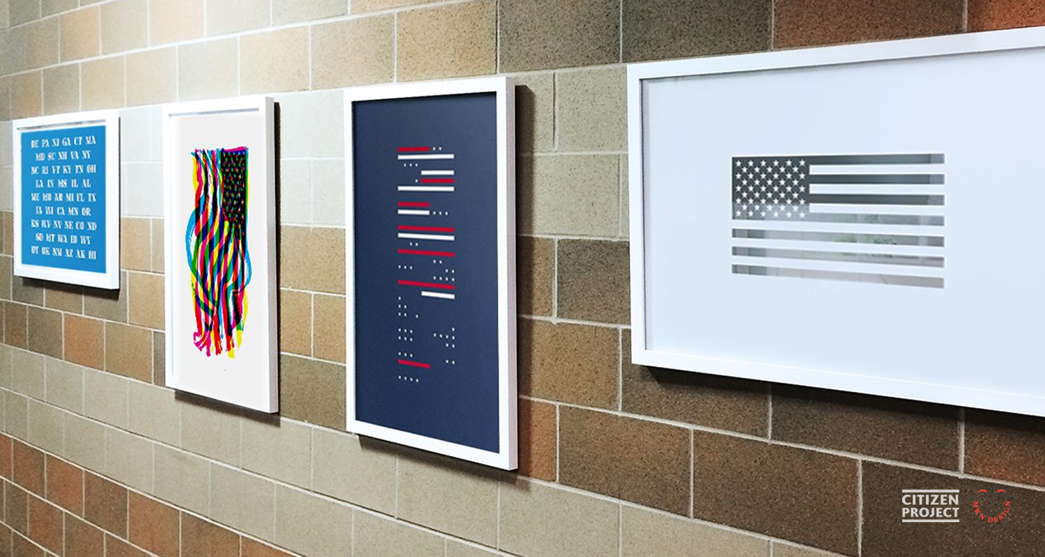
▲ The Citizen Project posters displayed at Grand Rapids Christian, Elementary School.
CANUX Conference Portraits


Client Project
October 2014
__
CANUX Conference Portraits
CANUX is an annual design, UX, and technology conference held in Canada’s historic capital, Ottawa, featuring engaging speakers from around the globe. I was commissioned to create portraits for the keynote speakers in both 2014 and 2015. Notable speakers included Aaron Draplin of DDC, Abby Covert of the IA Institute, and Louis Rosenfeld of Rosenfeld Media. The portrait style has evolved over time, building on techniques developed in an earlier project called Facebook Friends. This progression and my approach to simplifying the illustrative style were highlighted in an article written for the conference, which also explores my creative background.
-
+ Portrait Illustrations
-
+ Portrait Studies
+ Sketching and Ideation
+ Illustration -
Read article about CANUX and the portraits I illustrated for you. "Michael Nÿkamp, The Face Behind The Faces"
-
Want a custom portrait of your likeness? Email michael@mkn-design.com.
-
Photography by Elida Arrizza
CANUX Conference – Article

Article + Client Project
October 2014
__
CANUX Conference – Article
This article was originally published on October 2014 by CanUX which provided a background about myself and the process creating the speaker avatars.
Meet Michael Nÿkamp
Michael is an designer and illustrator born and raised in Ontario Canada, his only complaint (politely filed, of course) is that there are never enough pencils in the office.
The product of a tiny hamlet in Southern Ontario, called Nelles Corners, Michael is Dutch by blood but as Canadian as they come. One of seven children, Michael spent his days frolicking through the wide open spaces of the family farm. That’s right, Michael was not only one of seven, he frolicked; deal with it. When he wasn’t out and about in nature, he could usually be found holed up in the house watching his favorite shows “The Friendly Giant” and “Simon in the Land of Chalk Drawings.”
Michael loved to draw and create from a very young age and couldn’t understand why something artistic wasn’t incorporated into every class in school. He just knew math and science would be so much better with a little drawing or painting mixed in. He carried this certainty and love through grade school and high school and settled into Illustration, and New Media Design at Sheridan College.
After working in Toronto for several years, Michael met a beautiful Michigander and left his homeland for West Michigan. He worked at several design firms in Grand Rapids before going out on his own, “I was exhausted from trying to play the political game and do the design work” Nÿkamp says.
Michael has combined his experience, direction, design, and illustration to create mkn design. Michael regularly works with companies of all shapes and sizes, be they profit or non-profit, e.g., Herman Miller, Steelcase, Thesis:, and Hospice of Michigan. His design and illustration work has been recognized and awarded by Communication Arts and he was recently a finalist for his interpretation of the American Flag on behalf of The University of Baltimore, AIGA Baltimore and AIGA Blue Ridge.
Perhaps because of his Canadian roots or his general pleasantness, Michael is genuinely excited about being a part of his community and creating spaces for other designers and illustrators to connect. He’s a member of the AIGA and IxDA. And as if that isn’t enough camaraderie, Michael is also a member of Citizen Project and a founder of The Illustration League. When he’s not helping with one of these organizations, you might find him volunteering at or attending an event like Design for Good or Midwest UX. Michael is either the world’s most giving individual or too Canadian to say “no” to anyone. He’s not sure which either.
Process and Projects
Michael was always drawn to detailed organization and the idea of simplification; “All the blue legos went in one place and the red in another,” Nÿkamp chuckles, “And I still do that with my sons, Emmett and Landon. Throughout my life and education, mentors and teachers showed me that design was a process of simplification we use to create clear and informed pieces through avenues of distillation.” Nÿkamp began seeking out others who exemplified these design ideals and became influenced by works of Picasso, Piet Mondrian, Alexander Calder, Dieter Rams, and Stefan Dziallas. “These people all strive for simplicity and balance in their work and as I began to recognize and understand that, I began to emulate it in my own illustrations and design,” says Nÿkamp.
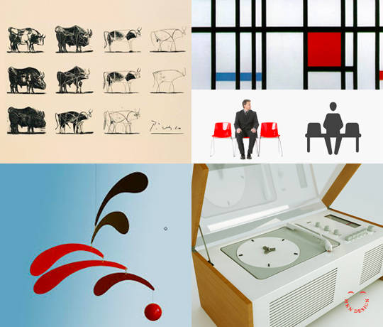
▲ Left to Right:
Pablo Picasso, ‘Bull, plate 1 – 11’; Piet Mondrian, ‘Composition with Red Blue and Yellow’; Stefan Dziallas, iconwerk; Alexandar Calder, ‘Mobile’; Dieter Rams; ‘SK4 Record Player’
“Good designers use this process all the time,” Nÿkamp points out. “Most designers strive to create a solution that is easy and pleasurable. I think about it every time I use my iPhone. The change from iOS6 to iOS 7 and 8 was a real design revolution. The simplicity of it is perfect. Windows 8 utilizes similar principles for their tile interface and it’s pleasant to use. So, whether we’re illustrators or UX designers, I think we’re all trying to recreate a simple, beautiful experience.”
This dedication to balance and simplicity can be seen and felt in Nÿkamp’s Iconified Project. “I started creating these iconified faces as a fun, self-initiated project using my friends from Facebook. Looking at profile photos, group shots, and selfies, I had a ton of material to help me create each individual. I find it difficult to illustrate people I don’t know so I tend to like a lot of background info. Whether it’s Einstein or my best friend, I’m trying to distill their essence into one image and that requires seeing them in a lot of different situations. Nobody is just one thing.”

▲ Art board of mkn design’s iconified process of Einstein’s face
The simplicity of his images belie the time and attention Nÿkamp puts into all of his work. As UX designers, you know you’re always striving to use less and accomplish more; Nÿkamp’s images do just that. Using only a few curves, lines, and dots, he distills the tale of each individual into one, single icon. They say less is more. Well, we think we’d like more of Nÿkamp’s particular brand of less.

▲ Some of MKN Design’s iconified faces, from left to right: Brandon Satterlee of The Forest; Lotta Nieminen; Mallory Bartz of Mutually Human; Steve Frykholm of Herman Miller
This article was written by Mallory Bartz, a writer, performer, and creator. She has strong likes, dislikes, feelings, and emotions about things; especially things that are important to her; but, don’t worry, she is in no way weird. She currently resides in New York and is a student at the Maggie Flanigan Studio Inc.
Nemschoff Healthcare


Client Project
May 2014
__
Nemschoff Healthcare
Collaborated with Nemschoff, the healthcare devision of Herman Miller (now
MillerKnoll) to develop healthcare environmental illustrations for their Chicago showroom. Each illustration was designed to convey a visual narrative of how different healthcare environments supported both patients and hospital staff. Moreover, these illustrations were crafted to mirror the layout of their showroom at the Merchandise Mart in Chicago, serving as an informative and insightful guide for visitors to understand each application.
-
+ Isometric Illustration
-
+ Concept Development
+ Sketching & Ideation
+ Product Illustration
Dutch Mafia Display Typeface


Creative Musing
January 2014
__
Dutch Mafia Display Typeface
A self-initiated project born from my childhood experiences growing up in a Dutch immigrant family.
The ornamental artifacts found in Dutch culture were the base that inspired the creation of this display font. Everything from fancy accouterments—including Delft pottery, wooden shoes, and doilies—to the unique architecture, cultural dress, traditions, and folk tales all defined the font. Though the style is simple in form, it conveys the unique and playful cultural background of Dutch society. In collaboration with Kurt Devlaeminck.
-
+ Display Typeface Design
-
+ Typography Design
+ Iconography -
Communication Arts, Typography Award, 2014. Featured on Typography Served and AIGA member galleries.
-
Dutch Mafia display typeface is available for purchase, email me for licensing and cost.
Midwest UX Conference Design

Client Project
October 2013
__
Midwest UX Conference Design
Managed a team to orchestrate the planning, development, and design of the Midwest UX Conference. This three-day event took place in Grand Rapids and drew more than 500 participants who engaged in workshops, talks, and keynotes. The overarching theme of “Place” served as the foundation for the event’s visual identity.
We meticulously crafted and refined key visuals, which were then translated into a range of assets, including badges, wayfinding elements, videos, websites, t-shirts, service design, social media content, and posters. The resulting assets harmoniously conveyed a unified design language, enriching the experience for both attendees and participants of the conference.
-
+ Branded Conference Environment Design
-
+ Creative Direction
+ Research
+ Creative Strategy
+ Concept Development
+ Design Ideation
+ Environmental Graphic Design
+ Project Management
Herman Miller Planning Guides


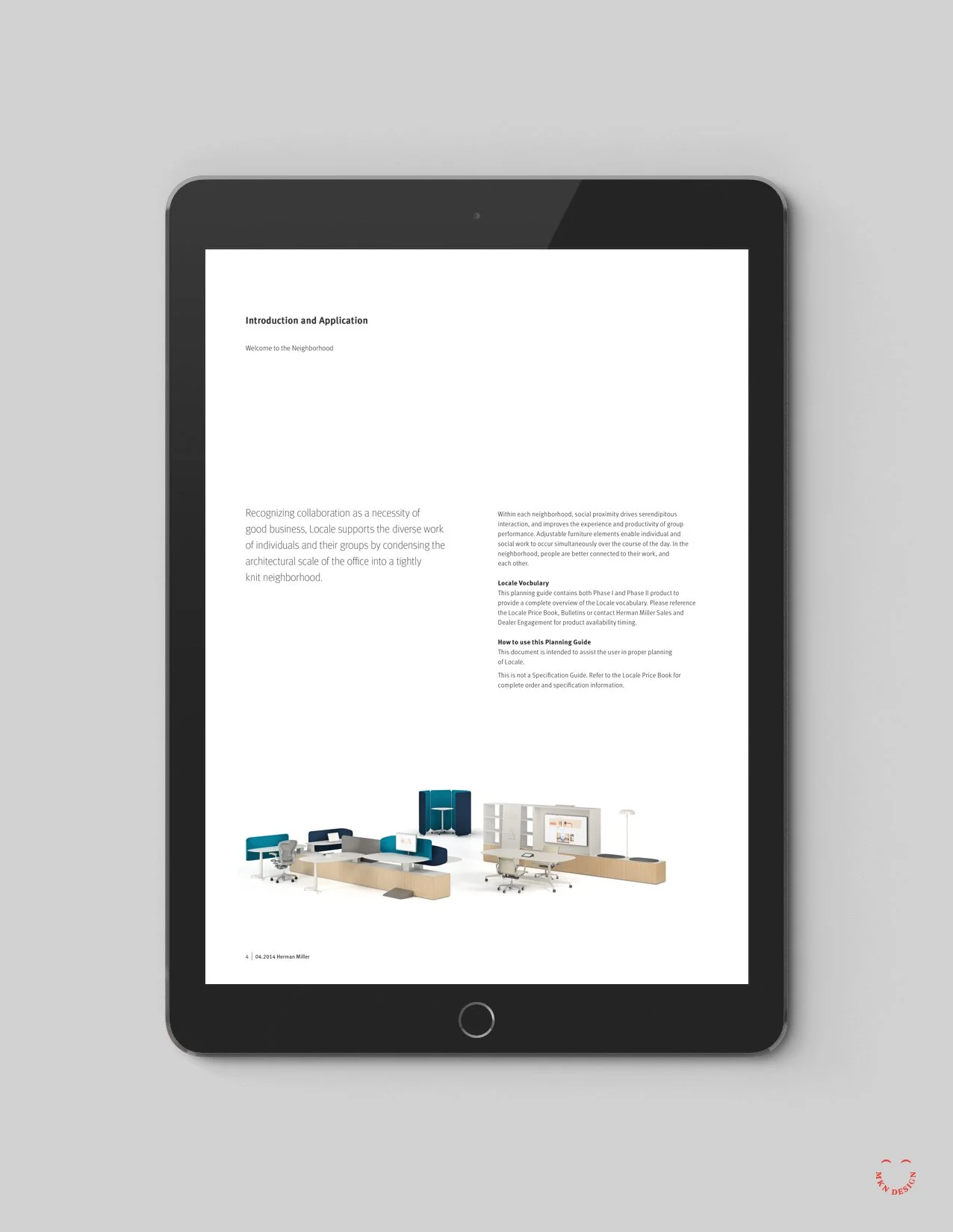


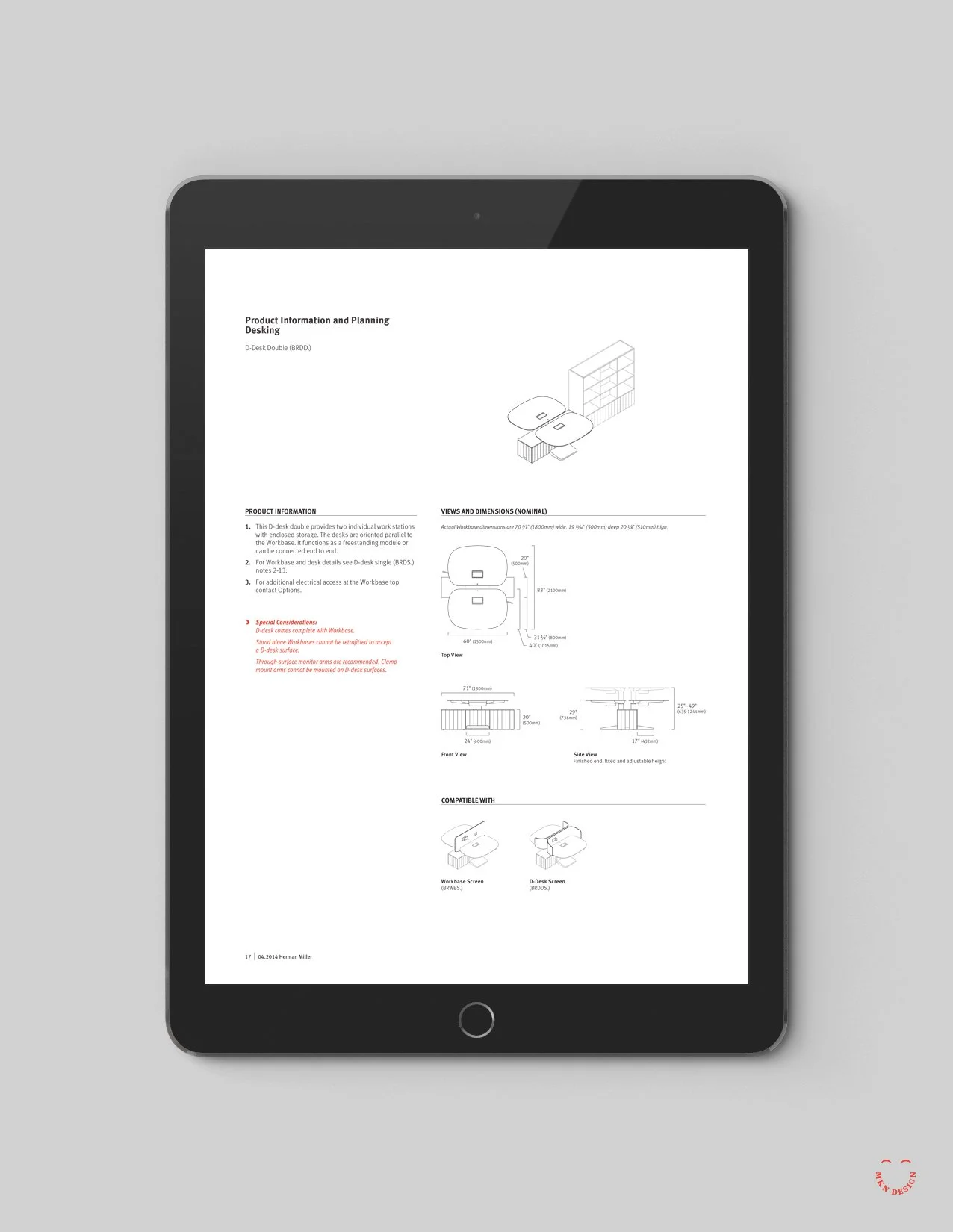


▲ Isometric Illustrations
A selected few of the 275+ isometric illustrations created for the Locale Planning Guide. Click images enlarge.
◀ Locale Planning Guide
Several layouts from the Locale product planning guide.
Client Project
September 2013
__
Herman Miller Planning Guides
Over two years, I designed a flexible framework for the Herman Miller’s product planning guides. The new designed framework revitalized their existing planning guides, enhanced search functionality, and introduced an intuitive layout. Thorough research, user experience considerations, creative exploration, and the synthesis of input from interior designers, customer care, and Herman Miller guided the transformation. The resulting implementation was user-friendly, easily navigable, expandable, and accessible to users across electronic devices, plus a function to download and print PDFs.
-
+ System Design Layout
+ Isometric Illustrations -
+ Art Direction
+ Creative Strategy
+ Concept Development
+ Design and Ideation
+ Graphic Design
+ Product Research
+ Illustration
+ Project Management
Remarker


Client Project
May 2013
__
Remarker
Collaborating with Sung Yi via Carambito I assisted with developing a logo and defining the aesthetic of his notebook. Through thorough research, it became evident that the logo needed to embody both the notebook’s simple sophistication and resonate with its intended audience. The outcome was a logo that conveyed individuality and simplicity. The logos freehand script mimicked a fluid motion of pen meeting paper. Crafted to be comfortably handheld, this product provides effortless access to personalized index cards that perfectly align with users’ needs.
Crafted to securely hold index cards, with future adaptability to accommodate cell phones. Users can choose from a variety of custom-designed index card options to suit their needs, including Blank, Dot Grid, Line Grid, Isometric Grid, Idea Card, Lined, Time Tracker, Task List, Hourly Task List, and Storyboard.
Notebook Dimensions:
• Closed Notebook: 5¼" x 3⅞"
• Open Notebook: 5¼" x 7¾"
-
+ Brand Identity
+ Product Development -
+ Creative Direction
+ Market Research
+ Concept Development
+ Sketching & Ideation
+ Graphic Design
+ Illustration -
This product was developed and designed by Sung Yi of Carambito. MKN Design assisted with ideas around binding, fabric selection and developing a logo for the product.